Gartner says most new business apps soon won’t be written by developers at all. A sales coach prototypes a “native-feeling” app over a weekend. Her clients ask, “Who built this for you?” Here’s the twist: nobody touched Xcode or Android Studio.
Gartner expects 70% of new enterprise apps to be built with low-code or no-code by 2025, yet many founders still assume “real” mobile apps demand a senior dev and a six‑month runway. Meanwhile, tools like Glide, Adalo, and Draftbit quietly power millions of installs for small teams who’d struggle to read a single line of Swift.
In this episode, we’ll zoom in on *how* those teams get a convincingly native feel without ever touching traditional mobile tooling. Not theory—practical patterns: using platform-appropriate typography, spacing that matches iOS/Android norms, and motion that feels intentional rather than jittery. We’ll also look at where no-code shines (data-driven dashboards, client portals, lightweight internal tools) and where you’ll hit friction. By the end, you’ll know exactly which “native-like” experiences you can ship yourself, and what to avoid, so your app feels professional instead of like a hacked-together prototype.
Users don’t care *how* you build; they care how fast the app opens, whether buttons respond instantly, and if it works on spotty coffee‑shop Wi‑Fi. That’s where modern no‑code platforms quietly shine: they bake in performance tricks, offline caching, and device integrations you’d otherwise need a specialist for. Instead of wiring up push notifications or camera access from scratch, you toggle features on and focus on flows, copy, and visuals. Like a good studio lighting setup in photography, these defaults flatter almost anything you build—if you know how to position your subject and avoid common mistakes.
Gartner’s trend line is one thing; watching someone ship a polished app in a weekend is another. To understand *why* these tools can fool even picky users, look at what’s actually happening under the hood.
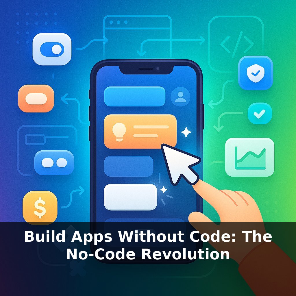
Platforms like Glide, Adalo, and Draftbit don’t just draw pretty screens in a browser. They lean on three layers working together:
First, pre-built components. Lists, tab bars, modal sheets, bottom navigation, swipeable rows—built to mimic iOS and Android patterns. You’re not inventing interaction; you’re selecting from behaviors people’s thumbs already “know.” That’s why a Glide list with proper cell height and padding can feel surprisingly close to a hand-coded feed.
Second, packaging. When you “publish to mobile,” the platform wraps your logic and UI in an iOS/Android container. That wrapper is what lets you tap into push notifications, camera, GPS, file pickers, and biometric unlock. To a user, it behaves a lot like any other installed app: it has an icon, appears in the app switcher, and can buzz on a notification.
Third, delivery. Some tools lean heavily on Progressive Web App tech, others generate more native code, but both approaches now routinely hit 60 fps for common layouts on modern phones (as Adalo’s internal benchmarks suggest). The bottleneck usually isn’t how the screen is drawn—it’s how you structure data and network calls.
So the real craft moves up a level: choosing when to sync vs. cache, deciding how much to preload before showing the first screen, and minimizing full-screen reloads. Think of a good ER doctor prioritizing which problems must be treated immediately and which can safely wait; smart triage in your data flows often matters more than pixel-perfect visuals.
This is where myths start to crack. No, these apps aren’t “just mobile websites”—push, haptics, offline access, even Face ID locks are all on the table. And yes, people are running tens of thousands of monthly users through Glide- and Draftbit-powered experiences. When limits show up, they tend to live in your chosen database, complex business rules, or heavy media processing—not in the tap-and-scroll layer.
The non-obvious constraint? Design literacy. The platforms will give you native-ish blocks and technical plumbing. Whether the result feels premium or clumsy comes down to choices: consistent icon styles, sensible hierarchy, clear affordances, and navigation that feels effortless rather than like a scavenger hunt.
A practical way to see the power here is to look at what people quietly ship. A solo fitness coach uses Glide to spin up a “check‑in” app: clients log workouts, upload form videos, and receive push nudges before sessions. She never touches a line of Swift, but she *does* obsess over how many taps it takes to log a workout and how fast the camera opens, so it fits seamlessly into her clients’ routines. A property manager builds an Adalo app where tenants submit maintenance requests with photos and track status; techs see a filtered queue based on building and urgency. The polish isn’t in exotic features—it’s in clear flows, responsive lists, and predictable back buttons. Draftbit teams go further, stitching in custom APIs for subscription billing or inventory. In all three cases, the tools handle the plumbing while the creator fine‑tunes the “moments of truth”: first launch, first successful task, first notification that actually helps instead of annoys.
As creators multiply, the question quietly shifts from “can you build it?” to “should you release it?” Expect teams to standardize reusable security blueprints the way designers share Figma kits today. Schools may teach data consent alongside color theory, and small businesses could treat app templates like policy documents—reviewed by legal, IT, and marketing. Your personal “stack” might become part résumé, part risk profile, updated as easily as swapping a theme.
The next frontier isn’t squeezing more features into tiny screens; it’s treating these tools like sketchbooks. Start with one sharp problem—missed appointments, slow approvals, messy handoffs—and prototype a fix in a weekend. Let usage, not opinions, judge it. Like testing recipes, small batches and rapid tastings will teach you faster than any tutorial.
To go deeper, here are 3 next steps: 1) Spin up a free Bubble account and follow their “Mobile-first app” tutorial, then install the Bubble Previewer app on your phone to test how close you can get to a native-feeling UI using responsive design and reusable elements. 2) Download the free Retool Mobile or FlutterFlow templates for mobile dashboards and clone one that matches your use case (e.g., marketplace, SaaS companion app), customizing at least one flow with native-feeling navigation (bottom tabs, swipe gestures, or modal sheets). 3) Read the “Progressive Web Apps” guide on web.dev and use tools like PWABuilder or Capacitor to wrap a simple web app you already have (or a Bubble prototype) into an installable app, then sideload it on your phone to experience the difference between pure web and “native-ish” behavior.