About half of your AI app’s success has nothing to do with the model. A user taps your shiny new feature… waits… squints at a cryptic result… and bails. In this episode, we’ll unpack why hiding complexity—and sharpening clarity—is your real competitive edge.
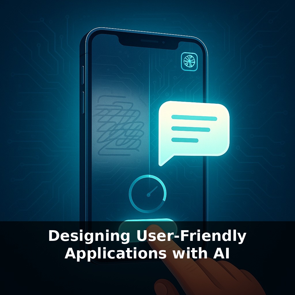
53% of people will abandon your app if it hesitates for more than three seconds—and they won’t blame the network, they’ll blame the “AI feature” you worked so hard on. In this episode, we’re moving from theory to the gritty details of making AI feel seamless, responsive, and trustworthy for real users.
We’ll zoom in on three pressure points: speed, control, and feedback. Speed isn’t just an engineering metric; it’s a trust signal. Control isn’t a settings page; it’s how confidently someone can steer your AI without fearing a hidden penalty. And feedback isn’t a survey; it’s how the product quietly learns from every correction, hesitation, and retry.
You’ll see how teams like Airbnb and others bake these ideas into their tools—and how a simple explanation panel can shift user trust in measurable ways.
Modern AI apps live in a strange tension: users want “magic,” but they don’t want to feel tricked, stalled, or judged. They expect your product to anticipate their needs without acting like it knows better than they do. That’s the real design puzzle—turning probabilistic guesses into interactions that feel respectful, reversible, and worth the tap.
In this episode, we’ll zoom out from individual screens and look at the whole journey: how people first encounter your AI, how expectations are set, how misfires are recovered, and how tiny interface choices can turn the same model into a delight or a deal-breaker.
A lot of “AI UX” advice stops at: make it fast, give controls, capture feedback. Useful—but thin. The deeper work is deciding *when* to let the AI lead, *when* to step back, and *how* to show its reasoning without overwhelming people.
Start with roles, not features. For each AI capability, ask: is this acting as an **assistant** (suggesting options), an **autopilot** (doing the default thing), or a **mentor** (explaining and teaching)? The same model can play all three roles in one product, but each role changes the interface.
Assistants should bias toward visibility and low commitment. Think of Gmail’s Smart Compose: greyed text, easy to ignore, no penalty for skipping. You can adopt that pattern for AI summaries, design variants, or code fixes—suggest first, apply on explicit confirmation.
Autopilots demand stricter safeguards. When you let AI take default actions (routing tickets, approving small refunds, resizing images), wrap them in **soft boundaries**: preview panes, easy undo, clear logs of what changed. Users accept more automation when they can quickly inspect and reverse it.
Mentor-style AI earns its keep through **selective** transparency. The MIT loan-approval study didn’t dump the entire model graph on people; it highlighted the few factors that actually helped them decide whether to trust the outcome. That’s your bar: expose just enough rationale that a skeptical, busy human can say “okay, that tracks.”
Now layer in **states and edges**. Think through:
- First-run: How do you set expectations so people don’t overtrust or underuse the AI? - Failure: What does the UI do when the model is unsure, rate-limited, or flat-out wrong? - Growth: How do power users discover advanced controls without cluttering the default path?
Treat uncertainty as a first-class state. Show graded confidence (e.g., “Likely match • Review suggested changes”) instead of binary success/fail. Let people steer with lightweight inputs: thumbs, quick edits, small nudges that your system can learn from over time.
One pragmatic approach: storyboard a day in the life of your user and mark every point where AI touches their flow. For each touchpoint, choose the role (assistant, autopilot, mentor), define the recovery path, and specify exactly what feedback the UI will capture—or quietly ignore.
Consider three concrete patterns from real products. First, Notion’s AI doesn’t just answer; it **offers alternative phrasings** inline, like a coach handing you three different plays before you pick one. The helpful part isn’t the text generation—it’s the feeling that you’re still the editor-in-chief, not a passive reader of machine output.
Second, think about Figma’s AI experiments: instead of one big “Generate UI” button, they lean on **tiny, contextual actions**—rename layers, align components, tweak copy. Many of these are single-click, reversible moves. You can chain them into powerful flows, but each step feels safe to try.
Third, look at customer support tools that use AI to **draft, not send, replies**. Agents see suggestions, plus a few color-coded hints like “highly confident on tone, less on details.” That subtle cue shapes behavior: they skim more carefully when confidence dips, and the system quietly learns which parts they rewrite most.
Keep asking: where can I make the next AI action as low-stakes as a practice swing, not a championship shot?
In a few years, “good enough” AI UX will feel like responsive web design does now: invisible until it’s missing. The frontier shifts to orchestrating many models across devices and contexts, like a conductor cueing different sections of an orchestra without breaking the melody. Interfaces will quietly adapt to user mood, context, and risk level. Teams that prototype these shape‑shifting flows early will set the patterns others copy—and influence emerging standards and norms.
Think of each release as a scrimmage, not a championship game. Ship a thin slice, watch where people hesitate, then tune prompts, microcopy, and guardrails. Over time, patterns emerge: which moments deserve richer context, which can fade into the background. The apps that win won’t just “use AI” — they’ll feel like they’re learning *with* their users.
Before next week, ask yourself: 1) “If I watched a first-time user interact with my AI feature today, exactly where would they hesitate or look confused—and what’s one small UI tweak (a clearer prompt example, a better empty state, or a more visible ‘Why did I get this result?’ link) I could ship to reduce that confusion?” 2) “Looking at my current onboarding and first-run experience, where am I assuming users understand how the AI works, and how could I replace that assumption with a concrete, in-product hint, tooltip, or microcopy that explains what the model can and *can’t* do?” 3) “In my next usability test, how will I specifically check for trust and control—what’s one scenario I can design where users adjust AI settings, review suggested outputs, or undo an AI-driven action, so I can see if they actually feel in charge?”