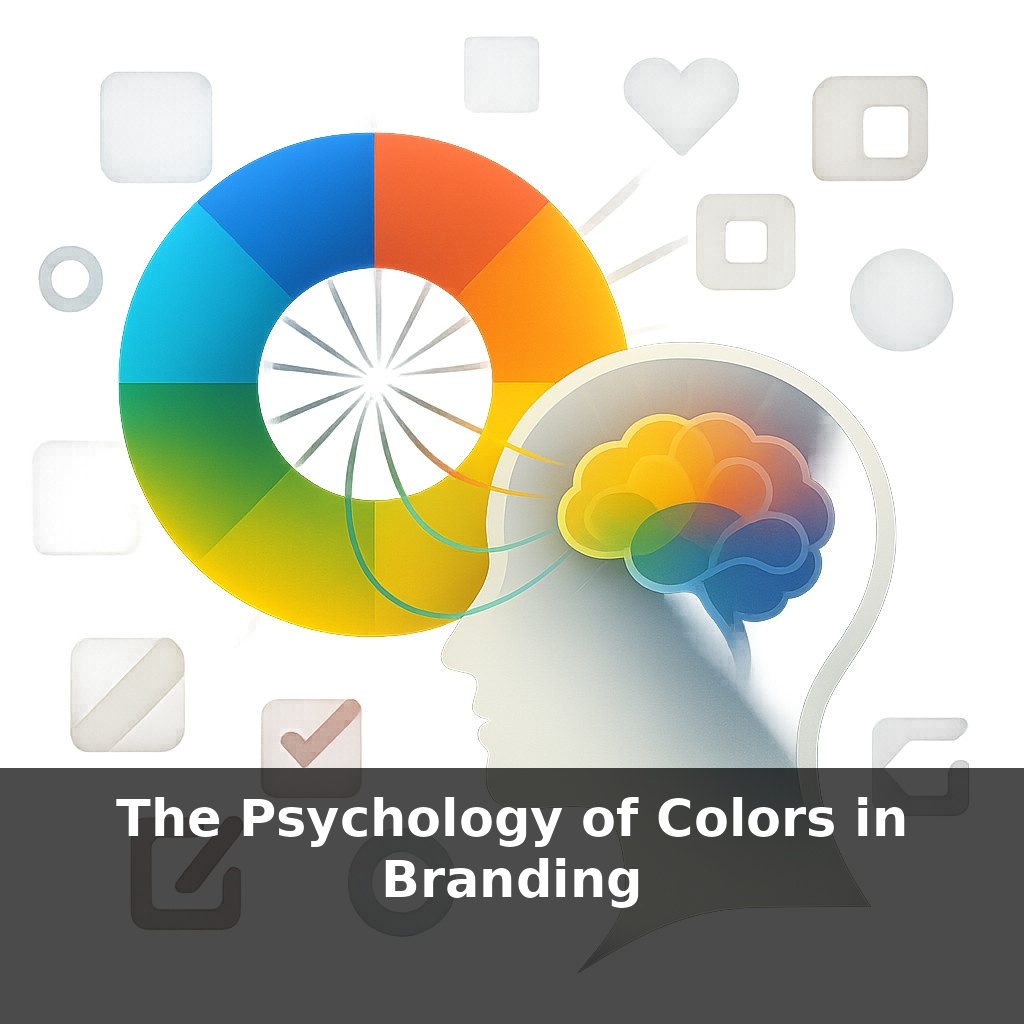
Within a blink, your brain decides if a brand feels trustworthy, cheap, or luxurious—often before you’ve even read a single word. You’re not “seeing” a logo; you’re feeling it. Today, we’re stepping inside that instant snap judgment to ask: what is color secretly telling you?
Some brands feel like an old friend the moment you see them; others feel like a pop-up ad crashing your day. That difference isn’t just about the logo icon or typeface—it’s about how all the visual pieces lock into a single mood. Color is often the first piece to hit your nervous system, but it doesn’t work in isolation. The same shade that signals “calm authority” on a bank’s app might scream “boring” on an energy drink can, because your brain is constantly cross-checking expectations: product type, price point, even where you are when you see it.
In this episode, we’ll dig into how context, culture, and category flip the script on familiar hues, and how smart brands bend those expectations without breaking them. You’ll see why the goal isn’t to find a magic color, but to choreograph the right emotional cue for the right audience, at the right moment.
Think about how certain brands feel “locked in” visually: from app icon to packaging to storefront, the same vibe follows you everywhere. That’s not an accident; it’s a system. The hues on screen, the accent on a shopping bag, even the paint on a storefront door are chosen to echo the same signal. This is where psychology meets consistency: repetition wires your brain to treat a color scheme like a familiar voice in a crowded room. Over time, that repetition can carry meaning on its own—comfort, status, rebellion—so the brand can speak volumes even when the logo is barely there.
When designers talk about “choosing a brand color,” they’re usually making three decisions at once: the general hue (blue vs. red), the exact shade (navy vs. teal), and the supporting cast (what it’s paired with). Each layer tweaks how people read the brand.
Hue sets the broad emotional lane, but shade fine-tunes the story. Look at Coca‑Cola’s deep, almost velvety red next to Netflix’s sharper digital red. Same basic family; totally different energy. One leans nostalgic and festive, the other urgent and screen‑first. Darkening, muting, or brightening a hue can push it toward premium, playful, or practical without ever changing “color family.”
Then there’s temperature and saturation. Warm, saturated palettes often feel more extroverted; cooler, desaturated ones feel more introspective or analytical. That’s why fintech startups frequently lean into cooler blues and greens, while fitness apps tilt toward hotter oranges and reds. But interesting brands often break that pattern on purpose: think of Cash App’s punchy neon green in a space dominated by sober navy.
Pairs and groups matter as much as the star color. A single hue can be made to feel democratic or exclusive depending on contrast and balance. IKEA’s bright blue and yellow feels open and accessible; Tiffany’s restrained blue with lots of white space and minimal metallic accents feels rarefied. Same principle: the ratio between main color, neutrals, and accent tones changes the whole social “temperature” of the brand.
Industry examples show how subtle this can get. Spotify’s green is more electric than the earthy greens used by Whole Foods; both signal “growth,” but one points to cultural discovery while the other points to health and sustainability. DHL’s yellow is cranked to maximum visibility for speed and logistics, while National Geographic’s deeper yellow frame leans toward curiosity and intellect.
Increasingly, brands also plan for motion and screens: gradients, dark modes, and accessibility. Instagram’s multicolor gradient lets it feel alive in motion, while Stripe’s system flexes from dark purples on dashboards to lighter tints in marketing—same personality, different “volume” depending on context.
Your challenge this week: audit three brands you interact with daily—on your phone, in your kitchen, or on your commute. For each, ignore the logo shape and just screenshot or photograph where you see their primary and secondary colors show up: app icons, emails, packaging, storefronts, even uniforms. Lay each brand’s images side by side and ask:
- How consistent is the main hue? - When does the shade shift darker or lighter? - Where do accent colors appear, and what’s happening in those moments (selling, warning, celebrating)?
By next week, you’ll start noticing not just “a color,” but an entire system quietly steering how you feel about those brands.
Think about how certain brands almost “claim” everyday objects. A bright, slightly warm red on a vending machine might trigger thoughts of Coca‑Cola before you even read the logo. A soft, powdery blue box in a jewelry store window can whisper Tiffany’s from half a block away. These aren’t accidental overlaps; they’re long-term bets that a very specific slice of the spectrum will become shorthand for a whole experience.
You can see different strategies at work. Tech tools like Slack or Asana often use multicolor accents: each feature or notification type leans on its own stripe of the palette, helping your brain sort information faster. Streaming platforms, by contrast, often commit to one dominant note—deep red, vivid green, saturated purple—so the interface feels like stepping into a single, focused “room” rather than a dashboard.
Art museums offer another twist: many use neutral, almost gallery-like interfaces and reserve bolder hues for wayfinding or special exhibits, so color functions as a spotlight rather than the main attraction.
As interfaces get smarter, your palette may become less fixed and more like a living ecosystem. Adaptive systems could shift hues by time of day, device, or even user mood, while still feeling unmistakably “you.” Think of a skyline across seasons: changing light, same recognizable outline. Designers will need rules for what can flex and what must stay rigid, so experimentation doesn’t erode recognition or trust in the long run.
If you treat your palette like a living language, each campaign becomes a short story instead of a disconnected ad. Over time, small shifts in shade can signal new chapters—launch, renewal, urgency—without losing the thread. Like trail markers on a long hike, thoughtfully repeated hues keep people oriented while still leaving room for surprise along the path.
Before next week, ask yourself: “If my brand were a person, what 3 emotions would I want people to feel when they ‘meet’ it—and do my current colors actually trigger those emotions (e.g., trust like blue, excitement like red, calm like green)?” Then look at your website or social profiles and ask: “Where does the color I’m using contradict the feeling I’m trying to create—like using aggressive reds on a ‘reassuring’ pricing page or dull grays on a ‘fun’ launch announcement?” Finally, pick one touchpoint (homepage hero, Instagram grid, or packaging mockup) and ask: “If I changed just one main color based on the psychology I learned, what specific swap would I make today—and how would I expect that to change my audience’s first impression?”