Some teams cut their creative briefing time nearly in half—without hiring anyone new or buying fancy software. A designer opens a shared board, the room goes quiet, and suddenly everyone’s nodding. Same project, same people—totally different clarity. What changed?
That “quiet nodding” moment usually isn’t magic—it’s the result of a clear brand mood board doing its job. Teams that use one don’t just feel more aligned; they move faster and make fewer revisions. One inVision survey found teams cut visual briefing time by 30–50% when they started centralizing references in a single, intentional board. That’s the difference between three chaotic review rounds and one focused pass with targeted tweaks.
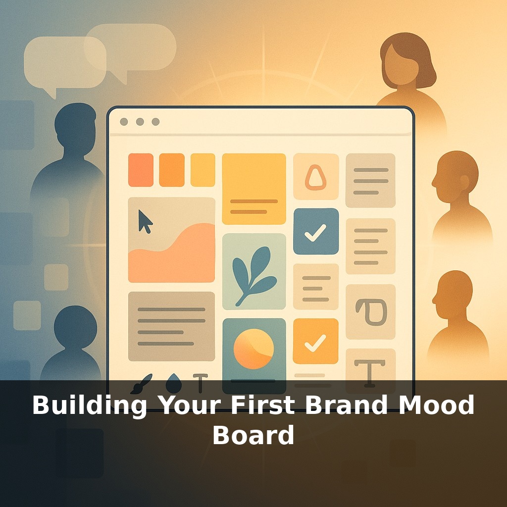
But a mood board isn’t just a pretty collage. It’s a visual hypothesis about how your brand should feel at every touchpoint—from a 12‑pixel app icon to a 12‑foot trade show backdrop. Get it right, and your designers, writers, and marketers can all pull in the same direction without constant hand‑holding. Get it wrong—or skip it entirely—and you’ll see it in mismatched ads, off‑brand decks, and products that “almost” look like they belong together.
Here’s where it gets practical: most strong mood boards aren’t “anything goes” collages—they’re tightly edited systems. Think 3–5 core colors, 2–3 typefaces, 8–15 images, and a handful of key words that lock in the emotional tone. That constraint is what turns scattered inspiration into a usable reference. And while white (#FFFFFF) shows up as a base in about 62% of digital boards, your choices should be driven by strategy, not trends: audience, industry, accessibility (4.5:1 contrast or better), and the specific feelings you want to trigger on screen and in print.
Skip the blank canvas. Start by writing a one‑sentence “feel” statement that will govern every choice: “Brand X should feel ___, ___, and ___ to [specific audience] in [specific context].” For example: “Our fintech app should feel calm, trustworthy, and quietly premium to first‑time investors on mobile.”
That sentence becomes your filter. Anything you add to the board must pass three tests:
1. **Does it match the feel words?** If you said “calm” and “quietly premium,” but you’re pinning neon gradients and ultra‑bold graffiti fonts, something’s off. Treat every piece like evidence in a case: keep only what supports your claim.
2. **Does it fit your audience’s world?** Ground your picks in real people. A B2B SaaS selling into Fortune 500 teams might lean into structured grids, generous white space, and restrained color accents. A DTC beauty brand for Gen Z could justify bolder palettes, expressive typography, and playful cropping. For each element you add, be able to answer: “Where would my audience have seen something like this—and liked it?”
3. **Can your team execute it realistically?** A board full of intricate 3D renders and custom illustration styles is useless if you have one overworked marketer and no design budget. If you know you’ll rely on templates and stock assets, select a direction that still looks distinctive with those constraints—e.g., a very specific color combo, or a consistent photographic angle or crop.
Next, think in **ratios**, not just ingredients. Instead of “we use blue and yellow,” specify something like “70% deep navy, 20% warm off‑white, 10% golden accent.” Visually, that might mean seven darker, grounding references, two light, airy ones, and a single pop color used sparingly. The same goes for typography: one dominant type style in ~80% of examples, one supporting style in the remaining 20%.
Finally, deliberately add **2–3 “anti‑examples”**—things your brand is *not*. A hyper‑playful palette, a grungy texture, or a loud meme‑style graphic can be tagged “off‑brand.” This sharpens decision‑making later: when someone suggests a direction, you can point back and say, “We explicitly decided not to look like this.”
Study three real boards before you build your own. Go to Dribbble or Behance and search for “brand mood board” + your industry. Pick 3 examples that feel close to your market, then dissect them like a designer, not a casual scroller.
Count elements: how many photos (8? 12?), how many distinct colors (3? 6?), how many text snippets. Estimate ratios: is 70–80% of the board light, with 20–30% dark anchors, or the reverse? Note layout patterns: do images cluster in columns, grids of 3×3, or asymmetric blocks?
Next, reverse‑engineer intent. Write a 10–15 word sentence about what each board is trying to make you feel. Compare: what *specifically* makes Board A feel more “direct” than Board B—tighter crops, bolder weights, higher contrast?
Finally, steal structure, not style. Use one board’s layout (e.g., 9 images, 3 color swatches, 2 text panels) as a skeleton for your first draft, while filling it with assets tied to your own audience, product, and constraints.
In 3–5 years, expect your board to behave more like a living prototype than a static collage. AI tools will auto-generate 20–30 variations from a few adjectives, then watch which options your audience actually clicks, scrolls, or buys from. A board that wins 15–20% more engagement will update guidelines automatically—swapping underperforming colors, refining contrast to meet ≥4.5:1, and suggesting fresh layouts. Your role shifts: from picker of visuals to editor of the story they tell.
Treat your first board as version 0.1, not a masterpiece. After launch, snapshot 3–5 assets shaped by it—homepage, ad, slide, email header. Track simple metrics for each (clicks, time on page, replies). When one outperforms by 15–25%, revisit the board and nudge 1–2 visual choices toward what’s clearly working.
Start with this tiny habit: When you open Instagram (or Pinterest), save just ONE image that feels like your brand’s vibe into a folder called “Mood Board – Draft.” Don’t overthink it—if it feels like your brand’s energy (color, style, or mood), tap save and move on. Do this every time you scroll, and by the end of the week you’ll have a starter mood board without ever having to “sit down and create one.”