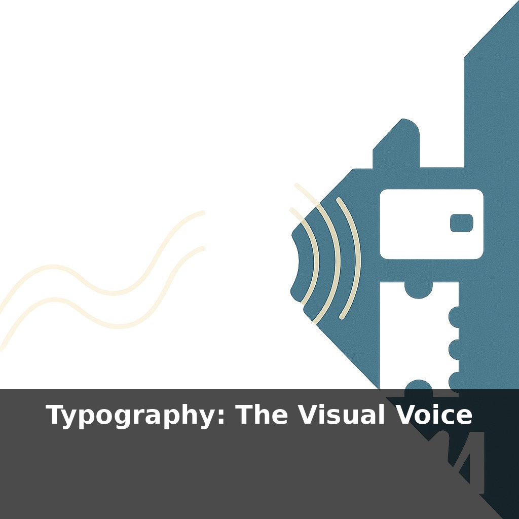
Your brain decides whether to trust a brand in less than a blink—often before you’ve read a single word. A friendly coffee shop logo, a serious banking app, a loud festival poster: each is “speaking” to you, not with copy, but with the shape of its letters.
Scroll through your favorite brands and you’ll notice something subtle: their words “feel” different long before you process what they say. That cozy DTC blanket brand, the sharp fintech dashboard, the rebellious streetwear label—all are using typography as casting directors use actors, choosing who delivers the lines so the script lands exactly right.
This “visual voice” doesn’t happen by accident. Teams debate whether a single curve is too friendly, a terminal too sharp, a numeral too mechanical for their story. Designers weigh accessibility guidelines, language support, and screen rendering just as carefully as mood and style. Typography becomes the quiet framework holding every touchpoint together—from thumbnails on your phone to receipt emails you barely skim—shaping how consistent, credible, and human a brand feels over time.
Watch how this plays out in the wild. Open Spotify, The New York Times, and your banking app side by side: each uses different rhythms of weight, spacing, and contrast to cue how fast you should read, how serious the content feels, and how long you’re expected to stay. Headlines might be punchy and compact, encouraging quick scanning, while long-form articles stretch into calmer, more open text that invites immersion. Subtle tweaks—like slightly tighter tracking in labels or higher contrast in buttons—guide your eye through tasks, much like thoughtfully placed lighting leads you through a gallery.
main_explanation: Zoom in from the big picture to the tiny decisions and you start to see why some brands feel sharply defined while others blur together. Type designers obsess over details most people never consciously notice: the height of a lowercase “x” compared to capitals, how round a “o” feels, whether a “t” leans mechanical or handwritten. These micro–choices change the overall texture of text, and that texture whispers something about the brand before any campaign line does.
Look at how different industries lean on these subtleties. A wellness brand might favor softer curves, generous counters, and slightly looser letter-spacing that give copy an easy, breathable quality—supporting messages about calm and care. A cybersecurity company, by contrast, might choose more condensed forms, sharper joins, and crisper diagonals that hint at precision and vigilance. Both could say “we protect you”; only one will feel like it actually patrols your data at 3 a.m.
Then there’s hierarchy: deciding what gets to shout, what gets to speak normally, and what only murmurs in the background. Headlines, subheads, pull quotes, captions, UI labels—they’re all cast in different roles. A fashion house might use a striking, high-contrast serif for headlines and a neutral sans for body copy, creating a runway moment at the top of a page that settles into quiet service as you read reviews or policies. This casting isn’t arbitrary; it’s tuned to how quickly someone should absorb each layer of information, and how “on brand” that speed should feel.
Modern tools raise the stakes. With variable fonts, a brand can fine-tune weight or width for a smartwatch, a billboard, and an in-car display—all from a single file—so the tone stays consistent while the typography flexes to new contexts. That same system can support dark mode, motion, and localization without breaking character. The most sophisticated identity systems are now less about picking a single font and more about defining a living typographic palette: when to be loud or quiet, tight or airy, formal or relaxed across hundreds of screens and situations.
Think of the way a city shifts from business district to arts quarter as you walk: the street signs, posters, and shopfronts change tone, even if you’re not consciously studying them. Typography works the same way across a brand’s touchpoints. Airbnb’s clean, rounded type in product screens softens into more expressive layouts in campaigns; the “voice” modulates without losing its accent. Netflix’s custom type was built to stay legible on everything from old TVs to phone screens, but the same letterforms feel cinematic on a billboard and purely functional in a playback menu.
Micro-decisions carry surprising weight. A slightly taller x-height in a health app can make medication instructions feel less dense, reducing cognitive load when users are stressed. Financial dashboards often use monospaced or tabular numerals, not for style points but to keep changing figures from visually jumping around. And as brands expand globally, their type systems must gracefully support scripts like Devanagari or Arabic—maintaining personality while respecting each writing system’s own traditions and expectations.
In the next decade, those “silent” type choices will start reacting to context as actively as a smart thermostat. Headlines may subtly swell on a shaky train, while dense data calms down at night, easing strain like city lights dimming after rush hour. AR layers could prioritize legibility the way road markings do in bad weather, turning brand systems into quiet safety devices. And as teams track energy use of assets, bloated font stacks will feel as wasteful as leaving studio lights blazing all weekend.
Treat your type choices like editing a documentary, not staging a billboard shot. Let rough cuts, user testing, and real-world glitches reveal where the voice cracks, mumbles, or shouts. Over time, patterns emerge: misread labels, skipped screens, moments of delight. Follow those breadcrumbs and your letters start co-writing the brand with your audience.
Before next week, ask yourself: Where in my current project (a slide deck, website, or document) is the typography sending the *wrong* emotional signal—does a playful script undermine a serious message, or does a rigid geometric sans make a human story feel cold? If my type choices were a “voice,” how would I describe it out loud (e.g., calm guide, bold activist, quiet expert), and does that voice actually match what I want my audience to feel at key moments like headlines, calls-to-action, or captions? Looking at one real piece you’re working on today, what’s one specific change in font, weight, spacing, or hierarchy (for example, softening all-caps headlines, increasing line spacing on dense paragraphs, or using one accent typeface for pull quotes) that would make your message clearer and more emotionally on-point?