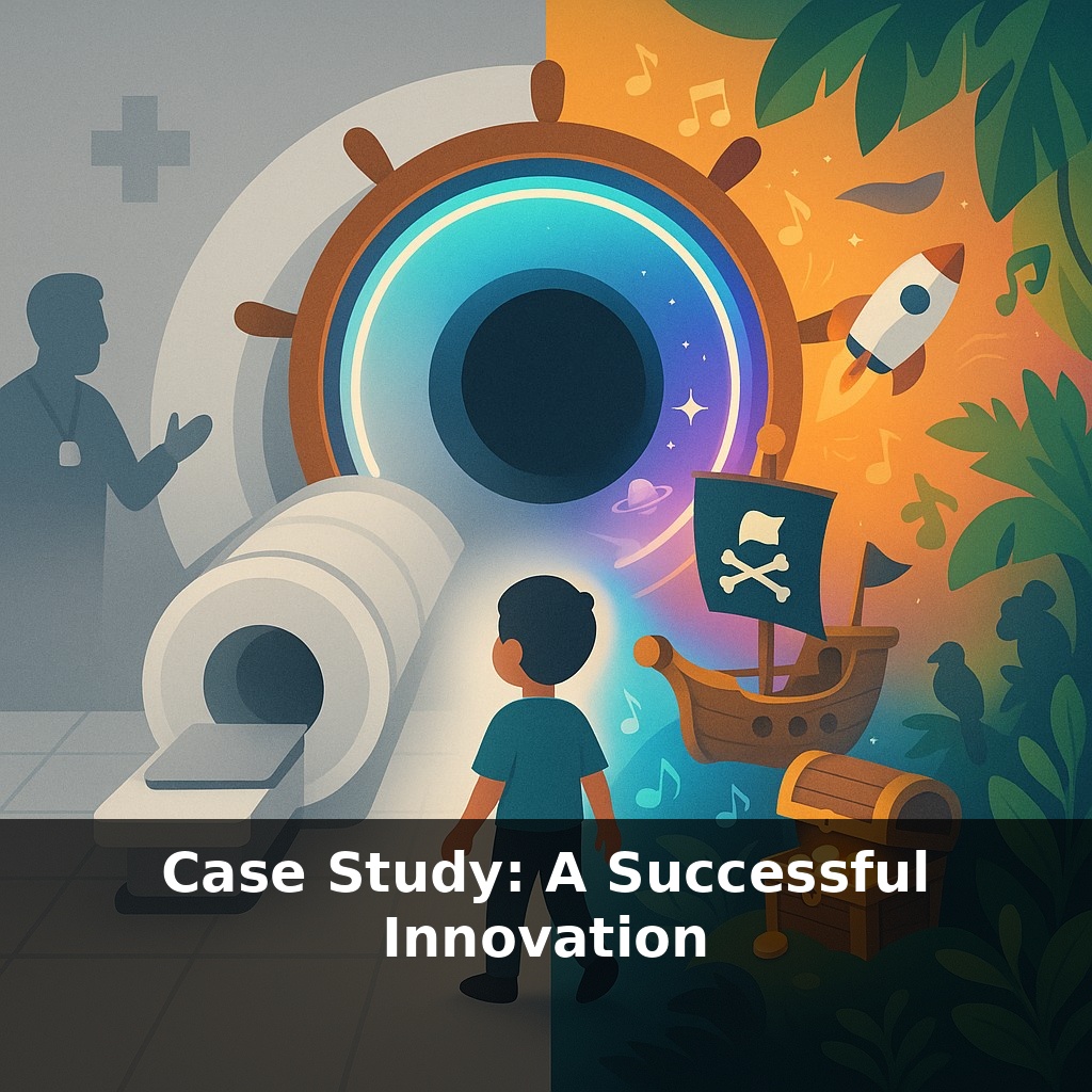
A hospital scans kids faster and earns more money… by adding pirates, spaceships, and jungle sounds to a gray MRI room. Same giant machine, totally different experience. How does “decorating” become a serious innovation strategy instead of a cute side project?
A technologist at GE didn’t set out to become a “theme park designer.” He set out to fix a performance problem: kids were moving too much, scans were being repeated, and sedation was sky‑high. The breakthrough wasn’t a new magnet or faster processor; it was noticing that the scariest part of the MRI wasn’t the scan itself—it was the story children were telling themselves before and during it. In previous sections we explored how environment shapes that story. Now we’ll zoom in on how Design Thinking turned that insight into a repeatable innovation playbook, not a one‑off miracle. We’ll walk through how GE’s team listened to kids and parents, reframed the “engineering” problem as an “experience” problem, prototyped low‑risk changes, and then scaled only what actually worked in the real world. Then we’ll translate each step into moves you can copy in your own projects.
The GE team didn’t start by sketching jungle murals; they started by sitting on tiny plastic chairs in pediatric wards, listening. Children described “the loud donut,” “the monster tube,” “the part where mom has to leave.” Parents talked about guilt, schedules, and costs when scans had to be repeated. Nurses shared workarounds they’d invented on the fly. Each group saw a different MRI. Design Thinking helped stitch those fragmented views into one shared map of the real problem. In this episode, we’ll unpack how that mapping happened—and how you can borrow the same moves for your own projects.
Sedation dropping from ~80 % to 27 % sounds like a clinical miracle, but it came from dozens of unglamorous moves across the five Design Thinking stages—not one big leap.
In the **Empathize** work, teams noticed patterns that clinicians had normalized away: kids going quiet right when the parent stepped out; tiny fists balling up when they saw yellow “caution” stickers; relief when a tech knelt to eye level and explained things as a game instead of a procedure. These details didn’t look like “requirements” in an engineering spec, but they became raw material for the next stage.
In **Define**, the team turned scattered observations into a sharper challenge statement. Instead of “reduce motion artifacts” or “lower sedation,” they crystallized something closer to: “How might we help a child feel brave and in control from the moment they see the scanner to the moment they leave?” That framing pulled in actors who had previously been “background”: child‑life specialists, parents, even facilities staff who controlled lighting and wayfinding.
The **Ideate** stage deliberately separated idea generation from feasibility judgment. Wall‑to‑wall Post‑its captured everything from scripted pirate narratives to parent coaching apps, colored gowns, soundscapes, floor decals, and pre‑visit storybooks. Clinical and regulatory constraints were real—but they came later. Early on, the team asked, “What would delight a 6‑year‑old?” not “What fits our procurement process?”
When they moved to **Prototype**, the first “Adventure” rooms were surprisingly scrappy. Vinyl decals instead of architectural remodels; portable projectors rather than custom ceilings; simple role‑play scripts for techs. Crucially, they prototyped not just physical elements but behaviors: how staff greeted kids, how they explained noise, how they rewarded stillness. A theme only “worked” if staff could perform it on a busy Tuesday.
In **Test**, metrics went beyond sedation rates. They tracked repeat scans, time per appointment, parent comments, even staff satisfaction. Some early ideas died quickly: certain themes confused younger kids; some soundtracks clashed with alarm tones; overly complex scripts slowed throughput. The surviving elements formed pattern libraries that other hospitals could adapt without copying blindly.
Your challenge this week: pick one service you’re involved in—clinic, classroom, internal tool—and run just the Empathize + Define steps. Spend one hour quietly observing real users in context; then write a single “How might we…” question that reframes their struggle as an experience challenge, not a technical one.
Think of the GE MRI project less as “designing a cute room” and more like curating a museum exhibit: every small element—signage, lighting, the path you walk, the text on the wall—quietly shapes what visitors feel and remember. In your world, the “exhibit” might be a check‑in counter, a performance review meeting, or the first ten minutes of a workshop.
Try tracing one complete journey the way the GE team did, but in your own setting: How does someone first hear about the service? What’s the very first physical or digital thing they see? Where are they waiting? Who talks first, and with what words? Where does anxiety spike, and where does relief show up?
Often, the leverage isn’t where the “core work” happens; it sits in the overlooked edges. A confusing email before a meeting, a harsh system error message, or an empty hallway can quietly undo your best “core” solution. The GE story shows that treating those edges as design material can unlock outcomes your main process never could.
If MRI rooms can justify “adventures” in a risk‑averse hospital, where else are we underestimating the value of emotional design? As care moves outside hospitals—into homes, apps, retail clinics—the quiet moments of fear, confusion, or boredom become design material, not background noise. Think of waiting rooms, telehealth lobbies, even billing portals as trailheads: small shifts in tone, sequence, and control can steer people toward healthier behavior without adding new technology at all.
Treat this case as proof that even “fixed” systems can flex. The next frontier is applying the same lens to dull or confusing moments you own: onboarding a colleague, handing off a project, closing a sale. Like rerouting a hiking trail to reveal a better view, small shifts in sequence, language, and control can turn routine paths into memorable journeys.
Here’s your challenge this week: In the next 48 hours, run a “mini–version” of the innovation from the episode by testing it with exactly 3 real users in your own context (e.g., 3 customers, 3 colleagues, or 3 students). Give them the simplest usable version of your idea (like the pilot app screen, lightweight prototype, or stripped‑down service the case study used) and watch how they actually use it for 15 minutes each. Capture one concrete metric the episode emphasized (e.g., completion rate, time saved, or conversion) and one surprising behavior you didn’t anticipate, then adjust one element of your solution based on what you learned and repeat the test with 1 more user.