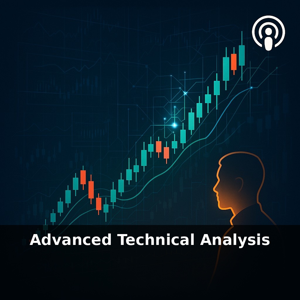
Roughly seven out of ten trades on the New York Stock Exchange are now driven by algorithms. Yet most human traders still stare at charts the way they did decades ago. In this episode, we step onto the algos’ turf and explore how advanced technical analysis really works.
Most traders zoom in on a single chart and hunt for one “perfect” signal. But the pros—and the algorithms competing with them—don’t think in singles; they think in combinations. They layer time frames, indicators, and risk rules until a trade idea either gains weight or collapses under scrutiny.
In this episode, we move past the basic “see pattern, place trade” mindset and into confluence: how price action, volume, volatility, and even crowd behavior can line up to tilt the odds. We’ll look at why the same pattern can be high-probability in one context and a trap in another, and how statistics can keep you honest when a setup “feels” good but the data disagrees.
By the end, you’ll see charts less as static pictures and more as evolving blueprints for where risk and opportunity are concentrating.
Think of this stage as upgrading from reading individual indicators to reading the market’s *grammar*. A single candle or oscillator twitch means little on its own; what matters is how structures connect across minutes, days, and weeks. We’ll bring in pattern statistics, but also ask: *when* during the session did the move occur? *Who* is likely in control—short‑term funds or longer‑horizon players? We’ll also start tying technical setups to catalyst windows like earnings, macro data, or options expiry, where even a textbook pattern can behave very differently once real news hits the tape.
To work like a modern technician, you start by stacking *contexts* before you even think about entries. Begin with the higher time frame: is the weekly trend rising, falling, or compressing into a range? Bulkowski’s work shows that a bull flag, for example, behaves very differently when it appears against a dominant uptrend versus inside a choppy sideways market. You’re not just spotting patterns; you’re grading the *environment* they’re growing in.
Then zoom into the daily and intraday to see how that structure is being “negotiated” in real time. A breakout that forms on a sleepy, low‑volume afternoon ahead of a major economic release is not the same trade as a breakout exploding on above‑average volume right after earnings. Same picture, different story.
Next layer: indicators used as *measuring tools*, not magic signals. Bollinger Bands, for instance, tell you whether price is stretching two standard deviations from its recent mean. An outer‑band touch after a long quiet period (narrow bands) carries more information than the hundredth touch in a wild, news‑driven tape. Likewise, ATR becomes a way to *normalize* risk. Instead of placing stops at arbitrary round numbers, you can step back and ask: “How far does this instrument routinely swing?” A 1.5–2× ATR stop often survives routine noise while still defining a clear “I’m wrong” line.
Advanced traders also think in *clusters* of behavior. A failed breakdown that quickly reclaims a key level, combined with shrinking ATR (volatility compression) and rising relative volume on up days, might signal accumulation by stronger hands. Add sentiment—options skew, short interest, positioning data—and you begin to see where pain and pressure could fuel the next move.
Crucially, every technical edge lives or dies through position sizing. Two traders can read the same setup correctly, but the one who risks 0.5–1% of capital per idea survives the inevitable losing streaks; the one who bets 10% blows up before the probabilities have time to play out.
Watch how this plays out on a real name. Suppose NVIDIA has been grinding higher on the weekly chart, then spends two weeks moving sideways under a clearly defined resistance zone. On the daily, you notice the pullbacks are getting shallower and closing off their lows. Intraday, each dip toward support is bought faster than the last, and downside follow‑through keeps shrinking.
Now overlay Bollinger Bands and ATR, not as “buy/sell” triggers, but as rulers. The bands are tightening while price rides the upper half of the range, hinting at stored energy. ATR has eased from its spike after the last earnings gap, so a 1.5× ATR stop now sits neatly below the recent higher lows, instead of inside the noisy part of the range.
Think of an architect testing how different loads sit on the same foundation: price retests of support, volatility compression, and cleaner reactions to news each add weight to your thesis that buyers can hold this structure—until they can’t.
Algorithms won’t just scan patterns; they’ll start “explaining” them, surfacing why a breakout aligns with macro shifts or options flows. Retail traders may get institutional‑grade dashboards, but edge will migrate from spotting setups to *curating* them—like running an app store, not just coding an app. As tokenized assets trade nonstop, technical triggers may evolve into real‑time risk thermostats, dynamically cooling or heating exposure as conditions flip faster than humans can react.
In the next phase of your learning, treat each chart like a rough city sketch you’ll gradually turn into a navigable map. Add landmarks: how price reacts around news, how indices and sectors move with your stock, where your own emotions spike. Your challenge this week: log these reactions on five names and review how your map evolves.