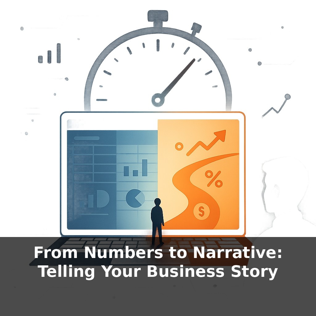
An investor studies your slide for barely 90 seconds… then decides if you’re worth a meeting. In that tiny window, are they seeing a story or just staring at a spreadsheet? In this episode, we dive into how your numbers quietly argue for—or against—your business.
Those 90 seconds aren’t just about “good” or “bad” results; they’re about whether your numbers add up to a journey worth joining. Growth, margin, cash flow—on their own, they’re isolated snapshots. What investors, lenders, and even employees lean in for is how those snapshots connect: what you tried, what happened, what you learned, and what you’ll do next. That’s where financial storytelling lives.
In this episode, we’ll explore how to turn a jumble of metrics into a through‑line that feels as clear as following a map: where you started, the terrain you’ve crossed, and the route ahead. We’ll look at real-world examples of founders who used a few key figures plus sharp context to shift tough conversations—from “why are costs up?” to “how fast can we help you scale this?”
And here’s the twist: your audience doesn’t just want to know *what* happened in your business; they want to know *why it matters now* and *what might happen next*. A flat revenue chart could signal stagnation—or disciplined focus before a big product launch. A dip in cash might reflect chaos—or a deliberate bet on a new growth channel. The difference lives in the story you wrap around the numbers: the choices you made, the risks you took, the trade‑offs you accepted, and the signals you’re watching to decide your next move. That’s what turns data into conviction.
Think in arcs, not slides. Most founders throw metrics at the page chronologically: Q1, Q2, Q3, Q4. But humans don’t actually process time that way. We look for *turning points*: “When did things change? Why? What happened after?”
So start by sketching a three‑act arc, anchored in numbers:
**Act 1 – Then:** What was broken or limited? Choose 2–3 figures that capture the “old reality”: maybe low gross margin, high churn, or tiny average order value. Name the constraint clearly: “We were growing, but every new customer barely covered its own support cost.”
**Act 2 – Now:** What did you do about it? Tie specific decisions to measurable shifts. “We rebuilt onboarding and changed pricing; churn moved from 14% to 6% over three quarters.” This is where qualitative context earns its keep: strategy, timing, and trade‑offs that explain the *shape* of the curve, not just the curve.
**Act 3 – Next:** Where does that trajectory point? Here, projections are less about hockey‑stick charts and more about *links*: “If we hold churn below 7% and maintain current payback periods, we can double revenue without expanding the sales team.” Investors don’t just want big; they want *legible*.
A few practical moves:
1. **Pick your “essential eight.”** Buffett proves you don’t need 40 KPIs. Choose a small, reusable set—say: revenue, gross margin, CAC, payback, churn, LTV, cash runway, and one segment‑specific metric (e.g., occupancy, utilization). Reuse them across decks, board packs, and updates so people build intuition.
2. **Translate spikes into sentences.** Any sharp change on a chart should auto‑generate a one‑line explanation: “Marketing paused during product migration; leads dipped 30%, recovered in six weeks.”
3. **Use colour with intent.** Don’t decorate; guide. One colour for growth levers, one for risk, one for efficiency. That simple palette makes key patterns stick long after the spreadsheet fades.
4. **Narrate decisions, not just outcomes.** “We chose to…” is more powerful than “Revenue was…”. It signals agency and learning, which matter more than perfection.
Done well, your financial pack stops being a museum of past quarters and becomes a live roadmap others can actually follow—and want to travel with you.
A founder I worked with used to send investors dense quarterly packs. Open rates were fine; follow‑up questions were shallow. Then she rebuilt her update around one simple journey: “From fragile to repeatable.” She opened with three numbers—on‑time delivery rate, refund rate, and NPS—plotted across six quarters. Instead of walking through every line item, she told the story of how operational fixes, not marketing spend, drove the inflection. Same data, different framing; suddenly investors were asking about expansion plans, not survival odds.
Treat your updates like a series, not isolated episodes. Each instalment should pick up threads from the last: “Last time we were testing X; here’s what the numbers say; here’s the new hypothesis we’re funding.” Over time, your stakeholders stop judging you on a single chart and start following your judgment. That shift—from “prove this month” to “show your process”—is where capital, talent, and partners begin to lean in for the long haul.
As AI tools start drafting “good enough” updates, your edge becomes *point of view*: why these moves now, in this market, with this team. Think less like a reporter reciting figures and more like an editor curating meaning. Coming regulation will also widen the frame—climate, people, and community outcomes will sit alongside profit, like new instruments added to a familiar band. Those who can orchestrate this fuller score will attract partners who care how returns are made, not just how big they are.
Your story doesn’t end at “the numbers look good.” It matures when you show how those numbers will guide the next hire, the next product bet, the next market entry. Think of each report as a draft chapter: share unresolved questions, alternative paths, and small bets you’re running. That unfinished edge is what invites others to help you write the sequel.
Before next week, ask yourself: 1) “If I had to explain last month’s key metric (like revenue per customer or churn rate) as a 3-sentence story to a smart 10-year-old, what would the ‘main character,’ the ‘obstacle,’ and the ‘turning point’ be?” 2) “Looking at one recent data point that surprised me, what is the most human reason behind it—what was my customer likely feeling, fearing, or hoping for in that moment?” 3) “If I turned my latest dashboard into a 3-slide ‘movie trailer’ for my business, which specific chart would I open with, which real customer moment would I highlight in the middle, and what concrete decision or change would I end the story with?”