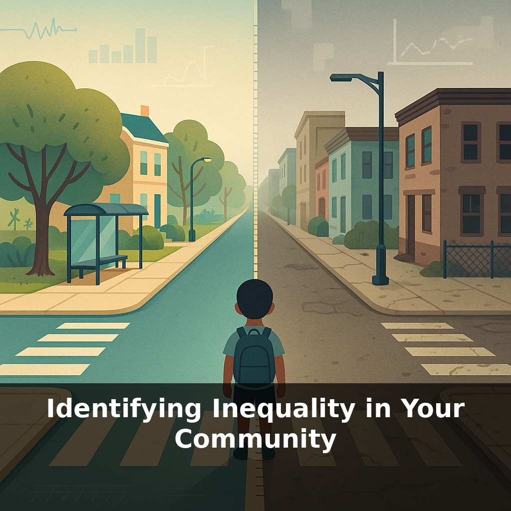
In one U.S. city block, a child’s life expectancy can drop almost twenty years by crossing a single street. Same town, same mayor, same weather—totally different futures. Today, we’re walking that street together and asking: how unequal is the ground under your own feet?
You don’t need a PhD or a city budget to start noticing how uneven your community really is—you just need to learn what to look for. Start with things your daily routine already touches: the houses on your commute, the bus stops you pass, the schools you drive by, the grocery options near your home versus across town. Treat your city like a layered map: one layer for income, another for housing quality, another for access to basics like fresh food or safe parks. When those layers stack up in the same places, they reveal pressure points where disadvantage compounds. Two streets can have the same average income on paper, yet differ sharply in eviction notices, asthma rates, or broken sidewalks. That’s why we’ll move beyond broad labels and practice reading the fine print of where opportunity clusters—and where it’s been quietly fenced off.
Now we’ll switch from noticing to actually measuring. Think of your community as a dashboard with many gauges, not just a single “average income” dial. Some gauges are numbers you can pull from public sites—census income by tract, rent levels, transit access, school funding. Others are lived signals: boarded-up shops, crowded bus stops, missing curb ramps, closed clinics. None mean much alone, but patterns emerge when you compare them side by side, block by block. Our goal is to assemble just enough of these pieces that invisible lines in your town start to show up in sharp relief.
Think of this step as learning to “zoom” your lens. Citywide numbers tell you one story; block-level details can tell you the opposite. The key move is going smaller and sharper: instead of “my city’s median income is X,” you ask, “what does that look like on *this* bus route, *this* school zone, *this* apartment complex?”
Start with income, but don’t stop there. Pull census data at the smallest geography available—often “tracts” or “block groups.” Note where the top 20% of earners cluster and where incomes are lowest. Then layer in rent levels, homeownership rates, and vacancy rates. Places with low incomes and rapidly rising rents are often under quiet stress, even before visible displacement starts.
Next, trace how people move. Download a transit map or open a routing app. Mark which neighborhoods have frequent buses or trains and which are “transit shadows” where trips take twice as long. Compare that with where jobs, clinics, and colleges are located. A neighborhood can look fine on paper yet be functionally cut off if every essential destination requires a car most residents don’t have.
Education offers another sharp lens. Look up per-pupil spending or PTA fundraising by school, not by district. Track which schools have full-time nurses, counselors, art and music, advanced courses. Then look at who those students are by race, language, and disability status. Separate averages for each group; gaps often widen when you disaggregate.
Health indicators work the same way. Instead of citywide asthma or diabetes rates, search for zip-code or tract-level data. Overlay that with truck routes, industrial zones, and tree cover. You’re not proving causation; you’re watching for suspicious overlaps that residents may already feel in their bodies.
Finally, add what the spreadsheets can’t see: whose complaints about potholes get fixed fastest, who has neighborhood associations with political pull, where new amenities consistently land. These “soft signals” of civic power often run parallel to the hard numbers.
Like debugging a complex piece of software, the point isn’t to stare at one line of code; it’s to step through the whole system, noticing where it behaves differently for different users. The more precisely you can say “inequality looks like *this*, in *this* place, for *these* people,” the closer you are to changing it.
Think about two playgrounds in the same city. In one, the rubber surface is new, swings are unbroken, shade trees are full, and parents relax on benches. In the other, the ground is cracked asphalt, one swing hangs lopsided, there’s no shade, and a busy road runs right along the fence. If you only knew the “average park quality” for the city, you’d miss how differently kids are actually growing up.
Or take grocery trips. On one side of town, someone can walk five minutes to a store with fresh produce and affordable basics. Across town, a neighbor takes two buses to reach a supermarket, so they rely on a corner shop with mostly packaged food. Their food budgets might be similar on paper; their real choices are not.
You can also compare how long it takes different residents to handle the same errand: picking up a prescription, reaching a job center, or finding a safe place to exercise. Those time costs quietly stack, revealing whose daily life runs on “easy mode” and whose feels like a constant uphill climb.
A new twist is coming: as cities adopt “real-time equity dashboards,” your neighborhood’s numbers may start influencing everything from insurance rates to which companies move in. That can attract investment—or quietly justify neglect. Your challenge this week: note every place where you must “opt in” to be counted—a survey, app, meeting, form. Ask: who’s missing here, and what decisions might be made without their data or voice?
Now, try swapping lenses with someone whose routine you rarely see: a night‑shift worker, a wheelchair user, a teenager without a car. Walk or map their likely routes. Where do things suddenly get harder—stairs, long detours, dead phone zones? Those “snags” are clues to where your town still runs on default settings that not everyone can use.
Start with this tiny habit: When you pass a school, grocery store, or bus stop in your neighborhood, pause and ask yourself, “Who’s missing here?” and say your answer out loud. Then add one more question: “What would make this place feel more fair for them?” and say just one concrete change (like “a ramp,” “translation in Spanish,” or “later bus hours”). If you’re walking with someone, simply ask them those two questions too and listen to their answer before you keep going.