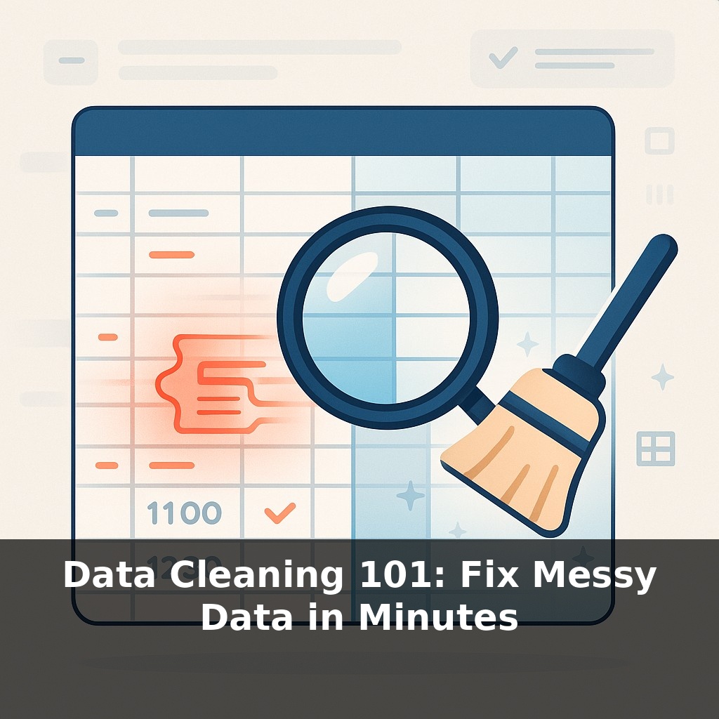
Most “data disasters” don’t start with bad algorithms—they start with a tiny typo in a spreadsheet. One wrong date, one extra space, and suddenly your sales report is lying to you. Today, we’re going straight to the source: the small, messy errors that quietly wreck decisions.
If tiny glitches can warp a report, the real shock is how often they go unnoticed. IBM once estimated bad data cost U.S. businesses trillions of dollars in a single year—and that was before data exploded to today’s scale. The problem isn’t that tools are missing; it’s that most people don’t know how far the tools they already have can take them. Buried inside Excel and Google Sheets are features that quietly tackle the boring, repetitive parts of cleanup in seconds. Think of cells with odd spacing, mismatched capitalization, or strange values that don’t fit the rest of the column. Instead of hunting them one by one, you can let the software surface patterns, highlight outliers, and standardize entries. In this episode, we’ll turn those “hidden” buttons into a fast, practical routine you can run on almost any messy file you touch.
Here’s the twist: the messiest files often *look* fine at first glance. Columns line up, totals calculate, charts render—yet underneath, quiet inconsistencies are changing the story. A “January” entered as text won’t sort correctly next to real dates. A product name with a hidden character won’t match your lookup table. A few rogue entries can tilt an average or break a trend line, and the spreadsheet won’t raise its hand to warn you. Instead of trusting that “no error message” means “no problem,” we’ll treat every new dataset like a hand-me-down jacket: try it on, test the seams, then tailor it before wearing it in public.
Think of this step as running a quiet investigation, not doing janitorial work. You’re looking for three things: where values disagree, where structure is broken, and where logic doesn’t add up.
Start with *disagreement*. Scan column by column and ask: “How many ways are people saying the same thing?” You might spot “NY”, “New York”, and “NewYork” in one place, or “Cancelled” and “Canceled” in another. Sorting a column is still one of the fastest lenses you have: values that don’t belong together cluster in odd pockets. Filters help too—especially when you filter by condition, like “Text contains ‘-’” or “Number is greater than 10,000”.
Next, check the *structure*. That’s the shape of the data, not its meaning. Dates should behave like dates: they should sort chronologically, support min/max, and allow you to change the format without breaking. Numbers should respond to sum and average without throwing errors. If a column refuses to sort properly or totals look suspiciously low or high, you’re dealing with a structural issue—often mixed data types hiding in the same field.
Then move to *logic*. This is where your knowledge of the business becomes more important than your knowledge of formulas. A birth date in the future? A discount bigger than the price? A subscription end date earlier than its start date? These aren’t “spreadsheet problems”; they’re contradictions in the story your data is telling. Simple helper columns with rules like “End >= Start” or “Age between 0 and 110” surface these contradictions fast.
Now layer in automation, but carefully. Tools that fill patterns or clean formats can multiply good decisions—or spread a subtle mistake across thousands of rows. The safest habit is to test on a small slice first, confirm a few edge cases, then apply to the full sheet. Treat every automated transform as a hypothesis: “If this rule is correct, the result should look like X.” If reality disagrees, adjust the rule, not the data.
Over time, this turns into a repeatable checklist: scan for disagreement, test structure, probe logic, then automate the fixes you trust. It’s less about perfection and more about building enough confidence that when a number changes, you know it reflects the real world, not a hidden glitch.
A quick way to see this in action is to grab a real file you half-trust: maybe last quarter’s lead list or a download from your CRM. Sort the “Country” column and notice how odd spellings often bunch together near the top or bottom of the list. You’ll see “US”, “U.S.”, “USA”, “United States”, and maybe a stray “Untied States” hiding in there. Grouping these side by side lets you quickly decide which version is “official” for your team, then align everything else to match. Do the same with a “Status” column: once sorted, strange one-offs like “In Progess” or “Followup later” pop out against consistent labels such as “In Progress” or “Pending”. Treat these oddballs as clues: was this a one-time manual entry, or does it reflect a real stage you never formalized? Cleaning isn’t just scrubbing; it’s a chance to discover how people actually use your systems—and whether your dropdowns and categories reflect reality as closely as your documentation claims.
Soon, cleaning won’t just mean fixing what went wrong; it’ll mean teaching your tools how you think. As spreadsheet assistants learn from your approvals and corrections, they’ll start proposing fixes like a junior analyst who has watched you work for months. The interesting part: you’ll also surface hidden rules in your organization—unspoken thresholds, exceptions, and naming habits—that can be documented, shared, and eventually enforced across teams, not just in one file.
Treat each new dataset like a fresh weather report: before trusting the forecast, check the instruments. Over time you’ll notice quirky “microclimates” in how different teams enter and interpret information. The more often you tune those differences, the more your dashboards stop being pretty charts and start behaving like a reliable early‑warning system.
To go deeper, here are 3 next steps: 1) Download a sample messy dataset from Kaggle’s “Dirty Data” or “Hotel Booking Demand” datasets and run it through OpenRefine, practicing column splitting, clustering for deduplication, and bulk transforms just like in the episode’s examples. 2) Work through Chapters 3–5 of “Data Wrangling with pandas” (free online tutorials and docs) using your own CSV exports from Stripe, Shopify, or Google Analytics to practice handling missing values, normalizing date formats, and standardizing category labels. 3) Install and explore the “great_expectations” Python library or Soda Core, and set up 3 concrete data quality checks mentioned in the episode—such as “no nulls in primary keys,” “valid date ranges,” and “allowed values for status fields”—on one real data pipeline you use at work.