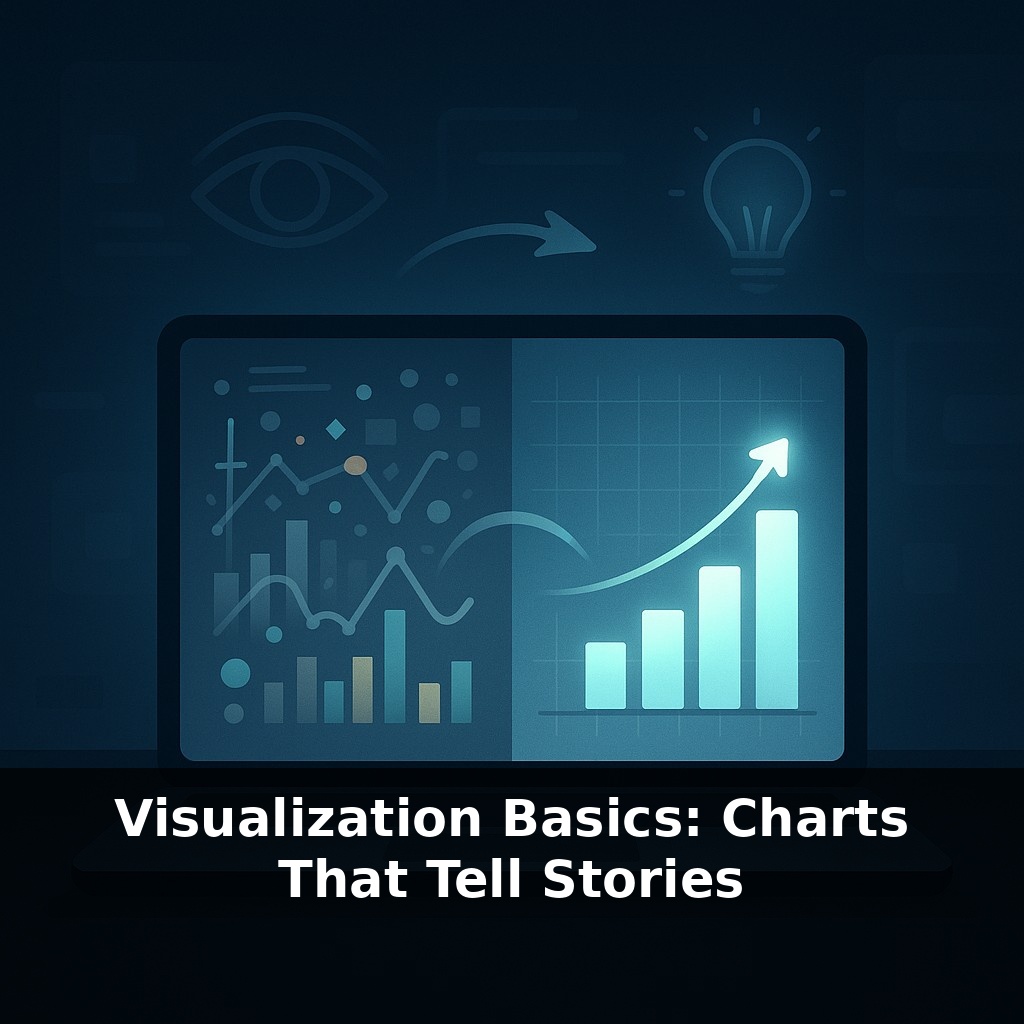
In the time it takes to blink, most of us can understand a visual scene. In less than a second, most people can grasp a visual—a chart flashes on the screen and everyone nods in agreement, while another leaves them puzzled. Same data, different impact. This episode reveals why some charts communicate effectively while others struggle.
You’ve seen how quickly our brains can latch onto a good chart. Now we’re going to zoom in on *why* some visuals feel instantly “obvious” while others feel like decoding a puzzle. The difference usually isn’t the dataset—it’s three quiet decisions the creator made (or skipped): how the data is encoded, how much visual noise is left on the slide, and whether the chart is framed around a single, sharp point.
Think about the last status meeting you sat through: one slide made the room lean forward, another made people reach for email. Same audience, same time limit, totally different impact. In this episode, we’ll break down the small design choices that separate those two outcomes and show how to make tools like Excel work *with* your story instead of against it, so your next chart doesn’t just display numbers—it directs attention.
Think of this episode as shifting from “why charts matter” to “how to make them do real work for you.” We’ll move from theory into the small, practical choices that separate a chart you glance at from one you *trust*. That means asking different questions: not “what can I plot?” but “what decision should this chart move forward?” We’ll look at how Excel’s many chart options quietly nudge you toward certain stories, how color choices can include or exclude part of your audience, and how to make a single visual carry its own headline without you narrating every pixel.
Here’s where we get tactical. When you open Excel, it quietly pushes you toward certain defaults: blue columns, grey gridlines, maybe a 3‑D option glowing temptingly in the menu. Treat those as suggestions, not instructions. The real work happens *after* the chart appears.
Start by asking: “What kind of pattern am I actually hunting for?” If you care about comparing categories at one moment in time (regions, product lines, teams), a bar or column chart is almost always cleaner than a pie. Pies force people to compare angles and areas—skills we’re surprisingly bad at—while bars let us compare lengths along a common baseline. If you’re tracking change over time, switch to a line. If you’re checking whether two numeric variables move together (ad spend vs. signups, load time vs. conversion), reach for a scatter plot. Those four types cover most analytical questions you’ll face.
Next, treat the axes as deliberate choices, not background furniture. If you’re showing differences that matter operationally—say defect rates nudging from 1.2% to 1.8%—a zoomed‑in y‑axis can be honest and useful, *as long as* it’s clearly labeled and the truncation is obvious. But if you’re communicating risk or growth to a broad audience, anchoring at zero helps prevent drama-by-formatting. Ask: “Will this axis make the change look bigger, smaller, or about right for the story I need to tell?”
Color is your second language. Start from restraint: pick one neutral color for everything, then use a single accent color only where you want eyes to land—this month vs. last month, target vs. actual, one outlier vs. the pack. And remember color‑blindness: avoid relying solely on red vs. green; pair hue with another cue like position, labels, or patterns so the point still lands if the colors blur.
Finally, think in layers. First layer: basic chart that faithfully encodes the data. Second layer: remove anything that doesn’t earn its keep—extra gridlines, 3‑D depth, busy backgrounds. Third layer: add minimal scaffolding that makes interpretation faster—direct data labels on the key points, a reference line for target, a short note next to the anomaly instead of a dense legend. The goal isn’t a naked chart; it’s a chart where every remaining element has a job.
Consider a few concrete scenarios. You’re analyzing churn by customer segment: a simple horizontal bar chart lets support, marketing, and finance all see at a glance which segment is bleeding the most, especially if you sort bars from highest to lowest. No speech needed; the order does the talking. Now switch to operations: you’re tracking defect rates hourly across a day. A line chart with a subtle band for “acceptable range” turns random wiggles into a clear signal: “we were out of bounds here, here, and here.” The visual band quietly encodes the standard without a wall of footnotes.
Think about experiments too. A product manager testing three signup flows might show completion rate vs. time-to-complete in a scatter plot, one point per variant. Suddenly, “fast but leaky” versus “slow but reliable” becomes a shape on the page, not a debate in the room. In medicine, clinicians often review run charts of infection rates; a single sudden spike, annotated directly on the point with “protocol change,” can redirect a whole quality-improvement meeting.
As tools shift toward voice and natural‑language commands, you’ll spend less time wrestling menus and more time choosing *which* question deserves a chart at all. That nudges you from “maker of visuals” to “editor of stories.” Expect dashboards to feel more like living conversations: filters that adapt to who’s looking, annotations that update as context shifts, and alerts that surface only when the pattern on screen truly breaks its usual rhythm.
Your challenge this week: take one chart you already use and rebuild it from scratch with a single focus—making the next decision in that workflow faster for a specific person. Ask them how they read it, what they ignore, and what they still have to go hunting for. Use that feedback to remove one element, add one clarifying cue, and tighten the title until it reads like a short, testable claim rather than a label.
Treat each new chart as a tiny lab: you’re running an experiment in how quickly a mind can “click” into the pattern. Some will fail, like rough drafts of a sketch, and that’s useful data. Over time, your slides start to feel less like reports and more like well‑lit rooms: people walk in, look around once, and know exactly where to step next.
To go deeper, here are 3 next steps: 1) Recreate one chart from the episode using Datawrapper or Flourish (both are free) with a small real dataset from Our World in Data, focusing on choosing the most story‑driven chart type (e.g., line for trends, bar for comparisons) instead of the default. 2) Skim the “Data Visualization: A Practical Introduction” free chapters by Kieran Healy (datavizbook.org) and apply one principle—like reducing chartjunk—to improve a slide or dashboard you already use. 3) Watch one short section of Cole Nussbaumer Knaflic’s Storytelling with Data YouTube channel and then revise the title and annotation of one of your existing charts so it clearly spells out the “so what” in plain language.