“Most people trust their gut more than their data—yet a few simple averages and comparisons often beat instinct. You’re checking bank alerts, fitness stats, and work dashboards anyway. The hidden question is: what quiet pattern is sitting there, that you’ve never actually looked for?”
Florence Nightingale didn’t have Python, dashboards, or a statistics degree—yet by simply counting causes of death and comparing them over time, she helped cut mortality in military hospitals from 42% to 2%. Her power move wasn’t complex math; it was noticing which numbers kept repeating, which suddenly changed, and what that said about reality.
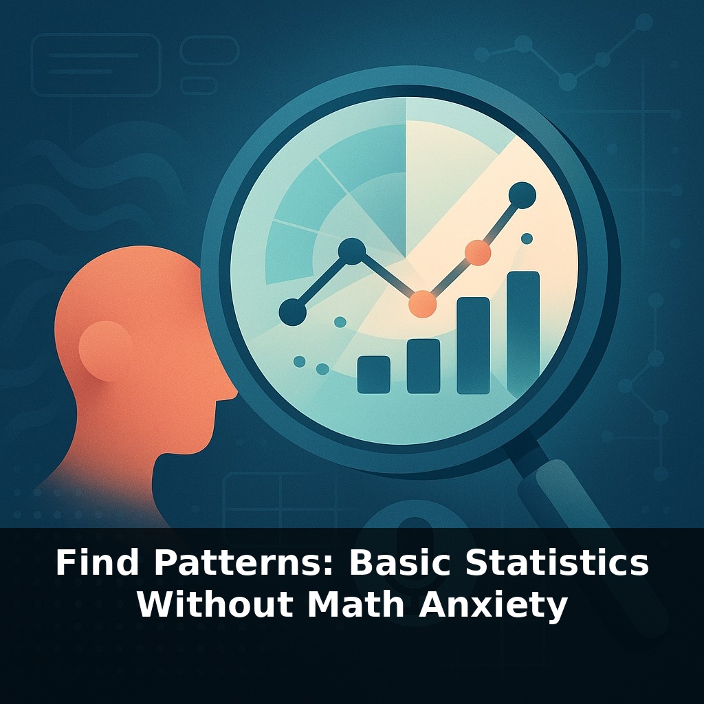
That’s the level we’re aiming for in this series: not textbook statistics, but practical pattern-spotting you can use on your own messy lists—expenses, workouts, sales, study hours, even sleep logs. Modern spreadsheets quietly handle the calculations for you; your real job is to ask, “Is this typical for me? Is something drifting? Is there a connection I’ve been missing?”
In this episode, we’ll turn basic tools—mean, median, mode, range, spread, and simple relationships—into a mini radar for your everyday decisions.
Some of your most important numbers already live in spreadsheets you barely look at: exportable bank statements, workout logs, gradebooks, sales lists, sign‑up sheets. They feel like static tables, but they’re really timelines and stories waiting to be read. Instead of treating them as receipts from the past, we’ll treat them as a live lab for your decisions: which habits are paying off, which costs are creeping up, which days keep breaking the pattern. With basic stats on top, the goal isn’t to become “a numbers person,” but to make your lists argue back when your intuition is slightly wrong.
Open your banking app or sales sheet and scroll through a month: you’ll see numbers jumping around, but not much else. The shift happens when you stop staring line‑by‑line and start asking, “What’s *typical*, what’s *weird*, and what’s *moving*?”
That’s where basic stats become a lens instead of homework.
First, use your spreadsheet to separate “normal” from “noise.” In Excel or Sheets, AVERAGE + STDEV.S turns a pile of entries into a rough comfort zone. Values that land far outside that band aren’t just big or small; they’re “out of character.” A single huge restaurant bill, a day with almost no steps, a sales spike on one random Tuesday—those become leads in your investigation, not just curiosities.
Next, stop looking at everything all at once. Patterns usually live in *slices* of your data: - Weekdays vs weekends - Mornings vs evenings - One client segment vs another
Pivot Tables are built for this. Drop “Day of Week” into rows, your metric into values, and suddenly you’re not asking, “How are my expenses?” but “How are my *Saturdays*?” That’s a different, much sharper, question.
Then, look for drift. A single average hides whether things are creeping up or down. Add a “Month” or “Week Number” column, build a Pivot Table, and watch how the typical value changes over time. Is your “normal” grocery spend inching upward? Is your usual study time sliding? Slow drifts rarely shout; they whisper through small changes in those month‑by‑month summaries.
Now, check what tends to travel together. CORREL doesn’t tell you *why* two things move in sync, only that they do. But once you spot that your longest workdays align with worst sleep, or that email volume and refunds rise together, you suddenly have better questions: “What’s tying these together? Do I need a new boundary, a new process, or just a different schedule?”
Think of it like reading a medical chart: you’re not trying to be the surgeon, just the person who can say, “This vital sign is stable, that one is spiking, and those two always worsen together.”
Your challenge this week: pick *one* real dataset you already have (bank export, workout log, sales list). In a spreadsheet, do three things: (1) calculate the average and standard deviation to flag anything unusually high or low; (2) create a simple Pivot Table that splits the data by day of week or month; (3) run one CORREL between two columns you *suspect* might move together. Don’t try to fix anything yet—just write down the three most surprising patterns you notice.
Think of your spreadsheet as a weather report for your life. You’re not forecasting decades ahead—you’re just checking: is this a normal season, a heatwave, or the start of a storm? When you combine a few columns, you start seeing micro‑climates you didn’t know you had.
For example, log two weeks of focus time and caffeine intake. Use your sheet to label entries as “high,” “medium,” or “low” focus based on your usual level. Now look for clusters: do “very low focus” days pile up after certain meeting types, not just after late nights? That’s a different culprit than you might expect.
Or take a class gradebook: instead of staring at scores, add a column for “hours studied” and another for “type of practice” (reading, practice questions, teaching someone else). Now sort and filter: which combination quietly gives you the steadiest results, not just the highest single score?
Your goal isn’t to chase every outlier; it’s to notice which conditions tend to produce the kind of day you actually want more of.
Soon, you won’t just format cells—you’ll *converse* with them. Instead of tinkering with filters, you’ll ask, “Which clients quietly grew fastest after we changed pricing?” and get a guided tour of the answer. As tools surface subtle shifts and odd pairings for you, your role tilts from human calculator to editor: deciding which stories in the numbers deserve a sequel, and which are just one‑off plot twists you can safely ignore.
As you keep poking at your own numbers, you’ll notice they start behaving less like a wall of receipts and more like a playlist: some tracks repeat, some clash, some quietly set the mood. The more you reshuffle, group, and compare, the easier it becomes to skip the noise, replay the useful patterns, and remix small changes into real-world upgrades.
Start with this tiny habit: When you open an app that shows numbers you already check (like your step counter, sleep tracker, or bank balance), whisper to yourself, “What’s the usual number here?” and mentally compare today’s number to that “usual.” If it feels higher or lower than normal, just label it in your head as “above my usual” or “below my usual”—no calculators, no formulas. This super-small comparison is you practicing averages and variation in real life, without any math anxiety.