Systems experts say most big corporate change efforts quietly fail—not because people are lazy, but because leaders misread how the system actually works. Now jump to you, on the verge of a big decision, with no map—just gut feel. How confident are you, really?
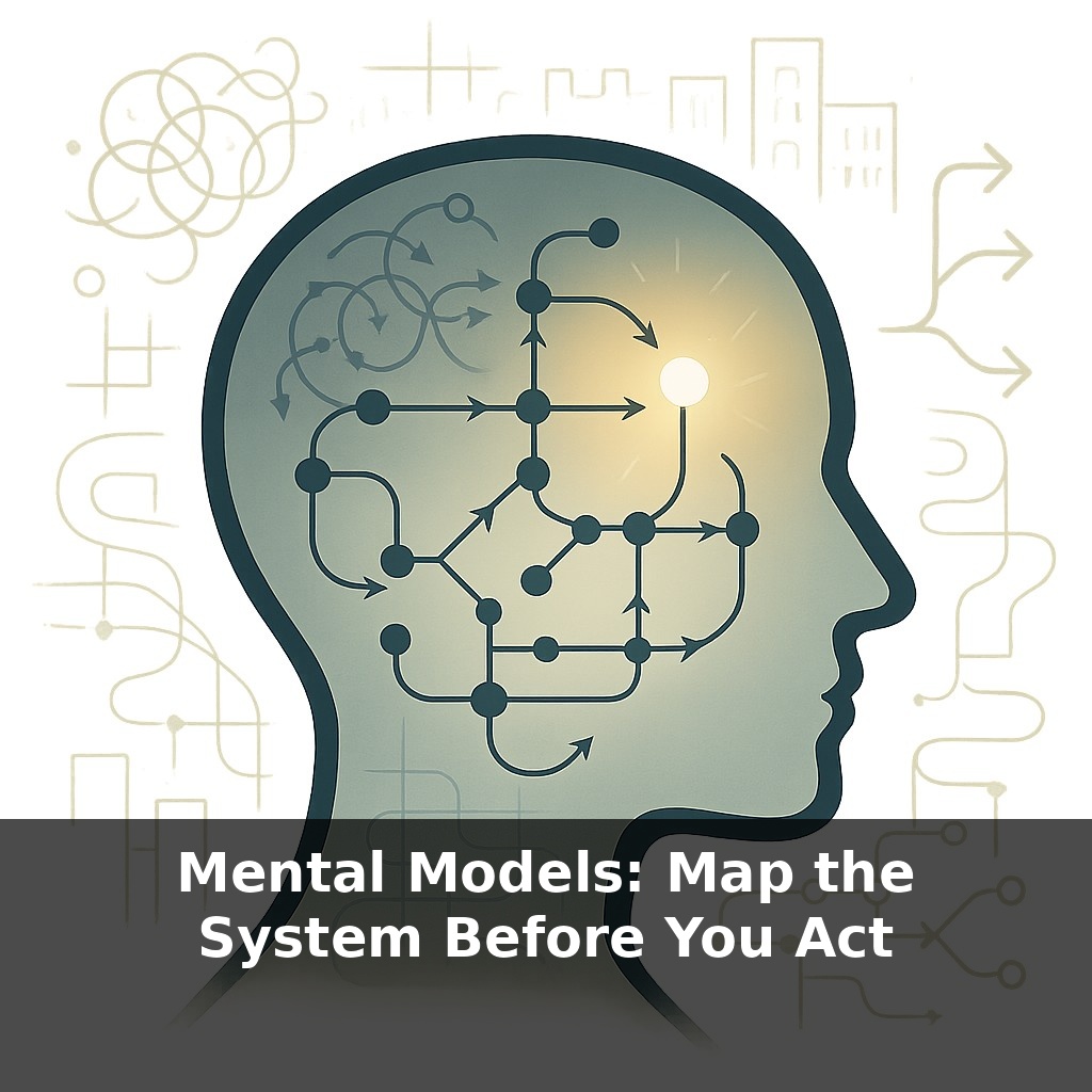
Most people treat complex situations like a messy to‑do list: fix this complaint, launch that feature, hire one more person. But high‑performers pause and do something different first—they sketch a *map* of what’s really interacting beneath the surface. Not a perfect diagram, just a rough outline of “if this moves, what else moves with it?”
Here’s the twist: your brain isn’t built to juggle more than a handful of moving parts at once. Past four or five interacting factors, you start dropping pieces, overrating some effects and ignoring others. That’s when “obvious” solutions quietly backfire.
So instead of pushing harder inside the mess, they step outside it. They draw boxes and arrows. They ask, “What’s feeding what? Where are things stuck? If I touch this, what chain reaction do I start?” Only then do they choose where to intervene.
Instead of searching for “the right move,” high‑performers first ask a quieter question: *“What am I actually dealing with here?”* That’s where mental models come in. They don’t try to mirror reality in full detail; they strip it down to the few elements that really drive what you’re seeing—who influences whom, where information or resources get stuck, where delays or bottlenecks sit. Think less “beautiful diagram,” more “rough sketch on a napkin.” The power isn’t in neatness, it’s in making hidden structure visible enough that you can test, refine and—even better—share it with others before you commit.
When researchers watch experts in action—elite firefighters, air‑traffic controllers, top surgeons—they see a similar pattern: before committing, the expert quietly runs a *simulation* in their head. They’re not just “being careful”; they’re using a mental model as a test bench: “If I do X, this should happen; if that doesn’t show up quickly, my model is wrong.”
That’s the real payoff: a model isn’t just a picture, it’s a *prediction machine*.
You can make this concrete. Start with a specific outcome you care about—say, reducing customer churn, getting a policy passed, or fixing chronic team burnout. Then, instead of jumping to solutions, ask three model‑building questions:
1. **What are the key stocks?** These are the “levels” that can accumulate or drain: number of active users, cash on hand, staff energy, public trust. They change slowly and explain why effects lag behind causes.
2. **What flows change those stocks?** Sign‑ups and cancellations change active users. New hires and resignations change team capacity. Public praise and scandals change trust. Flows are where you actually intervene.
3. **What feedback loops are reinforcing or balancing things?** Reinforcing: more users → more word‑of‑mouth → more users. Balancing: more workload → more burnout → more resignations → *less* capacity to take on work, which eventually forces cuts.
This is exactly how Toyota’s value‑stream maps expose wasted motion, or how NASA’s simulations surface unlikely but catastrophic interactions. They’re not “thinking harder”; they’re externalising assumptions so conflicts, gaps and circular causality become obvious.
One useful rule: if your diagram fits comfortably in your head, it’s probably too simple. Once you’re tracking 8, 10, 15 elements, you’ve moved beyond what working memory can reliably handle. That’s where diagrams, spreadsheets, and whiteboards start doing cognitive heavy lifting for you.
A mental model is like a personal budgeting app: you don’t list every coffee, you track the few categories that genuinely drive your financial trajectory, then adjust as you learn where money actually goes.
Precision isn’t the goal at first. *Usefulness* is. A “good enough” map that predicts roughly what will happen beats a beautiful diagram that surprises you every time reality hits it.
You don’t need a billion‑dollar lab to do this. Take a very ordinary mess: you feel “constantly behind” at work. Instead of blaming willpower, sketch what’s actually feeding that feeling. Maybe you notice three elements: incoming requests, your available focus time, and how often you say yes. Add one more: how guilt or anxiety pushes you to accept even more. That’s already a system map.
In a startup, you might map why launches keep slipping. Not “people are bad at planning,” but: shifting priorities, surprise bugs, unclear ownership, and last‑minute stakeholder requests. Draw who triggers what: when a big client asks for a tweak, who gets interrupted, which work gets paused, how that delay ripples to marketing and support.
On a personal level, you could trace why you keep skipping the gym. You see late‑night scrolling, low sleep, morning sluggishness, and then “I’ll go tomorrow.” Once it’s on paper, you can ask, “If I only change one arrow this week, which one?”
Your challenge this week: before you act on any recurring frustration—work, home, or health—stop and sketch a five‑minute map of what’s feeding it. No fancy tools: just a blank page and a pen.
Pick *one* repeating issue that keeps draining your time or energy. At the top of the page, write the outcome you dislike (“never finish deep work,” “weekends feel rushed,” “team standups run over”).
Then, instead of listing tasks, draw 5–10 bubbles for factors that seem to matter: specific people, policies, habits, timings, metrics. Connect them with arrows only where you *suspect* influence, and label the arrows with verbs: “delays,” “amplifies,” “blocks,” “creates pressure on.”
Now do three passes: 1) First pass: add at least one delay (“later,” “next day,” “end of month”). 2) Second pass: circle any small element that, if changed, would hit several arrows. 3) Third pass: star any loop where A eventually pushes back on A (a feedback loop).
For the rest of the week, keep this map visible. Each time the problem shows up, update just one arrow or bubble based on what actually happened. End of the week, don’t ask “Did I fix it?” Ask: “Does my map explain reality better than it did seven days ago?”
In a decade, sketching cause‑and‑effect will feel less like a niche skill and more like reading a spreadsheet. Kids may grow up “pinching and dragging” living diagrams of city traffic, school policies, even their own sleep. Offices could treat shared maps like version‑controlled code: branches for bold ideas, pull requests for policy tweaks. As AI tools highlight fragile links and blind spots, your advantage won’t be seeing the map—it’ll be asking sharper “what if?” questions about how to redraw it.
Treat this like learning a new language: clumsy at first, then oddly addictive. Soon you’ll catch yourself sketching quick diagrams before tense talks, big purchases, even weekend plans. The real shift isn’t the drawing—it’s the habit of asking, “What’s connected to this?” That question quietly upgrades everyday choices into small, deliberate experiments.
Start with this tiny habit: When you catch yourself about to “fix” a problem at work or home, pause and quickly name just **two other parts of the system** involved (for example: “my calendar” and “my manager’s expectations,” or “bedtime routine” and “screen time”). Then, instead of acting, ask out loud, “If I push here, where might things push back?” and imagine just **one** possible unintended consequence. If it still feels right, make a **1% tweak**—like moving one meeting, changing one rule, or adjusting one step in the routine—rather than overhauling the whole system.