Netflix says most of what we watch is chosen by algorithms, not us. You open an app, and before you think, the AI has. One tap feels helpful, ten taps starts to feel creepy. In that gap between delight and discomfort—that’s where AI-driven design quietly decides your day.
Some days, the tech gets it eerily right: the perfect song for your focus sprint, an email reply drafted before your coffee cools. Other days, it suggests a job you’d never take, autocorrects your name into nonsense, or “personalises” a feed that feels nothing like you. That whiplash isn’t random—it’s a design problem long before it’s a math problem.
Behind every smooth AI moment is a team deciding what “helpful” really means, how much power to hand over, and when to stay out of your way. They’re not just tuning models; they’re shaping tiny negotiations with your attention, your time, even your sense of agency.
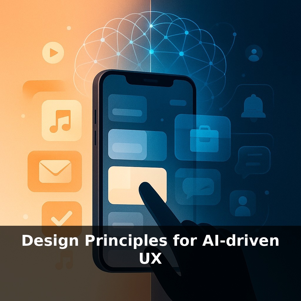
This series is about those decisions: five design principles that separate AI that quietly amplifies you from AI that quietly uses you. We’ll test them against tools you already use—and some you’re building.
In the next few minutes, we’ll zoom in on something deceptively simple: usefulness. Not “cool demo” useful, but “you’d miss it if it vanished tomorrow” useful. Netflix quietly proves this: when 80% of viewing comes from recommendations, the line between browsing and watching has been redesigned. Gmail’s Smart Compose does the same for writing, trimming billions of keystrokes so you focus on ideas, not typing. These tools don’t just work; they earn their place in your routine, the way a well-placed shortcut reshapes how you move through a city.
Usefulness in AI isn’t just “does it work?”—it’s “does this earn a permanent spot in someone’s mental toolbox?” That bar is getting much higher. Gartner expects 70% of design teams to use AI assistants in just a couple of years, which means most workflows will soon have some kind of “smart” layer. When everything is “intelligent,” the only things that feel valuable are the ones that reduce real friction better than any simple rules engine could.
A practical way to test this: if you could replace your AI feature with three dropdowns and a filter bar and users wouldn’t really care, you probably don’t have an AI problem—you have an interaction design problem. AI should step in where rules crack: messy intent, conflicting goals, changing context, and patterns too complex for a human to keep in their head.
Think about how you decide whether to keep a new productivity tool: you forgive early quirks if, over time, it seems to “get you.” That’s the quiet contract AI products live or die on: they must improve with use, not just impress at signup. Netflix and Gmail show this at scale, but the pattern applies to a tiny internal dashboard too. Usefulness is not one launch moment; it’s an evolving curve.
That curve starts with choosing the right problem. “Add AI” is a terrible requirement. “Reduce the time from intent to outcome in this workflow by 50%” is specific enough to judge whether AI is the right lever. Sometimes the honest answer is no: a better form, clearer copy, or a keyboard shortcut will outperform a model that adds latency and uncertainty.
When AI is the right choice, design shifts from “What can this model do?” to “Where does it remove the sharpest pain with the least extra cognitive load?” Think of a good spell-check versus an overbearing autocorrect. Both “work,” but only one consistently feels like it’s on your side.
One useful lens: treat user effort like a scarce budget. Every prediction, suggestion, and nudge should either pay down that budget or clearly justify spending it (for learning, control, or safety). If people spend more time correcting, doubting, or babysitting the system than they did before, the usefulness ledger is already in the red, no matter how sophisticated the model looks in a demo.
Think about a fitness app that simply logs your steps versus one that quietly learns when you’re most likely to move and proposes a 7‑minute routine at the exact moment your calendar opens up. Both “track activity,” but only one meaningfully shifts your day. That’s the difference between *data* and *decisions*.
Or take a design team using AI for interface copy. A basic tool spits out five generic headlines. A genuinely useful one learns from what users actually click, your brand tone, even regional phrasing, then offers one strong option and a clear “why this might work here.” The value isn’t the volume of suggestions; it’s how precisely they shorten the distance between intent and outcome.
Here’s the twist: the most useful AI features often feel almost boring once they’re dialed in. No fireworks, just a steady sense that the annoying parts of the job keep shrinking. If a feature doesn’t change what people skip, finish, or return to more often, it’s ornament, not infrastructure.
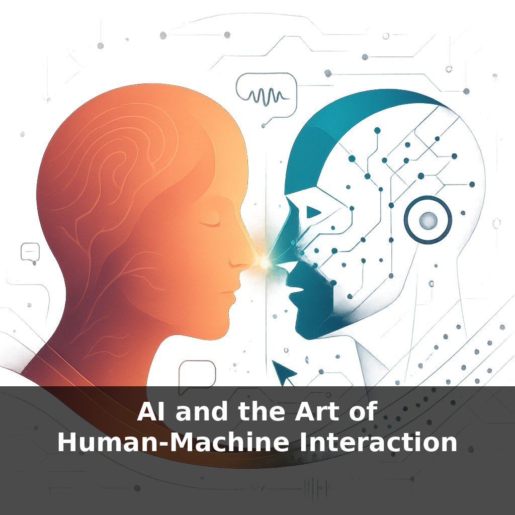
As AI stops feeling novel, interfaces start behaving less like tools and more like teammates with quirks, blind spots, and habits. The next wave of UX work is less about drawing screens and more about choreographing that relationship over time. Think of future products as evolving “living rooms” where content, controls, and even tone subtly shift with context, while still staying legible and fair. Teams that prototype this co‑evolution—rather than static flows—will set the cultural norms everyone else must follow.
Treat this first principle less like a feature checklist and more like urban planning: which paths do people naturally carve, and where is the ground uneven enough that adaptive help truly matters? In coming episodes we’ll layer on visibility, control, inclusion, and ethics—so each “smart” moment feels earned, not imposed, and worth inviting back tomorrow.
Before next week, ask yourself: 1) “Where in my current product could an AI-powered assist (like smart defaults, predictions, or auto-fill) genuinely remove friction for users instead of just ‘adding a chatbot’?” 2) “If my AI feature made a wrong or weird suggestion, what clear, humane way could I give users to understand *why* it happened (transparency), correct it, and feel more in control next time?” 3) “Looking at one key user flow I care about, how could I redesign the interface so the AI quietly augments the experience in the background—surfacing context-aware hints or next steps—without ever hijacking the main task?”