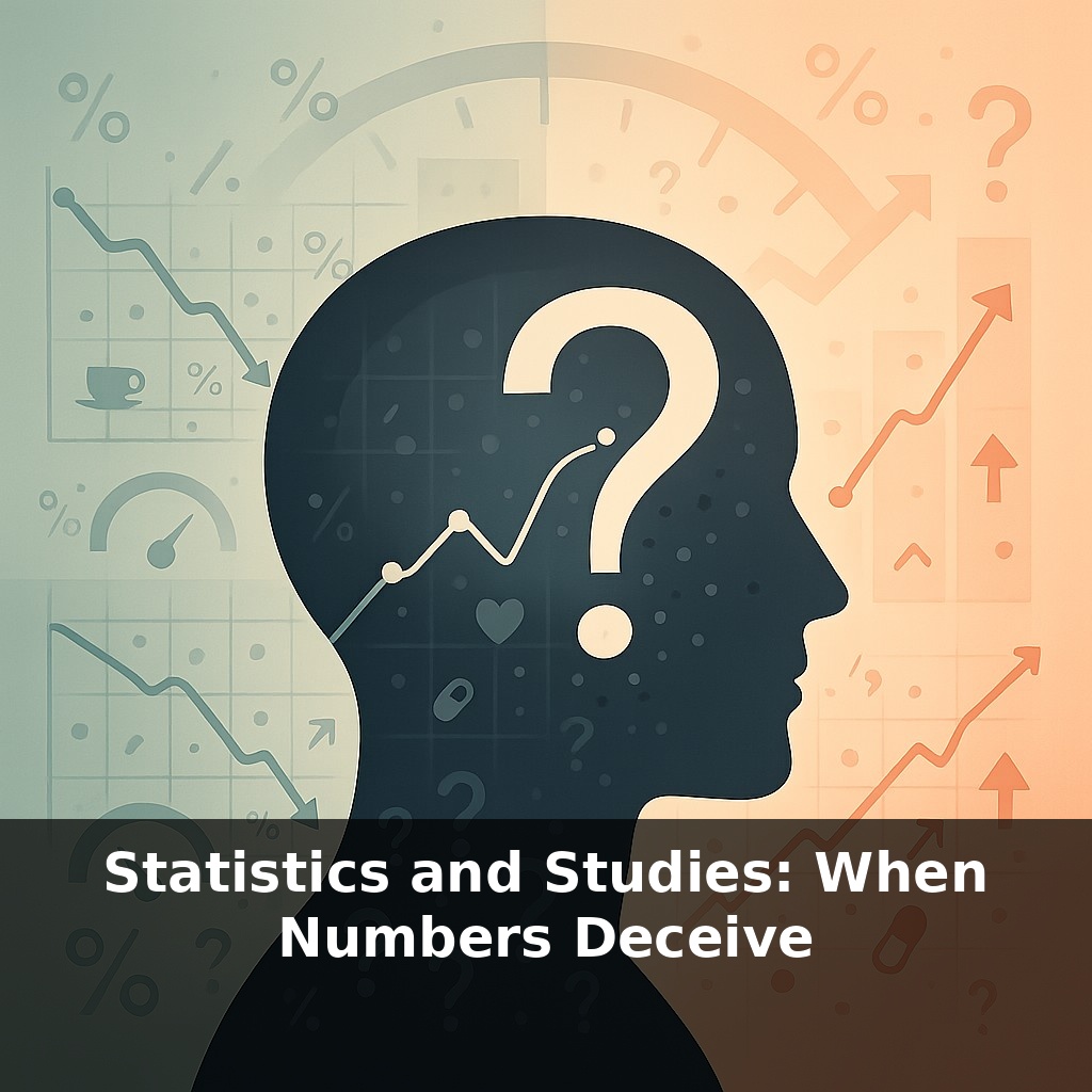
About half of the “breakthrough” health findings you hear about never hold up when scientists try them again. A headline says a coffee a day cuts your risk “by 50%.” Another says it doubles it. They can’t both be right—so what, exactly, is hiding inside those numbers?
About 36% of Americans can correctly interpret a p-value—which means most people (and many headline writers) are steering through research with a blurry dashboard. That matters, because shaky statistics don’t just live in journals; they shape drug approvals, public policy, and the advice your doctor gives you.
The trouble often starts long before the math: skewed samples, quiet exclusions, and subtle design choices can tilt results before a single calculation is run. Then comes the analysis—where choices about which outcomes to highlight, which to drop, and when to stop collecting data can turn weak patterns into “significant” findings.
Layer on top a replication crisis—where 40–60% of psychology and biomedical results fail to repeat—and you get a landscape where numbers can sound precise while reality stays stubbornly fuzzy. The real skill isn’t doing statistics; it’s learning to interrogate them.
Some of the most misleading numbers aren’t technically wrong—they’re just presented in ways that quietly push you toward the wrong conclusion. A 2020 BMJ review found that nearly 1 in 5 medical abstracts used only relative risk, skipping the absolute numbers that would show how big the effect really is. That’s like quoting a sale as “50% off” without mentioning it’s on a $2 item. Add in tiny samples, no confidence intervals, and no peer review, and you get claims that sound solid while resting on statistical sand. Our job is to learn where that sand usually hides.
When numbers mislead, it’s rarely because someone did the arithmetic wrong; it’s because of *what* they chose to count, compare, or display.
Start with a quiet villain: **biased samples**. A study on “Americans’ political attitudes” that recruits only from one university town might have thousands of participants and still miss most of the country’s views. Bigger isn’t safer if you’re just scaling up the same skew. Systematic exclusions—people without smartphones, non‑English speakers, those who don’t answer surveys—can all twist results while leaving tables and graphs looking perfectly respectable.
Then there’s **how we summarize**. A single “average” can hide wildly different realities. If tech salaries in a city are reported by the mean, a few extremely high earners can make pay look generous, even if most workers are scraping by. Medians, ranges, and distributions often matter more than one headline number, but they’re less flashy, so they get cut.
On the analysis side, **p‑hacking** thrives in gray zones. A researcher measures twenty outcomes but only reports the two that cross an arbitrary threshold. Or they keep adding participants until a pattern “pops,” then act as if that stopping point were pre‑planned. Each decision seems minor; together, they inflate how often “interesting” results appear, feeding that replication problem you heard about earlier.
Even when data and methods are sound, **confounders** lurk. A classic case: people who carry lighters get more lung cancer. Does that mean lighters cause cancer? No—smoking sits in the background, driving both. In modern studies, confounders can be exercise, income, age, or prior health, quietly shaping who ends up in which group.
Presentation is the final filter. A risk reduction framed in relative terms, with no baseline, and a bold color scheme can make a tiny difference feel life‑changing. Think of a budgeting app that only shows how much you “saved” with discounts, not how much you actually spent; the story feels positive while the underlying reality stays unchanged.
The through‑line: statistics are tools for *choices*—what to include, what to ignore, what to spotlight. Learning to see those choices is how you move from being persuaded by numbers to actually understanding them.
A food blogger tests a “miracle spice blend” on three friends, all good cooks, then posts, “100% of testers said it transformed their meals.” Nothing is factually false, but notice what’s missing: how testers were chosen, how many there were, what “transformed” meant, or whether anyone hated it and stayed quiet. You’re seeing the numbers, not the recipe behind them.
Or take an investing app bragging, “Users who follow our tips are 30% more likely to beat the market.” Is that after fees? Over what time period? Compared with whom—other app users, or total beginners trying stocks for the first time? The claim might rely on an especially lucky year, or on dropping users who quit after losing money.
Even in everyday life, a productivity tool might tout, “Teams using our software send 40% fewer emails.” That sounds efficient—unless the missing context is, “because they moved all their arguments into unlogged chat.” The trick is to keep asking: “Compared to what, exactly—and who got left out?”
As sensors, apps, and platforms log more of your life, you’ll meet statistics not just in papers but in personalized dashboards: “sleep scores,” “risk meters,” “productivity trends.” Each condenses messy reality into tidy digits that can steer your choices—what you buy, how you vote, even which jobs you see. When AI systems train on these same distorted summaries, their predictions echo the blind spots, quietly hard‑coding today’s biases into tomorrow’s “smart” tools.
Treat stats like restaurant reviews: don’t judge by the star rating alone—scan who’s reviewing, how many, and what they actually say. Your challenge this week: whenever a number appears in news, ads, or dashboards, pause once and ask, “What’s missing from this picture?” Not to dismiss the claim, but to see the story the number can’t tell alone.