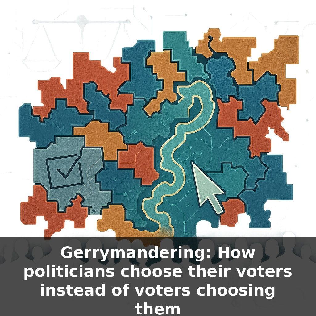
“In one recent state election, the party with less than half the votes walked away with a strong majority of seats. Same voters, same ballots—completely different outcome. So how did the map, not the people, end up deciding who holds power?”
Here’s where it gets stranger: most of the maps that decide your representation aren’t drawn in public, or by neutral experts. They’re crafted by small teams of partisan consultants and lawyers, often in secure rooms, using voter files that predict how entire neighborhoods will vote for the next decade. In many states, there’s more negotiation over where to place a single apartment complex than over any bill those future legislators will pass. It’s not just about packing or cracking one side’s voters; it’s about building “safe” districts where general elections barely matter and primaries become the only real contest. That shifts power away from the median voter and toward the most reliable partisans. The paradox: elections can look free and fair on Election Day, yet the real contest quietly ended months earlier—when the lines were drawn.
What’s changed in the last decade is the technology behind the lines. Instead of rough guesses about neighborhoods, map-drawers now feed detailed turnout histories, demographic data, and even consumer behavior into software that can spit out thousands of draft maps in minutes. Each one is scored: how many likely seats, how many swing districts, how durable under different turnout scenarios. It’s less like old‑school cartography and more like A/B testing in political labs, where the “winning” design is the one that locks in power most efficiently—and survives court challenges.
Here’s the twist most people miss: the “science” of map‑drawing is wrapped in layers of subjective choices that quietly tilt the field.
Start with where lines are allowed to move. Rules like “keep counties together” or “respect communities of interest” sound neutral, but they’re elastic. A “community of interest” might be defined as a media market, a school district footprint, or a shared industry—each definition nudges different groups together or apart. In practice, lawyers and consultants test these justifications in advance: which story about a “community” will sound most reasonable to a judge while still delivering the preferred partisan tilt?
Next comes the seat‑maximizing game. Map‑makers don’t usually try to win every district; they aim for the most seats they can hold under bad conditions. That means engineering a handful of overwhelmingly hostile districts they expect to lose by huge margins, so they can win more districts by modest but stable ones. In a polarized environment, a district that leans 54–46 can be treated like a locked safe—reliably theirs unless there’s an earthquake‑level wave.
Modern software then stress‑tests these designs. Teams simulate different turnout surges—young voters, rural voters, suburban college‑educated voters—and see which maps hold. They also scan for potential legal red flags: do racial patterns track too neatly with partisan advantage? Are minority populations “packed” at implausibly high levels? If so, the lines are nudged just enough to gain plausible deniability while preserving the core advantage.
Courts add another layer. Because federal judges largely stepped back from policing partisan gerrymanders, the battleground shifted to state constitutions and state supreme courts. That’s why the same map‑drawing tactics can be struck down in one state as violating a “free and equal elections” clause and survive in another with different language—or different justices.
The result isn’t a single master plan, but an iterative process more like tuning a complex musical instrument: adjust one string here (a suburb), dampen another there (a city ward), retune until the whole arrangement produces the desired partisan harmony—cycle after cycle, even as voters change.
Think about what this looks like on the ground. In Wisconsin’s 2012 Assembly map, Democrats could pile up huge margins in urban seats and still end up with fewer than half the chairs in the chamber. That wasn’t an accident; it was the product of testing how many tightly clustered Democratic voters could be “wasted” while still keeping surrounding districts just red enough to hold. At the federal level, analysts now list only about 10–15% of House districts as truly up for grabs—most others behave like long‑term incumbents, barely flinching even when statewide opinion swings. One 2021 Brennan Center analysis projected that the right combination of such maps could shift three or four House seats nationwide, which is the difference between a Speaker gavel and the minority. And the stakes aren’t only partisan: the NAACP Legal Defense Fund has shown how line‑drawing in the South has diluted Black voters’ influence in at least eleven districts, softening their ability to shape policy on issues that directly affect them.
Here’s where it gets uncomfortable: as AI supercharges line‑drawing, the gap between public mood and who actually holds power can quietly widen. Future maps could behave like noise‑canceling headphones for dissent—muting swings in opinion so chambers barely shift even when voters do. Yet the same tools could be flipped: citizens already test “people’s maps” in open‑source software. Your challenge this week: find one reform proposal in your state and trace who’s for it—and why.
The next map fight in your state might not trend on social media, but it could quietly shape which roads get fixed or which hospitals stay open. Your challenge this week: scan one local news source for any story about district lines. Note who benefits, who’s sidelined, and what never gets asked. That curiosity is the first lever ordinary voters still control.