You can lose the race…and still get the keys to the White House. A candidate could trail by millions of votes nationwide, yet wake up as president-elect. In this episode, we’ll walk through how that happens, step by step, without changing a single ballot.
Now zoom in from the big national scoreboard to the county map under the surface. The real drama isn’t in how many votes each candidate gets overall, but *where* those votes are piled up. A landslide margin in Los Angeles or Houston counts the same, electorally, as squeaking by with a few hundred votes in a small Midwestern state: one state in the “W” column. That twist quietly reshapes campaigns. Instead of trying to persuade the whole country evenly, candidates chase tiny slivers of persuadable voters in a handful of places—often suburbs around Milwaukee, Detroit, Philadelphia, Atlanta, and Phoenix. It’s like a band on tour skipping entire regions to play only the cities where a single packed show can make or break their chart position. In this episode, we’ll follow how those strategic choices can flip the outcome.
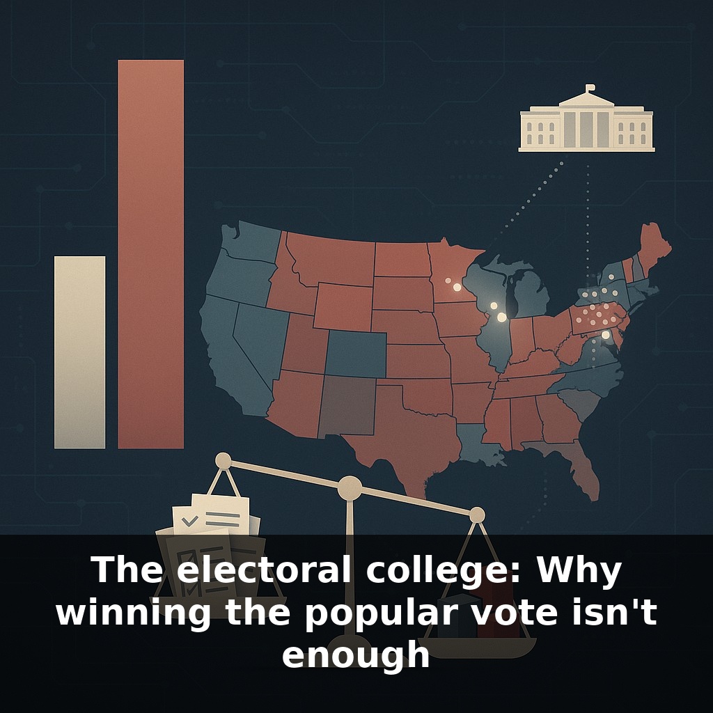
Here’s where the math gets unintuitive. In our heads, elections feel like a national tug-of-war: add up every vote, see who has more, done. But under the hood, each state is quietly running its own contest with its own scoreboard, then feeding the result into a separate, winner-take-all tally. That layering creates odd edge cases. For example, a candidate can run up huge margins in a few megastates, lose narrowly in a string of smaller ones, and still fall short overall. It’s not that any vote “doesn’t count”; it’s that votes are bundled differently depending on where they’re cast.
Start with the scoreboard the campaigns actually stare at: the handful of states where a tiny swing can flip everything. Political data teams don’t just look at red/blue maps; they build probability models. For each battleground, they estimate: “What’s the chance we’re up by even 0.1% on election night?” Then they ask a brutal question: “If we move one dollar or one hour of candidate time, which state buys us the biggest bump in *electoral* odds per unit of effort?”
That’s why you see bizarre patterns like this: a campaign might spend more on ads in a medium-sized state with 10 electoral votes than in a megastate with 40. If the megastate is already safely leaning one way, extra votes there are “wasted” from an electoral perspective, even if they help the national popular total. The medium-sized toss-up, by contrast, is like a locked door where just a few more “keys” (persuadable or turnout-ready voters) could open a 10-vote prize.
The math gets sharper when you list states roughly in order of how close they are and stack their electoral votes until someone crosses 270. That running total—the so‑called “tipping-point state”—often lands on a place that is neither the biggest nor the closest race, but the one that tends to sit right where the winner first passes 270 in many simulated scenarios. In recent cycles, states like Wisconsin or Pennsylvania often play that role. That “tipping” state quietly becomes more important than millions of extra votes in already-secure territory.
There’s also a structural tilt baked in by how voters are distributed. If one party’s support is heavily concentrated in big metros while the other’s is spread more efficiently across many states, the more dispersed party can convert a smaller share of the *national* vote into a majority of electoral votes. This isn’t about fraud or error; it’s geometry. Where people live, and how similarly they vote to their neighbors, changes how often the winner in the national count and the winner in the state-based count diverge.
Put all that together, and you get a system where maximizing raw votes is not the optimal strategy. The rational goal is to maximize the number of states (and districts) you win by *just enough*—and to stop there once more votes no longer move any additional electoral bricks into your column.
Think about election night like following two parallel playlists. One is the obvious “Top Hits” chart: the national vote everyone tweets about. The other is the quieter, but decisive, state‑by‑state chart the campaigns actually remix toward. A candidate might be “number one” in total listens nationwide yet still lose if their tracks aren’t charting in the right states.
Concrete history makes this less abstract. In 2000, Al Gore finished about half a million votes ahead nationally, but Florida’s 537‑vote margin—and its 25 electoral votes—handed the presidency to George W. Bush after a recount and a Supreme Court decision. In 2016, Hillary Clinton’s nearly 3‑million‑vote edge wasn’t enough because Donald Trump stitched together razor‑thin wins across Pennsylvania, Michigan, and Wisconsin.
Data analysts now simulate tens of thousands of such maps, hunting for the smallest clusters of states that can flip the final outcome. The lesson: the United States doesn’t just pick *one* winner; it assembles one out of 51 separate scoreboards.
Close races under this system act like stress tests. As population shifts and parties sort themselves, the odds of seeing more mismatches between expectation and outcome rise. That can feel like a plot twist where the “box office champ” doesn’t win the award. Some states are experimenting with different rules, and interstate compacts or court rulings could quietly reshape incentives long before any sweeping constitutional rewrite becomes realistic.
So the real question isn’t just “who got more votes?” but “what outcomes do we want this system to reward?” Reform ideas—like proportional allocation or the National Popular Vote Compact—are test drives for different answers. Your challenge this week: whenever you see a poll, ask not just who’s ahead, but *where* those voters are, and how that map might rewrite the ending.