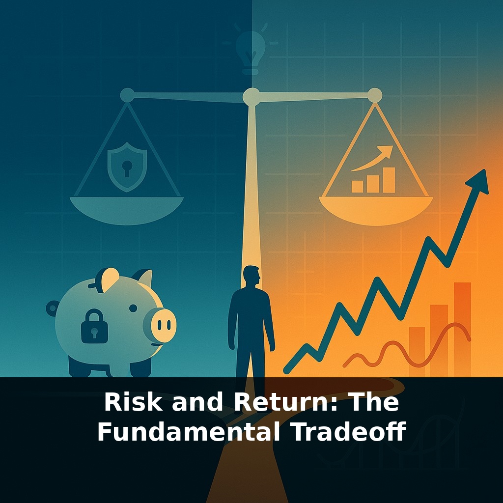
A safe savings account has almost never lost money in a year. The stock market? Some years it’s soared, other years it’s crashed. Yet most wealthy people still own stocks. Why choose the bumpy road over the smooth one? That puzzle sits at the heart of how investing really works.
Most people say they “hate risk,” but their choices tell a different story. They’ll happily accept risk in some areas—starting a business, changing careers, moving cities—while demanding absolute safety from their money. The catch: money doesn’t play by that rule. Every path that offers the potential to grow your wealth meaningfully also includes the possibility of painful setbacks.
This isn’t a quirk of Wall Street; it’s baked into how markets match savers with businesses and governments that need capital. When you see headlines about soaring tech shares, shaky real estate, or surging bond yields, you’re really watching different points along the same risk–return spectrum.
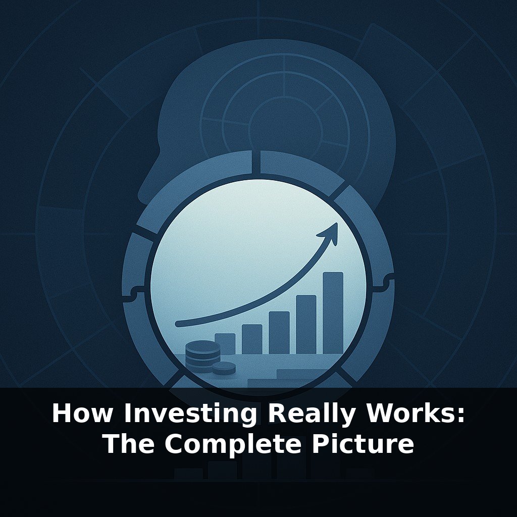
In this episode, we’ll unpack that spectrum, show how researchers measure it, and explore how you can choose a spot on it that fits your real life—not your wishful thinking.
Think of every financial choice—from paying off a loan to buying a rental property—as picking a different “flavor” of uncertainty. Some are mild, like steady debt payments; some are spicy, like a single hot stock; others mix ingredients, like a portfolio of businesses and government IOUs. Researchers don’t just label these as “risky” or “safe”; they track how wildly their results have swung in the past and how often they’ve disappointed. That history doesn’t predict the future, but it does reveal patterns you can use to decide which flavors you can realistically live with.
A 10% average stock return sounds great—until you learn how bumpy the ride has been. From 1926 through 2023, large U.S. companies delivered roughly that return, but with individual years swinging up or down by about 20%. Some years have seen gains over 30%; others, losses of 40% or more. That “standard deviation” number isn’t just math trivia; it’s a rough gauge of how far actual outcomes have wandered from the average.
Now compare that to short‑term government debt. Three‑month Treasury bills have historically earned closer to 3% a year, with wiggles of only about 1%. Very small moves, but also very modest growth. Leave money there for decades and inflation quietly eats away a big chunk of its buying power. On paper it feels calm; in real life, it can fail to meet long‑term goals.
Zoom out to a mix of assets and you see the tradeoff in a new way. A classic 60/40 blend of large U.S. stocks and high‑quality bonds has, over many decades, landed somewhere in the middle: long‑run returns around 8–9% with gentler swings than an all‑stock approach. Still, “gentler” doesn’t mean painless. In 1931 that mix dropped about 27% in a single year—far less than stocks alone, but still a gut‑punch for anyone expecting smooth progress.
The 2008 crisis shows how these pieces can offset one another. As broad U.S. shares plunged roughly 57% from peak to trough, 10‑year Treasury bonds gained around 20%. When one part of a portfolio suffered, another helped cushion the blow. That negative correlation is why mixing assets changes the shape of the ride, even though it can’t erase the possibility of loss.
Notice the pattern: whenever you see a chart advertising “higher potential return,” hidden underneath is either more frequent disappointment, bigger setbacks when they arrive, or both. Like adjusting the dose of a powerful medicine, you don’t get more benefit for free—you accept more intense side effects, or you combine treatments to spread them out. Your real job as an investor isn’t to hunt for magic exceptions; it’s to decide which combination of upside, volatility, and waiting time you can genuinely withstand without bailing out at the worst moment.
Think about three different people and where they sit on this tradeoff. First, someone in their 20s saving for retirement 40 years away. Missing a big chunk of growth matters more to them than a few nasty years along the way, so they might lean heavily on ownership in productive companies, accepting wide swings in value for a shot at much higher long‑term growth.
Now contrast that with a person in their 60s, planning to start withdrawals next year. Their priority shifts: avoiding a deep drop right before they need the money becomes more important than squeezing out every last percentage point of return. They may hold a larger share in contractual promises to pay, plus enough cash to cover the next few years of spending so they aren’t forced to sell at a bad moment.
Finally, consider a freelancer with wildly uneven income. For them, financial “safety” might mean building a chunky cash reserve first, then layering in long‑term growth assets only once short‑term surprises are covered.
As tools sharpen, the tradeoff gets more visible, not weaker. AI can flag when your mix quietly drifts into “spicier” territory—like a fitness tracker warning your heart rate’s creeping up. New risks will also step onto the scale: climate events, data breaches, even online reputation. And as tokenized assets let you buy slivers of themes you care about, the hard part won’t be getting access—it’ll be choosing how much swing you can live with for the story you want to back.
Your challenge this week: pick one real‑world risk (climate, cyber, or geopolitical) and trace how it could ripple into three different assets you’ve heard of—say, a large tech company, a bond fund, and a real‑estate‑related investment. Don’t judge which is “best.” Just map out how the same shock might hit each one differently, and notice how your own comfort level shifts as the path from event to loss (or gain) becomes clearer.
You don’t have to label yourself “risky” or “cautious” forever. As your goals and income shift, you can slide along that spectrum deliberately—dialing up growth when time is on your side, then easing back as commitments pile up. Just as a savings account offers different returns at different times, adjusting your investment mix allows you to align your portfolio with your current financial goals.
Here’s your challenge this week: Pick one existing investment (or a hypothetical one if you’re just starting) and calculate its *actual* expected return and risk using real numbers: look up its 10-year annualized return, its worst single-year loss, and how much it dropped in 2008 or 2020. Then, compare it to a second option with a different risk profile (for example, a broad stock index fund vs. a high-yield bond fund) and write down which one you’d choose if you needed the money in 3 years versus 20 years—and why. Finally, change the allocation in your real or paper portfolio by at least 5–10 percentage points to better match your true risk tolerance based on what you just discovered.