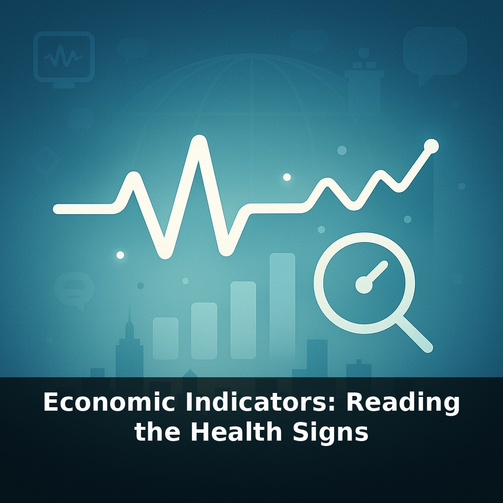
During fierce debates and sudden market swings, a single data point can shift the entire conversation - but what truly reveals the economy's health? Unlike checking your pulse, economic health isn't measured in heartbeats. In this episode, we'll dive into the diagnostic room to decipher how to truly assess its vital signs.
Politicians argue on TV, markets swing, your friend says a crash is coming—and all of them claim “the data” is on their side. The trick isn’t having numbers; it’s knowing which numbers matter, and how they fit together. That’s where economic indicators come in. They’re not fortune-telling tools; they’re more like a live scoreboard of how different parts of the system are behaving right now.
In this episode, we’ll zoom in on three of the most watched: growth, prices, and jobs. We’ll see how a world producing over $100 trillion of output can still tip into recession territory, why 2 % inflation is considered “just right” rather than zero, and how a small change in unemployment can mean a big hit to national income. By the end, you’ll be able to hear a headline about “hot inflation” or “weak jobs” and actually translate it into what it means for your savings, your paycheck, and policy decisions.
Headlines throw a lot at you at once: “growth slowing,” “prices cooling,” “jobs unexpectedly strong.” On their own, each update is like tasting a single ingredient in a complex dish—salt, spice, or sweetness. Useful, but incomplete. What really matters is how these flavors mix over time. A brief growth slowdown with steady prices might just mean a soft patch. Fast price increases and rising joblessness together, though, can signal deeper trouble. In this episode, we’ll practice reading how these indicators move together—over months and years—so they start to tell a coherent story instead of random noise.
Start by zooming out: indicators usually fall into three buckets—leading, coincident, and lagging. Leading indicators move first, hinting at where conditions are headed. Coincident ones move with the present. Lagging ones confirm what already happened. Markets obsess over leading signs because they give you advance notice before the “official” story shows up.
A classic leading signal: new building permits. When developers apply to construct homes or offices, that’s money they plan to spend over the next year or two—on land, materials, labor, financing. A sudden drop in permits can warn that construction, and the jobs tied to it, may soon soften even if current activity still looks fine.
Another: surveys of business expectations, like purchasing manager indices (PMIs). These ask managers if orders, production, and hiring are picking up or slowing. No one survey is perfect, but when many point the same way for several months, they often foreshadow turns in broader output and trade.
Coincident indicators track the “right now” beyond the big three. Retail sales reveal how willing households are to spend. Industrial production shows how busy factories are. Real-time card spending, restaurant bookings, and freight volumes—used heavily in 2020–21—give rapid, if noisy, clues about behavior before official releases arrive.
Lagging indicators help you avoid fighting the last war. Corporate bankruptcies, long-term unemployment, and serious loan delinquencies tend to spike after a downturn is underway. They’re crucial for judging the depth of damage, but dangerous if you treat them as predictors.
The trick is learning which indicator has power in which context. During a supply shock—like the 1970s oil crisis or recent chip shortages—watch capacity utilization, delivery times, and input prices. In demand-driven booms or busts, consumer confidence and credit growth often tell the story first.
Policymakers and investors rarely rely on a single series. They build dashboards: clusters of indicators that, taken together, reduce the odds of being fooled by any one noisy number. That’s your goal too—not to memorize acronyms, but to recognize patterns in how these signals move relative to one another and over time.
Think of a central bank meeting a bit like a weather-forecast briefing. No one walks in and says, “It rained yesterday, so it will rain tomorrow.” Instead, they pull up maps of wind patterns, ocean temperatures, cloud cover—each a different indicator that only makes sense in combination with the others.
You can do a simpler version with real examples. Take mid‑2022: inflation readings were extremely high, but card‑spending data and corporate earnings calls showed many households still traveling, dining out, and buying concert tickets. At the same time, some big tech firms began announcing hiring freezes. Read together, those signals hinted at a rotation rather than an immediate collapse: strength in services, cooling in interest‑sensitive sectors.
Contrast that with early 2020, when flight bookings, restaurant reservations, and mobility data all plunged almost overnight, even before some official statistics moved. The pattern there wasn’t “gradual slowdown”; it was “sudden stop”—a very different story, and a cue for very different policy responses.
Global GDP may top $200 trillion within decades, but the story between now and then will be told in faster, messier data. High‑frequency readings—cargo images from space, tap‑to‑pay streaks, even search trends—will act like traffic sensors on an economic highway, flagging bottlenecks before a crash. Expect more tension between precision and privacy, and more weight on who benefits from growth, not just how big it is. Learning this “data language” early is like getting the map before the road bends.
Soon you’ll notice each data release the way you notice small shifts in a friend’s mood: not dramatic on its own, but meaningful in sequence. That’s the real skill—seeing when stats quietly contradict each other, or when they finally line up. Follow those tensions and you’re not just consuming headlines; you’re practicing your own small-scale macroanalysis.
Try this experiment: For the next four Fridays in a row, pull up three sources: the latest U.S. unemployment rate (BLS), the 10-year Treasury yield, and the S&P 500 level. Before you look at any commentary, jot a one-sentence “diagnosis” of the economy’s health based only on those three numbers (e.g., “low unemployment + rising yields + rising stocks = overheating?”). Then read a reputable economic summary for that week (like the Wall Street Journal’s markets wrap or an FRED blog post) and compare your diagnosis to the experts’ take. At the end of the month, see how your interpretations changed over time and whether you got better at “reading the vital signs” without relying on headlines.