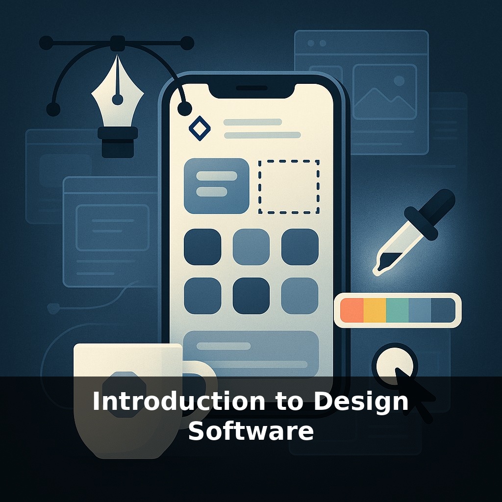
You’ve already used design software today—even if you never opened a “design” app. The icons on your phone, the layout of your playlist, the logo on your coffee cup: all built with invisible tools. The intriguing part is how different tools quietly shape what you notice and trust.
Open almost any modern app and you’ll see the fingerprints of specialized software categories working together. The crisp logo in the corner likely started life in a vector program. The atmospheric hero image on the homepage passed through a raster editor. The way buttons, text, and spacing feel “just right” comes from layout and UI tools, while prototypes were probably refined in collaborative platforms where designers, developers, and stakeholders could poke, comment, and tweak in real time.
Behind all that polish is a surprisingly practical question: which tool should handle which decision? Professional teams rarely rely on a single app; they assemble a system, the way a band chooses instruments, and route work between them. In this episode, we’ll map out the main types of software in that system, why each exists, and where beginners waste the most time by picking the wrong tool for the job.
Beginner designers often open whatever app they’ve heard of first, then try to force every task through it. That’s like drafting blueprints in a chat app: technically possible, practically painful. The real shift happens when you see each category of software as a stage in a pipeline: some tools are best for generating raw visual material, others for arranging it, others for testing how it behaves in real use. Once you notice this flow, questions change from “Which app is best?” to “Where in the process am I—and which tool belongs here?”
Think of this episode as zooming out one more level: not “what tool does what,” but “what kind of work actually shows up on your screen, and which tools tend to orbit that work?”
Most beginners bump into three kinds of tasks first:
1. **Making raw visual material** This is where you create assets from scratch: photos, illustrations, icons, textures, 3D objects. Here, you’re concerned with *origin stories*: - Where will this image live? Phone screens, billboards, social feeds, slide decks all stress different constraints. - How flexible does it need to be? A social post is disposable; a logo might live for a decade. - Who else will touch it later—developers, printers, marketers? Their needs quietly dictate format, resolution, and color choices.
At this stage, the “right” tool is the one that preserves future options. Non-destructive edits, reusable components, and version history matter more than flashy filters.
2. **Assembling and sequencing** Once you have pieces, the job shifts to arranging them into a narrative: a landing page, slide deck, product screen, or brochure. Now the work is about: - Hierarchy: what must be seen first, then second, then third. - Rhythm: how dense vs. open each screen or page feels. - Variants: how the same content adapts to mobile, desktop, or print.
The trap here is using asset-creation tools to “lay out” entire projects. It often locks you into awkward text handling, inconsistent spacing, and painful revisions when content changes.
3. **Testing behavior and handoff** Past a certain fidelity, static mockups stop answering important questions. You need to know: - Does this flow still feel clear when someone rushes through it? - Do edge cases—long names, error states, different languages—break the layout? - Can engineers, printers, or collaborators extract exactly what they need without recurring meetings?
This is where real-time collaboration, comments pinned to specific elements, and links to code, specs, or export presets pay off. The job is no longer just to “show how it should look,” but to *encode decisions* so they survive contact with a large team.
Here’s one way to frame your own work: **creation → composition → communication.** For any task you pick up, ask which of those three you’re really doing. Then notice how different software tilts toward one stage or another. Over time, you’ll stop forcing every problem through your favorite app and start matching each stage with tools that naturally support it.
You can feel this most clearly when you switch contexts. Sketching an icon on a tablet, you’re in “creation” mode: nudging curves, trying alternatives, throwing away nine versions to keep one. Drop that same icon into a slide deck and suddenly you’re in “composition”: does it balance with the headline, does it overshadow the chart, does it still read clearly from the back of a room? Share the deck in a browser for stakeholders to comment, and you’ve crossed into “communication”: now the important part is who can see it, annotate it, and trace why a change was made.
Think of a small startup announcing a new feature. One person roughs visuals in a sketching app, another arranges them in a launch page, marketing refines copy directly in the file, and engineering checks spacing against their design system. Each step reuses the same ingredients but asks a different question—and quietly favors different software.
Your challenge this week: take a tiny project—like a single social post, mini landing page, or one mobile screen—and *force yourself* to pass it through all three stages consciously:
1. **Creation:** Start by generating raw ingredients in a tool dedicated to making assets. Don’t worry about the final layout; explore at least three visual directions for each key element (e.g., three icon styles, three photo crops, three illustration moods). Capture these variations side by side.
2. **Composition:** Move only your favorite ingredients into a separate file or tool designed for arrangement. Here, create two distinct compositions using the same assets: one dense and information-heavy, one minimal and airy. Switch between them and note how hierarchy and rhythm alone change the story, even though the content is identical.
3. **Communication:** Finally, share this work with at least one other person using a commenting or presentation feature—no screen-sharing. Ask them to leave comments directly on specific parts: one about clarity, one about emotion, one about feasibility (e.g., “Could this be coded or printed easily?”). Resist explaining verbally; let the file do the talking.
By next weekend, review your mini-project and write one sentence for each stage: what felt natural, what felt forced, and which tools actually helped you think, not just draw. Over time, that awareness becomes your real “design software.”
Soon, your “file” may feel more like a living lab than a static canvas. As AI suggests variations in real time—swapping layouts like playlists—you’ll spend less effort pushing pixels and more judging options. Design-to-code bridges could blur where mockups end and products begin, the way rehearsal and performance merge in improv theater. Expect new questions too: who owns AI‑generated variants, and how do you keep a coherent voice when software keeps offering endless riffs?
Treat this first project like a low‑stakes scrimmage: you’re learning how you move, not trying to win a championship. Over time you’ll notice your own “default plays”—the views you always open, the tools you reach for under pressure. Paying attention to those habits is how you gradually shape a personal stack that fits the way *you* think, not the way tutorials assume you should.
Start with this tiny habit: When you open your laptop, spend 60 seconds opening either Figma, Canva, or Adobe XD and click through one built-in template—don’t design anything, just look. Pick one element (a button, a header, or an image) and hover over it to see its properties (font, size, color) so you start recognizing common design settings. If you feel like doing a bit more, duplicate that template and change just one thing—like the button color or the heading font—then close the app.