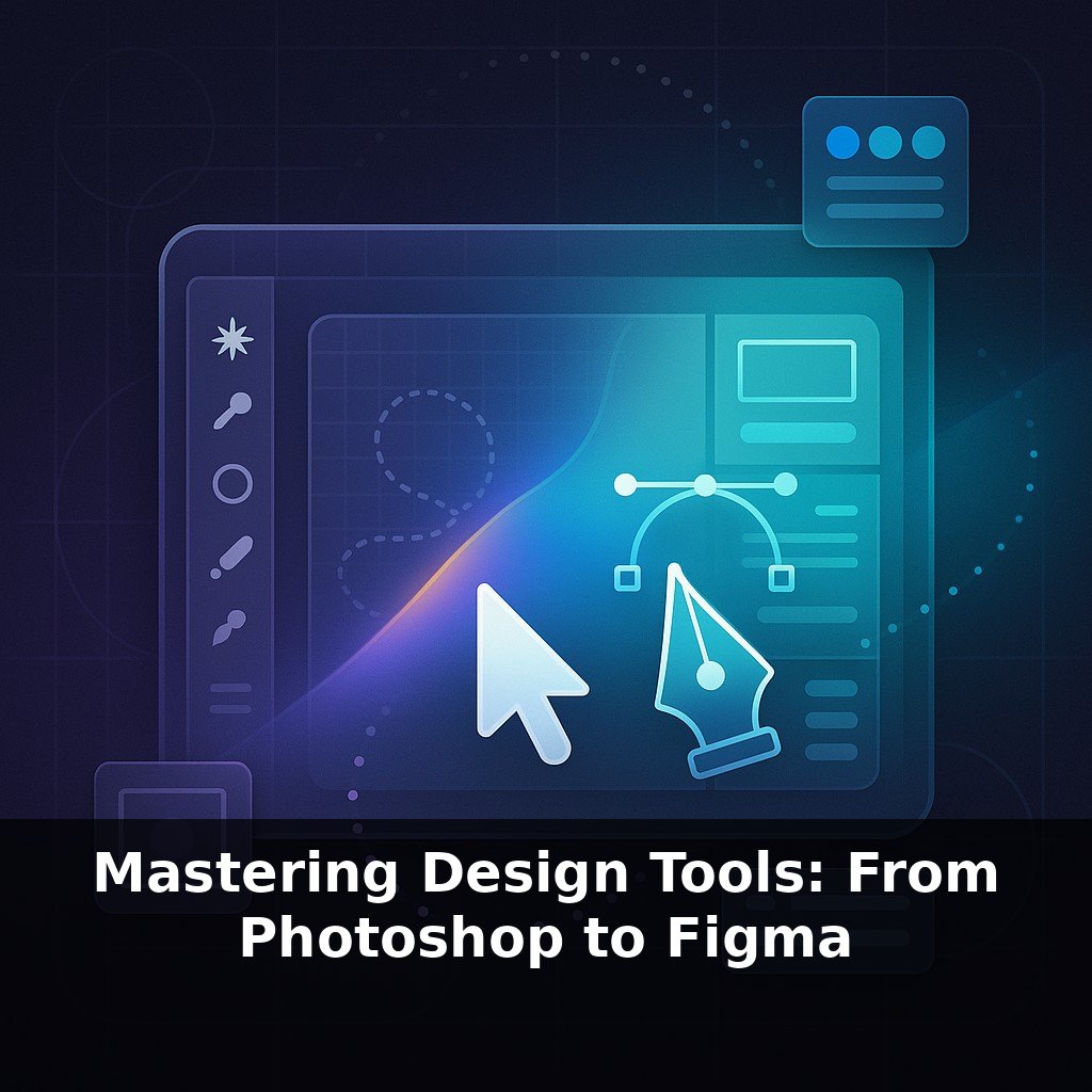
Photoshop can handle images so huge most phones would crash just trying to preview them—yet most people only tap a tiny slice of its power. You’re fixing blemishes and cropping vacation shots… while tools built for movie posters and billboards sit quietly in the toolbar.
Those billboard-level tools become far less intimidating once you realize Photoshop isn’t one giant skill—it’s a handful of essential habits repeated in smarter ways. The pros you follow on Behance or Instagram aren’t “doing everything”; they’re combining the same few building blocks over and over, just with more intention and control. Instead of memorizing every icon, you’ll get further by learning how to set up a file so you can safely experiment, undo risky ideas, and revisit a project months later without wondering, “How did I make this?”
We’ll focus on a core workflow that scales from fixing a single portrait to assembling a full campaign: starting with a clean, organized document, keeping edits flexible, and using structure to stay fast. By the end of this episode, you’ll know how to open a blank canvas in a way future-you will actually thank you for—and how that single decision shapes everything you build on top of it.
Before we touch a single brush or filter, there’s one quiet decision that separates “looks fine on my screen” from “prints perfectly on a client’s banner”: how you define the space you’re working in. Canvas size, resolution, and color mode sound dry, but they decide whether your file stays crisp on a 4K display or falls apart on a phone. Professional workflows start by matching these settings to the final destination—print, web, social, or motion—so every move downstream serves a clear purpose instead of guesswork. Think of it as choosing the stadium, lighting, and rules before you start the game.
Layers are the first place where that “define your space first” decision starts to pay off. Once your document is set, the real control comes from how you stack, name, and protect the pieces inside it. This is where Photoshop stops being a single flat image and becomes something you can rearrange, test, and safely break without losing the original idea.
Start with a simple rule: never work directly on your background pixel data if you can avoid it. Duplicate your base image and keep that copy as your “workhorse” layer. Above it, create new layers for every distinct move: retouching on one, color changes on another, text on its own, graphics on their own. It feels slower at first, but it’s the difference between editing a live website on production and pushing changes through version control—you always have a way back.
Naming matters more than it seems. Replace “Layer 1 copy 3” with “Skin Retouch,” “Logo White,” “Shadows Boost.” Group related layers—everything for the header in one folder, everything for the background in another. When a client asks you two weeks later to “make the text pop more, but keep the colors from version two,” you’ll actually know where to look.
Masks are the second half of this structure. Instead of erasing, you hide and reveal. Add a mask to a layer, paint with black to conceal, white to restore. You’re shaping how layers interact, but the pixels remain untouched underneath. This is how pros test three or four compositing ideas side by side: duplicate a layer, tweak the mask, toggle visibility, compare.
Smart Objects extend that safety net when you bring in logos, mockups, or high-res assets. Convert an element once, and you can scale, warp, and filter it repeatedly while the original stays pristine. Need to update the logo across twenty mockups? Edit the Smart Object; every instance updates automatically.
One helpful way to think about your document: it’s less a single picture and more a well-structured app interface. Each “module” (group, layer, mask, Smart Object) does one clear job. When every part has a role, you gain the confidence to iterate aggressively—because you’re never more than a few clicks away from the version you started with.
Think about a real campaign: a sneaker brand wants a hero image for web, in-store posters, and a motion teaser. The art director shifts direction mid-week: “Keep the lighting from version three, use the background from version one, and swap in the new logo lockup.” If your document is a tangle of unnamed layers, this request is painful. With clear structure, it’s like toggling feature flags in a codebase—switch background group A off, background group B on, update a single Smart Object, and the entire system responds.
This structure also makes collaboration possible. A retoucher can focus on a “Skin + Fabric” group while a typographer fine-tunes the “Type System” group, without stepping on each other’s toes. When motion designers receive your PSD, labeled elements become layers they can animate directly: “Reflection Sweep,” “Glow Pass,” “Shadow Matte.”
The payoff is compounding: cleaner files become reusable templates. You stop rebuilding from scratch and start evolving proven setups, just like a product team iterates on a design system instead of redrawing every button.
Neural filters, Generative Fill, and shared libraries are nudging Photoshop from “solo craft” toward “co-directed system.” The more intentional your layers, masks, and Smart Objects are, the more these AI tools behave like expert assistants instead of chaos engines. Treat prompts and filters as hypotheses: duplicate groups, branch variations, and compare like a scientist testing versions. Over time, you’ll develop a personal “lab” file—reusable patterns that speed up new projects without flattening your style.
Treat this structure-first approach as groundwork, not homework. You’re laying rails so ideas can move faster later—like organizing a workshop so any tool is within one step’s reach. Your challenge this week: rebuild one old file using clear groups, masks, and Smart Objects, then time how long it takes to swap colors, text, and layout for three new variations.