Your next great app design might already exist—just not on your screen. Right now, thousands of designers are editing the *same* file at the same time, without a single version conflict. One cursor tweak in Figma, and an entire product team silently shifts direction.
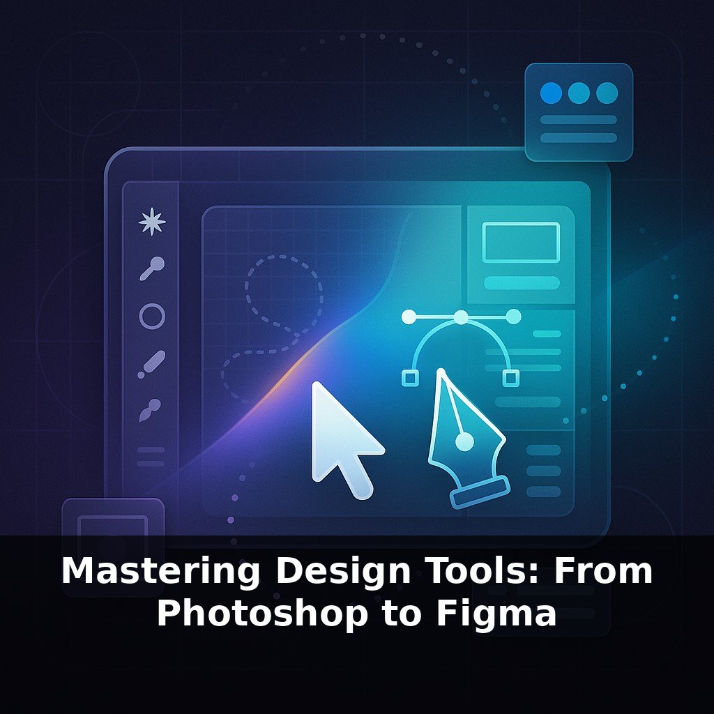
Figma mastery starts where basic familiarity ends: in the tiny decisions that turn a messy canvas into a living system. This isn’t about learning where the buttons are; it’s about thinking in reusable patterns, shared language, and deliberate constraints. Instead of drawing one-off screens, you’ll be structuring tokens, components, and variants so updates ripple through your product with a few intentional changes. Think less like a lone artist at an easel and more like an urban planner laying out districts, transit lines, and zoning rules so the whole city can grow coherently over time. In this series, we’ll zoom in from high-level system thinking down to practical moves: setting up base components, wiring responsive layouts, and shaping files so collaboration feels frictionless, even when dozens of people are building on top of your work.
Think of this phase as learning the “physics” of your Figma world: grids, auto layout, and typography rules that quietly govern how everything behaves. Before you worry about polishing UI, you’ll map out spacing scales, set up foundational text styles, and decide how frames should adapt when content grows or shrinks. This is where chaos either multiplies or disappears. We’ll also zoom out to file structure—how you separate libraries, organize pages, and name things so teammates can guess what’s inside without opening a single frame. Done well, your canvas starts to feel less like a sketchbook and more like well-zoned infrastructure.
Auto layout is where those “physics” start to feel real. The moment you stop dragging rectangles by hand and let frames respond to content, you move from decorating screens to defining rules. Auto Layout v5 isn’t just “stack things vertically”; it lets you nest behavior: buttons that expand with their label, cards that reflow as you add tags, layouts that stretch from mobile to desktop without a separate design for every breakpoint.
Start simple: a button with text. Turn the frame into auto layout, set padding, define spacing for an icon, and decide how it resizes: hug, fixed, or fill. Now nest that button inside a horizontal group of controls, then nest that group inside a top bar that pins to the edges of the viewport. With each layer, you’re encoding decisions that used to live only in your head or a handoff document.
This is also where designers and developers finally speak a similar language. When you treat a frame like a flex container, it becomes much easier to describe intent: “This section distributes space between items,” or “These cards wrap onto the next line.” Developers can inspect that behavior directly, instead of guessing from static mocks.
Real teams lean hard on this. When Airbnb rethought search results, they didn’t build 20 static screens; they modeled one flexible layout that could handle mixed content: long titles, short titles, new badges, price changes. That single, robust structure cut the number of “edge case” redesigns and made experimentation faster.
Constraints might feel restrictive at first, but they’re what keep a design system from fracturing as more people touch it. Decide which elements are allowed to stretch and which must stay fixed. Give your content room to grow without breaking the grid. One careful decision about resizing on a card can save hours every time marketing wants to try a new message.
Your challenge this week: pick one messy screen you’ve already designed and rebuild it entirely with nested auto layout. No manual alignment, no free-floating layers. Test it by swapping in longer text, extra tags, and alternative CTAs. If something breaks, refine the frame rules until the layout behaves—even when you try to “break” it on purpose. By the end, you’ll know exactly which parts of your UI are truly flexible and which only looked that way.
Think of auto layout-heavy files as a training ground for future experiments. Instead of polishing a “final” screen, treat it like a prototype of your rules. For example, set up a panel that can switch between error, warning, and success messages by simply swapping text and icons; then see how far you can push it before anything looks wrong. Or duplicate a layout and try stripping away half the content—does the spacing still feel intentional, or do gaps appear where you never defined behavior?
A practical move: create a small “stress test” page in your file. Drop in your most common patterns—cards, list items, modals—and deliberately abuse them: max-length titles, three lines of metadata, no icon where you normally expect one. If they survive, promote those patterns into your shared library. If they don’t, tweak their auto layout rules and constraints right there, while the failure is visible. Over time, this page becomes your quiet QA lab for layout logic, catching fragile designs long before engineering does.
Auto layout skills quietly change what “finished” means. As responsive behavior becomes expected, static mocks will feel like wireframes: useful, but incomplete. Soon you’ll judge a screen by how it flexes under pressure, not how it looks at one ideal size. Treat every layout like a stadium roof that must open, close, and withstand bad weather. The better your rules handle weird content, the more confidently your team can ship experiments without redesigning from scratch.
As you push layouts to their breaking points, notice which ones bend gracefully and which snap like a cheap tripod in a strong wind. That friction is a map: it tells you where to refine rules, where to simplify, and where a pattern is trying to become a true part of your system. Keep following those stress lines—they quietly point to your next leap in mastery.
Here’s your challenge this week: Recreate one full screen from a product you use daily (e.g., Spotify, Airbnb, or Uber) in Figma using only Auto Layout, Styles (color, text, and effects), and Components with Variants—no “manual” spacing or one-off frames allowed. Set a 60-minute timer, open Figma, and start by building a spacing system (4pt or 8pt), then apply it consistently across every frame, button, and text block. When you’re done, duplicate the file and improve the hierarchy using at least three text styles and a clear layer naming convention, so your file would be understandable to a teammate seeing it for the first time.