A design decision you made today might quietly be worth millions—or quietly be killing results. In one McKinsey study, design‑driven companies beat their peers by about a third in revenue growth. So here’s the riddle: why do most “good‑looking” designs still perform badly in the real world?
Here’s the twist: world‑class output rarely comes from “genius moments” in the canvas. It comes from what happens *before* and *after* you push pixels. The best teams treat design more like running a high‑performance lab than decorating a page. They obsess over three things: how clearly the eye is guided, how precisely they’re speaking to a specific audience, and how reliably they can repeat excellence at scale. That means asking who will use this, on what device, in what mood—and then wiring those answers into every layout, type choice, and interaction. It means letting numbers from user research quietly veto your favorite idea. And it means building systems—tokens, components, rules—so your “one strong screen” becomes a hundred strong experiences without falling apart.
Most designers stop at “the layout looks right” or “the client likes it.” Professional output pushes further: it asks, *does this behave right under pressure?* That means testing your beautiful screen as a shaky 3G connection loads it, as a screen reader reads it aloud, as a rushed user taps with one thumb on a small phone. It means stress‑testing typography against dense, real content instead of tidy lorem ipsum. And it means wiring analytics and feedback into your process so every release is less of a guess and more of a measured step forward. In this episode, we’ll turn polish into predictable performance.
Most “advanced” design problems turn out to be very basic problems you didn’t push far enough.
Not “Do I have hierarchy?” but “Does it still work at 2 a.m. on a cracked Android screen with 3 bars of battery left?” Not “Is my type pairing nice?” but “Can someone with low vision skim this in 5 seconds and know what to do?” This is where timeless principles stop being academic and start behaving like performance constraints.
Start with hierarchy under stress. Take your layout and progressively strip comfort away: first color, then imagery, then generous spacing. What’s left should still tell a clear story using size, weight, and position alone. If *every* card, button, and label is fighting to be medium‑bold in mid‑gray, nothing is important. World‑class teams treat “too many priorities” as a requirements bug, not a visual puzzle.
Then typography. Don’t just pick a type scale; test it against ugly realities: long German words, legal disclaimers, user‑generated text. Adjust line length and line height so dense paragraphs don’t become gray bricks. Set hard rules for minimum sizes and contrast, and enforce them through tokens rather than taste. This is where accessibility stops feeling like a checkbox and starts acting like guardrails.
Color and motion come next. Color should carry meaning first, personality second. If you grayscale your interface, actionable elements should still be discoverable purely from shape and placement. Motion should clarify cause and effect—micro‑delays that show where something came from or where it went—not just add sparkle. Remember that a 0.1‑second delay *anywhere* in the chain can leak conversions; ornamental flourishes have to earn their milliseconds.
Here’s the paradox: the more you standardize these decisions—type scale, spacing, interaction patterns—the more cognitive space you free for genuinely hard problems. It’s like a seasoned point guard in basketball: the fundamentals are so automated that they can read the whole court while dribbling. Design systems, components, and constraints aren’t cages; they’re what let you play at full speed without dropping the ball.
A/B tests are your scrimmage games: low‑stakes environments where you find out which version actually wins under pressure. Instead of debating button copy in a meeting, run two variants to 5–10% of traffic and let behavior choose. Pair this with session replays or heatmaps to see *why* people hesitate or miss key actions. Treat every surprising pattern as a prompt to refine your rules: maybe your “primary” color isn’t as obvious as you thought, or your “safe” body size fails on smaller Androids.
Real teams wire this into their rhythm. Shopify designers, for instance, review metrics alongside mocks, so every new component ships with a hypothesis: “This layout should improve completion on mobile by 5%.” After launch, they revisit the numbers, then adjust tokens or patterns, not just that one screen. Over time, your library stops being a static museum and becomes more like a living playbook. Each card, modal, or flow carries a story: where it’s already been battle‑tested, who it serves best, and which edge cases it quietly protects you from.
Design work is drifting toward something closer to product strategy than decoration. As AI floods teams with “good enough” options, your edge becomes knowing *which* option advances a KPI, respects constraints, and still feels human. Treat AI like an ultra-fast intern: great at drafts, terrible at judgment. As AR, VR, and neuro-inclusive needs mature, you’ll be sketching flows in 3D and timelines, not just screens—more like choreographing a play than arranging frames.
Treat each project like tuning a race car: you’re not just painting the shell, you’re shaving milliseconds off every turn. The next level isn’t another shiny gradient; it’s tightening feedback loops with engineers, analysts, and support so your layouts adapt like a living organism—learning from friction, then quietly rewriting the rules.
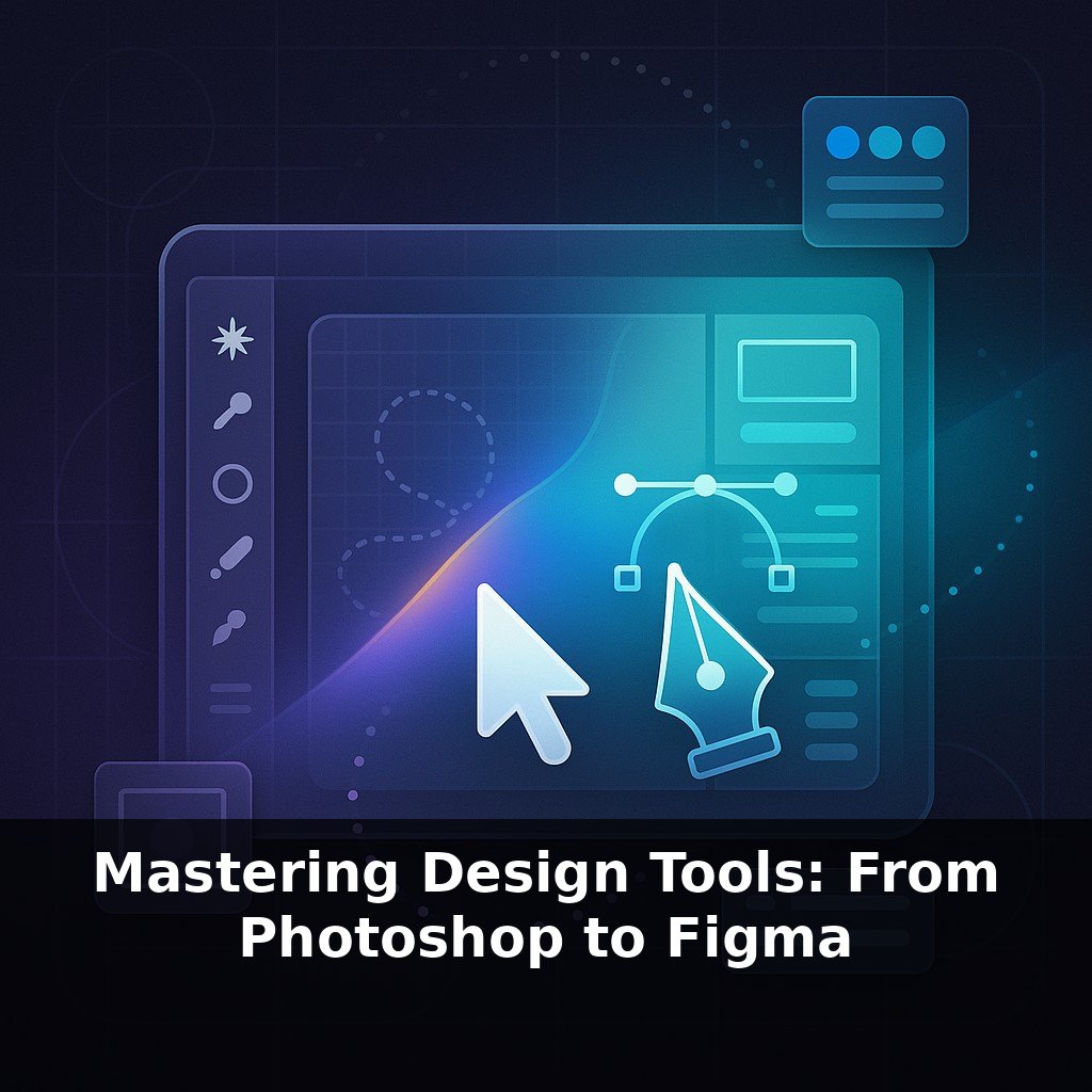
To go deeper, here are 3 next steps: 1) Rebuild one of your recent client projects as a polished design system in Figma using Auto Layout, Components, and Variables—follow along with the free “Design Systems in Figma” playlist on the Figma YouTube channel and compare your file structure to their examples. 2) Level up your visual craft by taking one chapter from Jonny Ive’s *Designed by Apple in California* (or any Apple Human Interface Guidelines section online), recreating a screen in your own style, and then running it through the Contrast plugin and Stark for accessibility and edge-case checks. 3) Set up a professional export pipeline by installing TinyPNG (for compression) and Squoosh (for formats), then use Zeplin or Figma Dev Mode to hand off one existing design to a developer friend and ask them to critique your spacing tokens, naming conventions, and redlines.