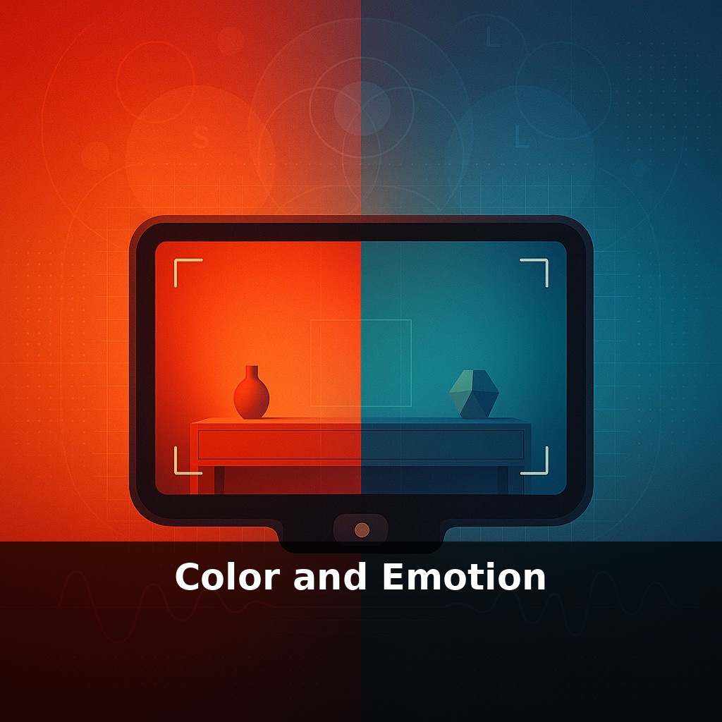
A red wall can make the same room feel warmer than a blue one, even when the thermostat doesn’t move. You lift your camera: same light, same subject, same frame. Change only the color palette—and the emotion in the final photo flips from calm to urgent in a single shot.
A viewer’s eyes never meet your photo as a blank slate; their biology and culture are already biasing the emotional read before they notice the subject. Those S, M, and L cones in the retina don’t just “see” red, green, and blue—they weight them differently, nudging attention toward certain hues and away from others. On top of that, every viewer brings a lifetime of color associations: team jerseys, hospital walls, fast‑food logos, childhood bedrooms. When your frame fills with a dominant color, you’re quietly activating all of that. This is why a muted teal street scene can feel thoughtful while the same scene graded in rich amber feels nostalgic or romantic. The trick isn’t memorizing color rules; it’s learning to predict how a specific palette will land on a nervous system shaped by both physics and experience, then using that prediction on purpose.
Now zoom in from big ideas to small choices: a single slider nudge or wardrobe swap can redirect how someone feels moving through your frame. Research on complementary pairs shows they literally hold the eye longer; that extra 15% of fixation can be the difference between a scroll‑past and a photo that lingers in memory. Warm hues can subtly “heat up” a scene, cool ones can steady it, and tools like Vibrance are tuned to protect skin while intensifying mood elsewhere. In practice, this means you’re not just correcting color—you’re casting emotional “lighting” over every surface, from background walls to the tiniest highlight.
Think less about “favorite colors” and more about *where* each hue sits in the frame and *how* it relates to its neighbors. The eye is naturally pulled toward contrast boundaries—light vs dark, saturated vs dull, warm vs cool—so your emotional message often lives in those edges, not in any single patch of color.
Start with dominance: pick one family to lead the scene, then decide whether the supporting colors should echo it or argue with it. A portrait wrapped in soft, low‑saturation blues with a tiny accent of orange in the eyes or lips will feel very different from the same portrait in mostly neutral grays with a single, sharp red scarf. In both cases, the accent becomes a psychological “exclamation mark,” but the surrounding palette decides whether that exclamation reads as comfort, tension, or drama.
Local color vs. global color is your next lever. Local color is what’s actually there—the green jacket, the beige wall. Global color is what you impose in post: split toning shadows toward teal, pushing highlights slightly pink, or using a subtle LUT that bends everything warmer. Photographers who control mood consistently tend to unify the global palette (for example, all shadows lean cool) while letting only a few local elements break that rule to grab attention.
Pay close attention to saturation distribution. Instead of cranking everything up, try concentrating high saturation in your story areas and letting the rest fall toward muted. Our visual system treats saturation as importance weighting; a desaturated background turns into emotional “silence,” helping the main subject speak louder without shouting.
Real‑world example: many cinematic color grades push skin tones along a narrow, warm band while steering skies and shadows into teal. That separation isn’t just trendy; it maximizes subject isolation and keeps human emotion readable, even in complex environments.
Your histogram won’t tell you this story. The real question when you adjust HSL or calibrate a camera profile isn’t “Does this look correct?” but “Whose feelings am I dialing up—and whose am I calming down—when these wavelengths hit the frame together?”
Think about how different photographers “speak” in color. Saul Leiter often bathed scenes in foggy reds and ambers, letting a single cleaner hue peek through a window or umbrella. The emotional read isn’t just about red feeling warm; it’s about a murky field with one note of clarity, like a whispered secret in a crowded room. Street brands do similar things: Supreme’s stark red box isn’t just loud, it’s *isolated* against neutrals, so your eye has nowhere else to land.
Sports photographers lean on this too. A stadium can be a chaos of jerseys, ads, and turf, yet a well‑timed frame will let one saturated team color cut through a blur of motion, turning strategy into something legible in a fraction of a second. Landscape shooters often chase the opposite: a tight family of greens and earth tones, with the sky nudged slightly off that family so it feels like a quiet counterpoint rather than a shout.
All of these choices live less in theory and more in the tiny, deliberate imbalances you permit inside the frame.
As tools learn to “feel” with us, color becomes less a static choice and more a live dialogue. You might nudge a slider, and software quietly tracks which palettes make you linger, like a Spotify algorithm for hue. In shared spaces—galleries, apps, even smart homes—multiple emotional profiles could clash, forcing systems to negotiate a “group mood.” Expect debates over who owns that dial when a room’s colors can subtly steer focus, comfort, or urgency in real time.
As you refine this, notice how tiny shifts—a cooler shadow, a muted sign, a brighter sleeve—quietly re-order the story, like rearranging chairs at a dinner table so new conversations start. Over time, you’ll stop asking “Which colors look nice?” and start asking “Which emotional thread do I want the viewer to follow first—and which should stay a secret?”
Before next week, ask yourself: “When I walk into my living room/bedroom/desk area, what emotion do the dominant colors make me feel right now—calm, energized, distracted, heavy—and is that how I actually want to feel there?” “If I think about the color I reach for most in my clothes or phone wallpapers, what emotion am I unconsciously choosing over and over (comfort, confidence, playfulness), and where else in my life might I want to invite that same feeling?” “Looking at one space I use every day, which single color tweak (like swapping a gray throw for a warm terracotta pillow, or adding a deep blue mug instead of white) could shift the overall mood closer to what I need this week?”