“Most people think pricing is about picking a number. In reality, the *way* you arrange your prices can quietly double what customers spend. A coffee chain, a software app, and a gym can sell the same thing—yet one earns far more—just by reshuffling its price tiers.”
SaaS benchmarks show something odd: adding more than one way to buy can lift revenue per user by up to 40%, *even when nothing else about the product changes*. That’s the power of price architecture—how you combine packages, tiers, and subtle anchors to guide choices. This isn’t theoretical. A quirky offer from The Economist dramatically shifted readers into a more profitable option; Starbucks quietly nudged millions toward a larger cup that powers over half its coffee revenue. These moves don’t bully customers—they clarify “what’s a good deal here?” and “who is each option for?” Done well, your pricing stops being a static list and becomes a silent salesperson: widening your market at the low end, protecting margins at the high end, and gently steering most buyers toward the option that’s best for both them and you.
Here’s the twist most teams miss: your “good, better, best” isn’t primarily about *features*—it’s about *trade‑offs*. Each step up should trade a bit more money for a lot more relief: less risk, less hassle, less limitation. That’s why three‑tier setups consistently boost revenue: they frame a sensible middle path between “bare minimum” and “all‑in.” Think of how a chef designs a tasting menu: not random dishes, but deliberate progressions that make the next course feel like the natural next step, not an indulgence. Your structure should make the upgrade feel obviously safer than staying small.
Starbucks doesn’t just sell three cup sizes; it sells three different *stories* about yourself: “I’m being sensible,” “I’m treating myself a bit,” and “I’m going all in.” The same drink in a different cup taps a different identity—and that’s where smart architecture lives: at the intersection of math and self‑perception.
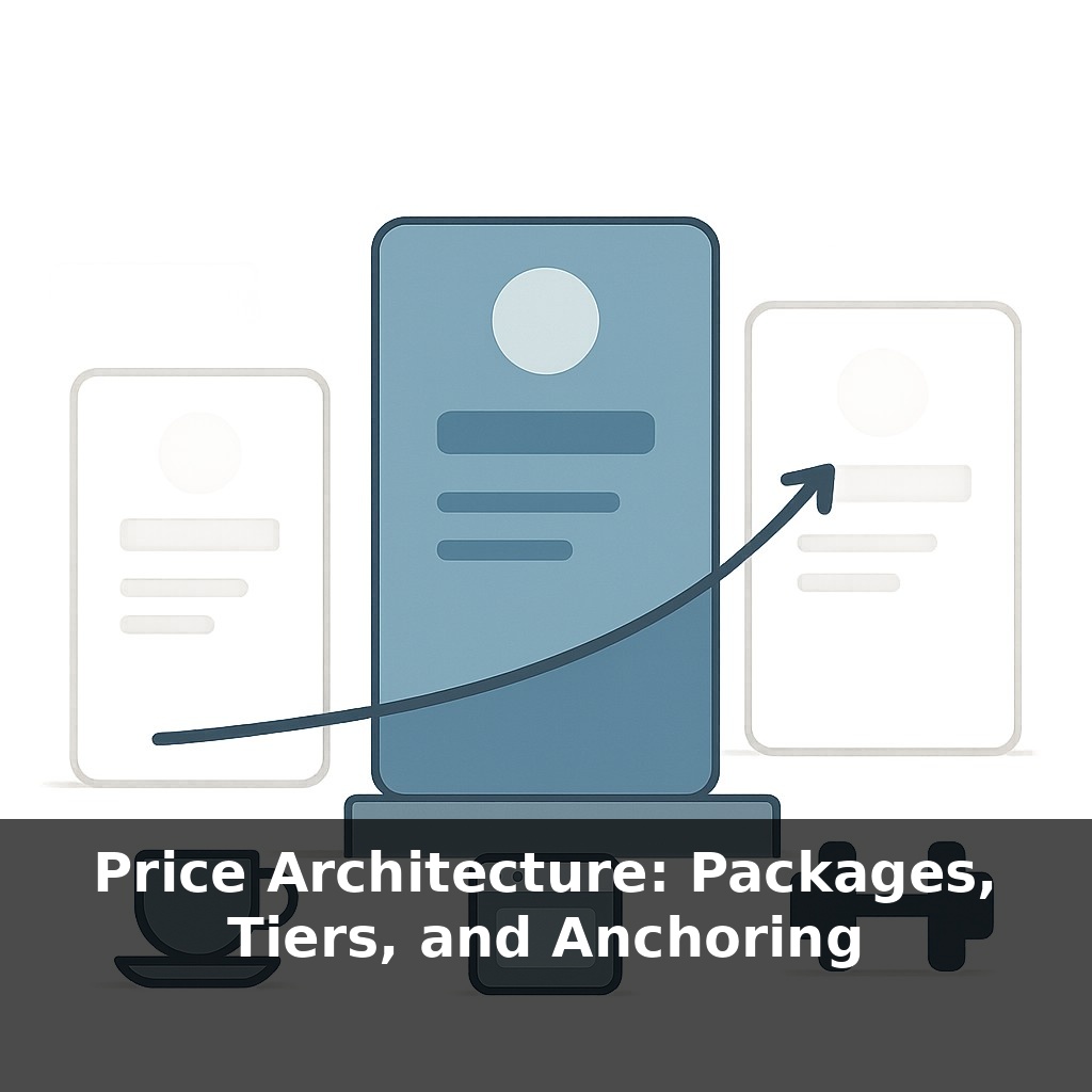
There are three moving parts to design here: what’s inside each option, how those options relate to each other, and which one you quietly want most people to choose.
Start with packages. The mistake is throwing random features together or simply piling more stuff into the higher option. Instead, design around *jobs to be done*. For each segment you care about, ask: “What’s the minimum complete solution they’d happily pay for?” That becomes a package. A project tool might split around jobs like “freelancer managing 3 clients,” “team coordinating across departments,” and “agency reporting to big brands.” Different jobs, different must‑haves, different ceilings.
Next, versioning. Here the question is not “What else can we add?” but “What constraints will push the right customers up a step?” Those constraints can be seats, usage, speed, support, or risk. The trick is to cap the thing that grows with value. If your power users get value from volume, don’t limit cosmetic features; limit volume with grace, then make the jump feel like going from cramped to comfortable, not from cheap to expensive.
Anchors are the context that makes all of this feel reasonable. The Economist’s decoy worked because the “print only” option redefined “expensive” and “fair” in readers’ minds. You can do the same without trickery: a transparent “enterprise” tier with higher price and heavier commitments can legitimize your mid tier and make it feel like a savvy choice rather than a compromise.
Notice how these pieces reinforce each other. Packages clarify *who* each option is for. Versioning creates natural breaking points where upgrading feels like relief, not regret. Anchors frame the whole ladder so the step you want people to take looks obviously responsible, not indulgent.
Your architecture is successful when customers can finish this sentence, unaided: “People like me usually choose… *that* one.”
A boutique gym offers “Class Pass,” “Class + Open Gym,” and “All Access + Coaching.” Notice how each option quietly reframes what “doing it properly” means. The lowest tier feels like dabbling, the middle like commitment, the top like transformation. Members aren’t just buying access; they’re deciding what kind of trainee they are.
Now shift to a meal‑kit service: one plan for “2 recipes/week,” another for “3 recipes + quick lunch add‑ons,” and a top plan for “5 recipes + dinner party box once a month.” Most people don’t sit down with a calculator; they react to the stories each bundle tells about their week—busy couple, food‑curious family, or aspiring home host.
In both cases, the architecture works when customers mentally self‑sort *before* they see details. They scan down the page, think “that sounds like me,” and only then check the price. Your job isn’t to squeeze them upward; it’s to arrange options so the version that truly fits feels like the obvious, self‑respecting choice.
Regulation and tech will quietly reshape how you structure choices. Dynamic bundles may update like weather forecasts—shifting with each user’s behavior and context, not just their segment label. That makes it easier to serve edge cases, but harder to keep things legible and fair. Expect scrutiny over tricks that feel like ambushes, and growing demand for “values‑based” options where ethics, data use, and environmental impact are as visible as features and price.
Treat this like an ongoing design problem, not a one‑time spreadsheet exercise. As your product, costs, and customers evolve, so should your menu of choices. Think less “set it and forget it,” more like tuning a sound system: small shifts in one dial change how everything feels. The real skill is learning to hear what your customers are actually responding to.
To go deeper, here are 3 next steps: 1) Open a fresh Google Sheet and build a 3-tier offer matrix (Good/Better/Best) using the exact structure from Alan Weiss’s “Value-Based Fees” (grab the sample proposals in the Kindle preview or via his site) to map features, outcomes, and prices side by side. 2) Install a pricing page A/B testing tool like Google Optimize (or VWO if you’re on a paid plan) and set up two versions of your pricing page: one with a high “anchor” tier at 3–5x your core offer, and one without, then let it run for at least 200 unique visitors. 3) Read the “Pricing” chapter in *Obviously Awesome* by April Dunford and use her positioning canvas to rewrite the headline and value bullets for each tier, then plug them into a live landing page builder like Carrd or Webflow and publish a test-ready pricing page today.