A museum study found people stared longer at photos with strong composition—even when they didn’t like the subject. Now picture scrolling your feed: some shots grab you instantly, others vanish in a blur. Today, we’re going to quietly hijack that first glance.
That “quiet hijack” of attention doesn’t happen by accident—it starts before you even lift your phone. Most people see something interesting, raise the camera, and tap the shutter. Composed images flip that order: you decide what the viewer should notice first, second, and last, then arrange everything in the frame to support that path. Think of it less like “taking” a photo and more like “directing” a tiny, silent scene. Where will their eyes land? Where do they travel next? What do you want them to feel when they pause there? On a busy street, that might mean stepping three paces left so a crosswalk points toward your subject. At home, it might mean shifting a coffee cup so it doesn’t steal attention from a face. Composition turns random moments into deliberate experiences.
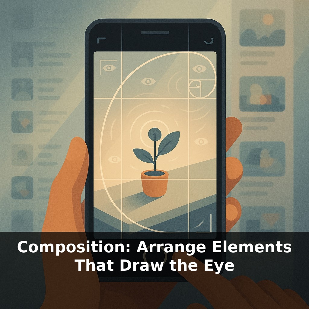
On a phone screen, you’ve got maybe a second before a thumb flicks past. In that blink, your viewer’s eyes don’t wander randomly—they snap to contrast, edges, and patterns first. Eye‑tracking studies back this up: people trace bright lines, bold color shifts, and clustered shapes almost like following a route on a map. That means what’s in your frame matters, but where you place it matters just as much. A red umbrella in the corner feels like an afterthought; move it where natural “traffic” flows, and it becomes a deliberate stop on the viewer’s visual journey.
Think of the frame as a tiny stage: every element either supports your main actor or distracts from them. Start by quietly asking, “What is this photo *really* about?” That answer is your protagonist. On a busy street, it might be one person’s expression, not the whole crowd. At a café, it might be steam curling from a mug, not the entire table. Once you’ve picked that core, everything else becomes negotiable.
Now decide where that subject should sit. The classic rule of thirds—placing key elements near the intersections of a 3x3 grid—still works beautifully, but it’s not your only option. Try three simple layouts:
1) **Commanding center** Center your subject when you want formality or stillness: a doorway, a portrait, a plate of food seen from above. For extra impact, echo shapes around it—arches, windows, or even lamp posts forming a loose frame.
2) **Dynamic off‑center** Slide your subject to one side and let something else balance it: a block of shadow, a patch of bright sky, a splash of color. Asymmetry feels alive because the frame looks like it’s mid‑motion, not frozen.
3) **Deep path** Use floors, roads, fences, countertops—anything that recedes—to subtly pull the viewer inward. Stand where those lines angle *toward* your subject, not away from it, and adjust your height until the path feels clean and uninterrupted.
Next, deliberately remove clutter. Before tapping the shutter, scan the edges of your screen: stray bags, half faces, poles “growing” out of heads. Shift your feet, tilt slightly, or zoom a touch to either fully include or cleanly exclude them. Empty areas aren’t wasted; negative space can amplify mood—airiness, loneliness, quiet focus—depending on how much you leave.
Finally, treat color as a spotlight. A single warm element (red, orange, yellow) against cooler surroundings (blue, green) becomes an instant anchor. On your phone, tap to focus on that anchor and nudge exposure a bit darker; richer contrast often makes the arrangement feel intentional, not accidental.
Think of each element in your shot as having “visual weight.” A bright jacket, a bold sign, a patch of sky—some things are heavy, some are light. Your job is to keep the picture from tipping over. On your phone, try this: aim at a friend standing by a colorful wall. Take one photo with them small at the bottom edge and a huge blank wall above. Then take another where their head is near the top third, and a chair or window fills some of the lower space. Compare how stable each frame feels.
Now play with mood. Put your subject small in a wide, empty area—like a single person on a beach—to lean into quiet or isolation. Fill the frame with overlapping faces or objects when you want energy and tension. Use color contrast as a shortcut: a single red object in a sea of blues will pull attention first, but you can soften that grip by adding a second warm element elsewhere so the eye bounces between them instead of getting stuck. Over time, you’ll start to feel when the scene “clicks” into balance.
Future tools will feel less like grids and more like gentle co‑pilots. Your phone might ghost in alternative layouts as you move, highlighting options that match your style—moody, clean, or chaotic—almost like a sous‑chef laying out ingredients so you choose the final dish. In AR glasses, you could pin “hotspots” in real space, testing how people would flow through a scene before you even lift a camera, turning everyday walks into live composition practice.
Treat each scene like a question instead of a trophy: “What happens if I crouch? If I crop half the skyline? If I let that reflection steal the spotlight?” Shift your phone a few inches as if tuning a radio; when shapes, colors, and gaps suddenly feel like they’re humming together, that’s your cue to tap—and see what the image is really saying.
Here’s your challenge this week: Choose one everyday scene (your desk, kitchen counter, or a corner of your living room) and create three different photo compositions of it: one using the rule of thirds, one using leading lines, and one using framing. For each version, physically move at least twice—change your height (stand/sit/crouch) and your angle (shoot straight on, then from a diagonal). Take at least 15 shots total, then pick your favorite 3 and note where your eye goes first and which compositional choice pulled you in most.