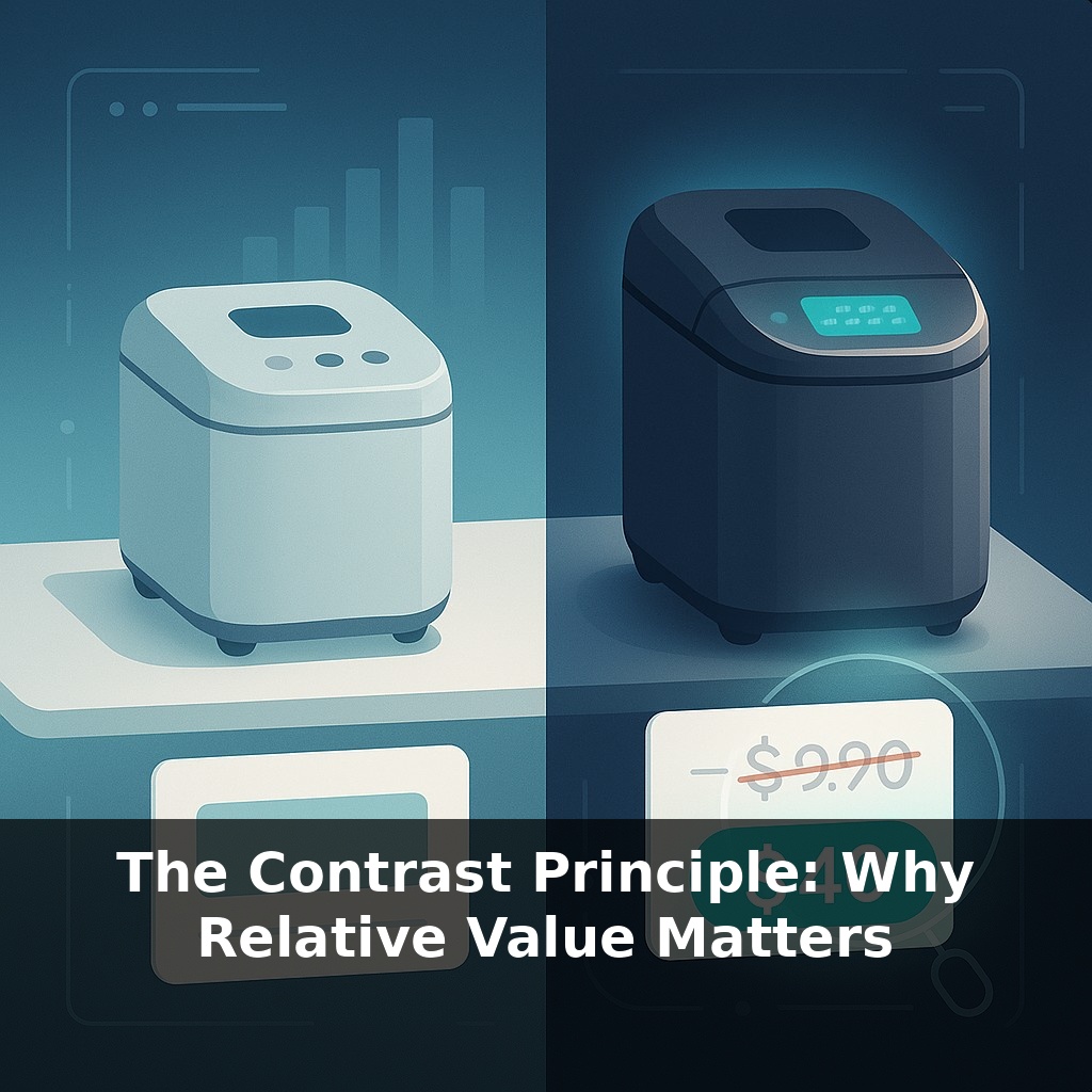
An almost-ignored bread maker quietly changes everything. Williams-Sonoma adds a fancier, pricier version—hardly anyone buys it, yet sales of the original model nearly double. Same machine, same price. Here’s the twist: the only thing that changed was what shoppers could compare it to.
68% of U.S. online shoppers say they lean on list-price discounts to judge value. Not features. Not materials. Not even reviews. A crossed-out “$199” next to “$99” quietly does more work than a page of marketing copy.
In this episode, we zoom in on that hidden comparison engine in your head. You’re not just reacting to a price—you’re reacting to what it’s sitting next to: the “regular” price above it, the premium version to its right, the cheaper option you just scrolled past.
Marketers know this. That’s why you’ll see “compare at” prices, oddly expensive “deluxe” tiers, and bundles that exist mainly to make another option feel smart. We’ll look at how these contrasts push decisions, how regulators are starting to push back, and how you can use the same principle ethically in your own pricing.
Marketers aren’t guessing about these effects—they’re measuring them. In Dan Ariely’s MIT experiment, a nearly useless “print-only” option quietly steered most people toward a more profitable bundle. Williams-Sonoma’s higher-end bread maker did the same job in retail: it served as a silent anchor, nudging shoppers toward the mid-tier choice. Behind the scenes, neuroscientists see the brain’s value circuits light up differently depending on what shows up first on the page, like your salary feeling huge or tiny depending on the offers you’ve seen just before it.
Here’s the uncomfortable part: your brain doesn’t wait for you to “decide” how much something is worth. It quietly grabs the nearest reference point and uses it as a shortcut—long before you feel like you’re weighing pros and cons.
That’s why the order in which options appear matters so much.
Show a $2,000 coaching program first and a $500 workshop feels almost trivial. Reverse the order—start at $99, then $249, then $500—and that same $500 suddenly feels serious. Nothing about the workshop changed; only the path your mind took to reach it.
Product teams and founders exploit this with sequencing:
- On SaaS pricing pages, the annual plan often appears with a bold “Best value” tag, flanked by a clearly worse monthly plan. The layout isn’t random; it trains your eye where to land. - In ecommerce, you’ll often see a conspicuously high “first” option when filtering by price. By the time you scroll to the middle, your sense of what’s “normal” has already shifted upward.
A single outlier can tilt the entire frame. Add a $9.99 in-app “pro-plus” upgrade above your $4.99 “pro” tier, and many users will suddenly experience $4.99 as reasonable instead of pricey. Remove it, and $4.99 regains its sting.
This isn’t limited to price. Relative cues shape how we read *quality* too:
- In app stores, a 4.3-star rating looks mediocre next to a 4.8—but strong next to a row of 3.6s. - In marketplaces, a product photo shot on a clean background looks premium when every other seller uses dim, cluttered images.
The effect stacks when multiple signals line up: a mid-range price, slightly better visuals, a modest but higher rating than neighbors. Together, they form a “this is the smart choice” impression without a single persuasive sentence.
One useful mental model is a financial order book: the “best bid” and “best ask” define the market at any moment. Move those top levels, and every other quote suddenly feels cheap or expensive. In pricing, your highest and lowest visible options set that perceived market for everything in between.
The ethical question isn’t *whether* you’re shaping these reference points—you always are. It’s whether you’re doing it transparently, in a way that would still feel fair if a customer saw exactly how you designed the page.
A good way to *see* relative value in action is to step outside pricing for a moment. Think about travel time: a 20‑minute delay on a 30‑minute flight feels outrageous; the same 20 minutes tacked onto a 10‑hour haul barely registers. The delay is identical, but your reference frame quietly rewrites its meaning.
The same thing happens when you launch or reposition products:
- Release a stripped‑down “starter” feature set first, and your later “standard” tier will be judged against that baseline. Release an overbuilt flagship first, and even modest cuts in the next tier down will feel like bargains. - Change the *neighborhood*, not just the number. Put your course beside $29 mini‑workshops and it signals one thing; place it next to a $5,000 cohort‑based program and it signals another, even at the same price.
One practical test: before publishing a page, blur your eyes and look only at the order, spacing, and *gaps* between options. Those gaps are doing more persuasive work than any individual number.
Regulators are starting to treat reference points like ingredients labels: not just “what’s the price?” but “what are you mixing it with?” As AI learns your habits, it can show you a “normal” that’s calibrated to your past splurges or frugality, then slide new offers just above or below that line. In AR, you might drop a virtual laptop onto your desk and instantly see it auto‑lined up against pricier or cheaper models nearby—a live “market” rendered on your coffee table. The real power move will be choosing which benchmarks you *don’t* show.
Your brain will keep hunting for anchors, even when none are obvious, so you’ll start inventing them: “last time I paid X,” “this feels like a splurge,” “my friend got hers cheaper.” It’s like checking street signs in a foggy town—half‑visible, slightly wrong, but still guiding you. The more you notice those homemade benchmarks, the less they quietly steer you.
To go deeper, here are 3 next steps: 1) Watch Dan Ariely’s TED Talk “Are we in control of our own decisions?” and pause at each pricing example to list 3 ways you could “reframe” how you present your own product/service (e.g., adding a decoy option or a high-anchor package). 2) Open up your favorite shopping site and install the free “Keepa” or “CamelCamelCamel” price tracker, then track 3 items you want for a week to see how the “original price” vs “current deal” contrast is actually manipulated over time. 3) Grab Robert Cialdini’s *Influence* (focus on the “Contrast Principle” section) and compare his examples to one real sales page you visit today—then note exactly where they use anchoring, decoys, or strike-through prices and how it changes your felt sense of value.