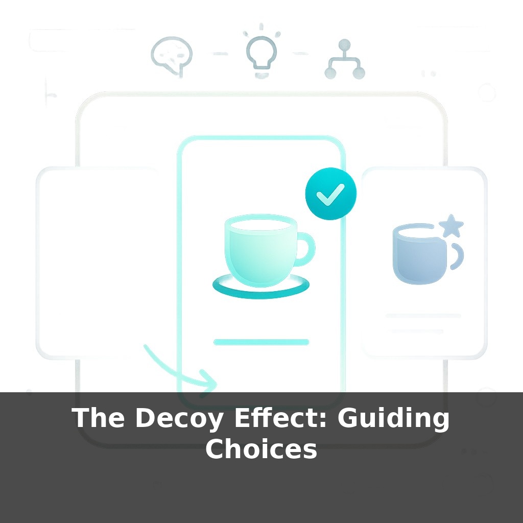
A nearly ignored option on a menu can quietly change what most people order. You glance at three coffees, three software plans, three gym memberships—one is clearly worse, yet it rarely sells. Here’s the twist: that “loser” might be steering almost everyone’s choice but yours.
Huber and colleagues found something wild back in 1982: simply adding one inferior option nearly doubled how often people picked the “target” choice. Since then, versions of this pattern have shown up from magazine subscriptions to cameras—and now, in almost every SaaS pricing page you scroll past.
In Episode 2 we touched on how one cleverly placed option can tilt your sense of value. Here, we’re going deeper into how tech companies quietly weaponize that tilt. Think of how often you see three plans: “Basic,” “Pro,” and “Enterprise.” The middle one suddenly looks like “smart value”—and that’s rarely an accident.
This episode isn’t about spotting a trick once; it’s about training your eye. We’ll look at how modern pricing tables, feature bundles, and even coffee sizes are engineered to guide your click—and how you can use the same mechanics ethically in your own offers.
In tech, decoys don’t just sit in product grids—they show up in how limits, bonuses, and “coming soon” labels are arranged around each tier. One plan quietly caps the features you actually care about; another flaunts generous thresholds and a few prestige perks, like priority support or AI tools. The decoy becomes a kind of price lighthouse: it marks what “too little” and “too much” look like so your brain settles on “just right.” You’re not only choosing a plan; you’re choosing an identity—starter, serious, or power user—and the page is scripted to make one identity feel inevitable.
In tech, the most effective decoys aren’t random “extra” plans; they’re built by carefully choosing *which* dimension to make obviously worse and *which* to quietly highlight. Researchers call this an “asymmetric dominance” setup: the decoy loses clearly to your profitable plan on the attributes that matter, but looks similar enough that comparing them feels natural. The real art is picking those attributes.
For B2B SaaS, that’s often: - Seats or active users - Storage or usage caps - Response time / support level - Access to “status” features (SSO, audit logs, AI add‑ons)
Instead of stripping everything from the decoy, smart teams downgrade just one or two high-salience levers. The rest is left looking respectably close. This keeps it from feeling fake while still making your target plan feel like “obvious value.”
Huber’s early work showed meaningful jumps in choice share, but modern experiments in digital interfaces add nuance: - The effect grows when people are rushed or distracted (mobile checkout, in‑app upgrades). - It weakens when users can easily sort or customize plans, because they escape the frame. - With sliders or usage-based pricing, the “decoy” can be an auto-suggested configuration rather than a full plan.
Notice how many tools now surface three configurations of *the same* product: “Recommended,” “For teams,” “For power users.” The middle one often isn’t a separate SKU; it’s a prefilled set of toggles. Still, it plays the same role: one setup is clearly cramped, another feels padded with extras you won’t use, and the preselected one looks just right.
From an experimentation standpoint, this is gold. You can A/B: - Which feature becomes the scarcer, painful tradeoff in the decoy - Whether the decoy is priced near the target or slightly above it - How labels (“Most popular,” “Best for startups”) shift where people land
The ethical line shows up in *how hidden* the tradeoffs are. When the decoy transparently exposes what you’re giving up or gaining—better support, stronger security, lower environmental impact—you’re helping people align choices with their real priorities, not fabricating them.
A streaming startup tests three plans: “Lite,” “Standard,” and “Cinephile.” Lite is cramped on devices and resolution; Cinephile adds festival films and early releases most viewers don’t recognize. Standard quietly includes the everyday wins—no ads, downloads, 4K on main devices. In experiments, the founders notice Standard’s share climbs when Cinephile is only slightly pricier but stuffed with niche perks. Subscriptions rise, churn falls, and support tickets drop because “it just feels like the right plan” for most people.
Travel sites play similar games. One airline surfaces three bundles for the *same* seat: “Saver,” “Flex,” “Max.” Saver quietly buries change fees; Max throws in lounge access and priority everything. Flex suddenly looks like the practical traveler’s move, even if you hadn’t planned to pay for flexibility. Over time, revenue shifts upward—not by forcing anyone, but by choreographing where “reasonable” seems to land.
Decoys won’t stay static. As pricing gets personalized, you may find “ghost rivals” created just for you—plans tuned to your budget, past clicks, even time of day. Like a GPS quietly rerouting you, the interface can keep steering you back toward a higher-margin lane while still feeling like free choice. That cuts both ways: consumer tools could soon flag lopsided options, and regulators may ask, “If this choice vanished, how many people would actually miss it?”
When you design offers, test swapping which plan plays the “odd one out” and watch how behavior shifts, like adjusting ingredients in a recipe until the flavor clicks. As a buyer, treat any trio—apps, flights, laptops—as a hint to zoom out: ask, “If I only saw two choices here, would this still feel like the smart move, or am I being gently steered?”
Before next week, ask yourself: Where in my life right now am I choosing the “middle option” (subscription plan, menu item, product tier, even a project at work) mainly because it feels safest or most reasonable—if I removed the highest-priced or most extreme option, would I still pick it? The next time you face three choices (like Basic / Plus / Premium), can you pause and ask, “Which of these is the ‘decoy’—the one that only exists to make another option look better—and what would I choose if that decoy vanished?” When you’re presenting options to someone else (a proposal at work, package options for a client, or even choosing where to go with friends), could adding or removing a “decoy” option help guide them toward the choice that’s genuinely best for both of you?