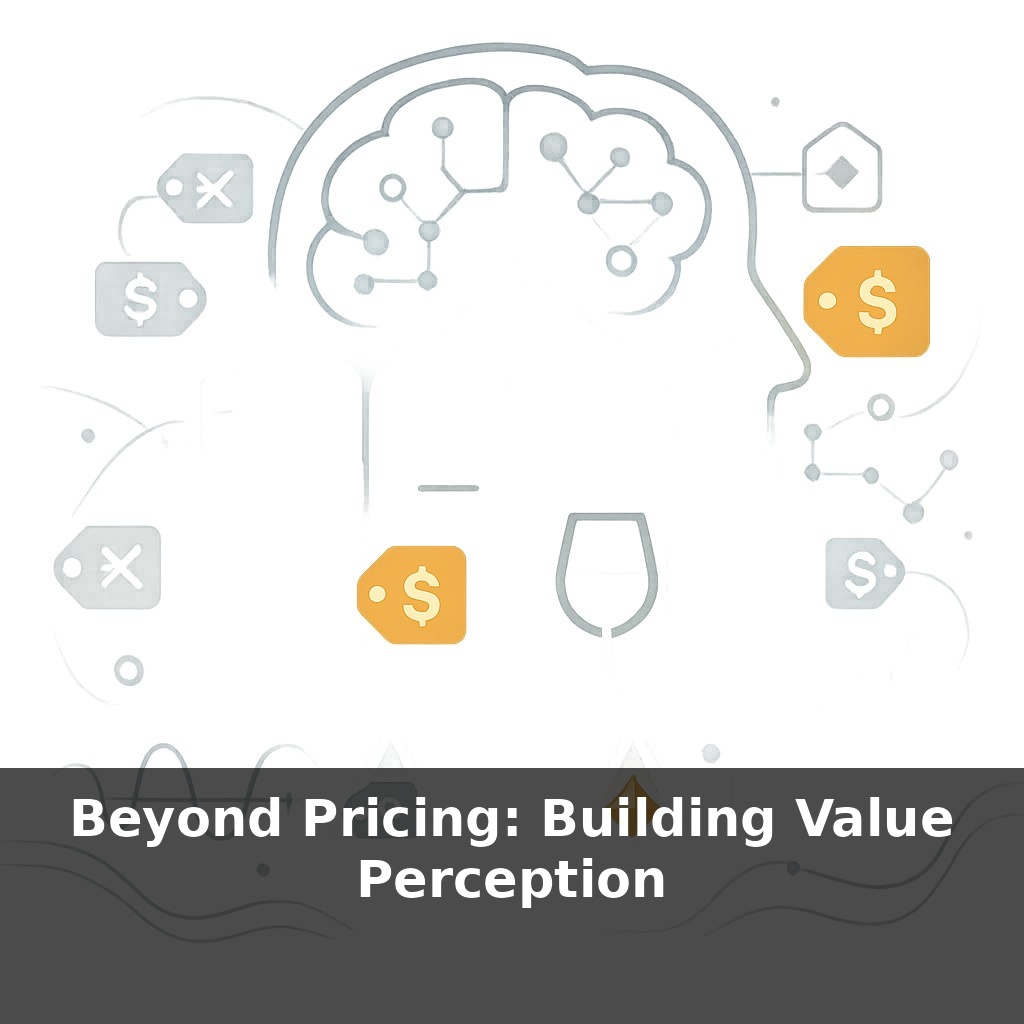
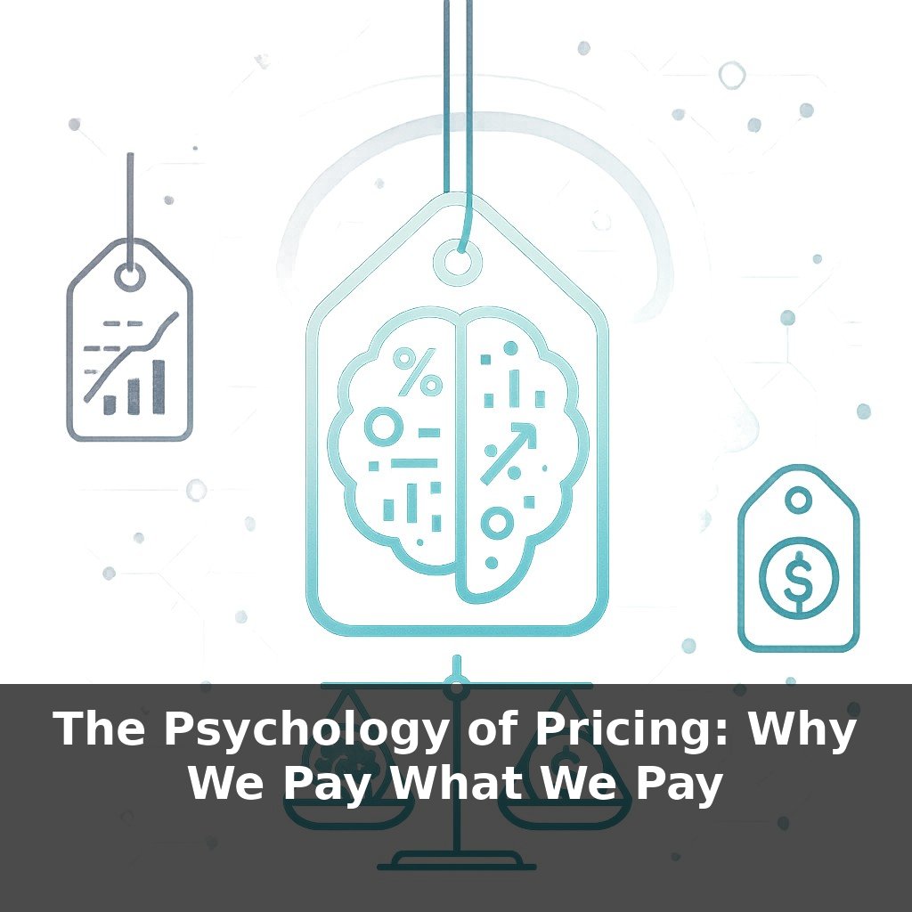
A cheap bottle of wine labeled with a higher price suddenly “tastes” better to most people. In this episode, we drop into three everyday moments—a phone launch, a jacket ad, and a simple wine test—to unpack how brands quietly turn ordinary products into must-have treasures.
Apple earns roughly 55% gross margin on each iPhone. That isn’t just pricing power—it’s proof that buyers feel they’re getting a deal even when they’re paying a premium. In this episode, we shift from “What should this cost?” to “Why does this feel worth it?” and dig into the mechanics behind that feeling.
You’ll see how Patagonia could run a “Don’t Buy This Jacket” ad and still grow revenue by about 30% that year, why a $5 wine labeled $45 literally lights up the brain’s reward centers, and how a reported 66% of consumers saying they’ll pay more for sustainable brands (Nielsen, 2022, worth double‑checking) reshapes smart pricing strategy.
We’ll connect these dots into a practical playbook: aligning product, story, and context so that your price becomes the least interesting part of the offer.
Think of value perception as a stack, not a single lever. At the base, you have core outcomes: does this save 2 hours a week, increase revenue 10%, or last 3× longer than alternatives? On top of that sits proof: 4.8‑star ratings from 3,200 reviews, a 27% lower defect rate, or a 92% renewal rate. Then come emotional and social layers: status, identity, values alignment. When these layers line up, a $300 product can feel like a “steal” next to a $99 rival, even when specs look similar on paper. Your job is to deliberately design and signal each layer so the final price feels obvious.
Think of three levers you can pull beyond the price tag: what people see first, what they compare you to, and what story their brain completes in the gaps.
First: what they see first. Behavioral economists call this anchoring, and it’s brutally practical. A $49 plan framed next to a $179 “business” plan feels cheap; the same $49 next to a $9 “starter” suddenly feels pricey. In SaaS, simply leading with a $199 “Pro” tier can push 20–40% of sign‑ups there, even when most users don’t need every feature. Retailers do it physically: a $900 coat placed beside a $2,400 one becomes the “sensible” choice. Your initial anchor doesn’t just set expectations; it redefines what “expensive” means in your category.
Second: what they compare you to. People almost never evaluate a price in isolation; they run quick, fuzzy comparisons: “Cheaper than hiring,” “More than my gym,” “Same as three Ubers.” You can steer that comparison. A B2B tool at $600/month can be framed against “one freelance designer day rate,” not “another $49 app.” A coaching program at $1,500 might explicitly contrast itself with a $20,000 degree. The comparison you highlight becomes the reference ROI in the buyer’s head.
Third: the story their brain completes. Neuroscience work on prediction and reward shows that when the “surface signals” of quality line up—weight, materials, typography, responsiveness—the brain starts predicting a rewarding experience before it happens. That prediction alone increases willingness to pay. When Apple spends extra cents on haptics, or a DTC brand chooses thicker cardstock for packaging, they’re not being precious—they’re feeding micro‑evidence into that prediction engine. Ten or twenty such cues can quietly justify a 30–80% higher price without a single line of copy.
Your task is to engineer these three levers to be internally consistent. If your price sits in the top 20% of the market, your anchors, comparisons, and cues all need to point “top 20%.” A $200 product arriving in a flimsy polybag, or a “premium” plan hidden below a giant “Basic” banner, introduces friction: the story and the number don’t match, and perceived value collapses.
A boutique coffee subscription charges $39/month while grocery beans cost $12. Instead of justifying the gap with flavor notes, they show a 3‑step journey: $4 goes to above‑market farmer pay, $6 to small‑batch roasting, $3 to compostable packaging. A simple diagram in the checkout flow reframes $39 as “fairly allocated,” lifting plan uptake by 18% versus a generic “premium” pitch.
In B2B, a $12,000 analytics tool can feel untenable if it appears as a line item. One founder reframed it in the proposal as “0.6% of your $2M ad spend,” then added a mini‑case: “Client X cut wasted spend by 9% in 90 days.” That ratio plus a concrete win shifted close rates from 14% to 27%.
In travel, a $280/night hotel can stack cues: a pre‑arrival SMS with local tips, a 2‑minute mobile check‑in, and a 10 a.m. “late checkout unlocked” message. Even if the room is standard, guests often rate “value for money” 4.6/5+, because the stay feels orchestrated rather than incidental.
AI and tokenization will force you to operationalize value perception, not just talk about it. Dynamic offers will expose gaps instantly: if two users see a 40% price spread with no credible narrative, churn will spike. Start designing “value receipts”: short, data‑backed summaries of what a buyer got last month (e.g., “12 hours saved, 3 bugs avoided, $940 protected”). As regulations tighten, being able to quantify and surface this monthly will become a core pricing capability.
Your challenge this week: redesign one touchpoint to make value unmistakable. Add a post‑purchase “value summary” email that lists 3 concrete gains (e.g., 2 hours saved, $147 refunded, 3 issues prevented). Run it for 14 days with 50–100 customers, then compare upsell take‑rate and NPS against a control group that gets the old flow.