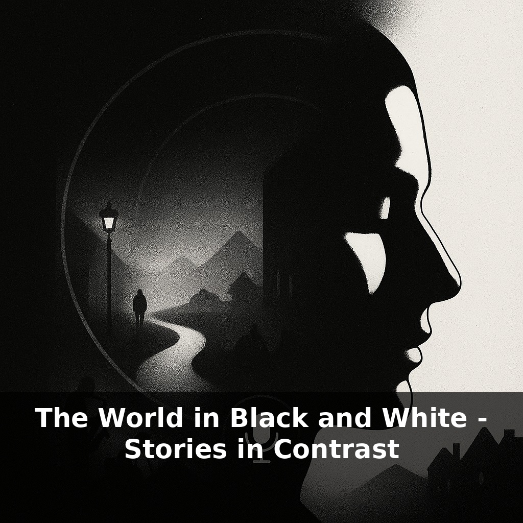
A single missing element—colour—can make a photograph feel more real. A Rochester study found people judged black‑and‑white portraits more “authentic” than colour. Think of a war photo, a jazz club, a quiet street at night: in monochrome, the story suddenly sharpens.
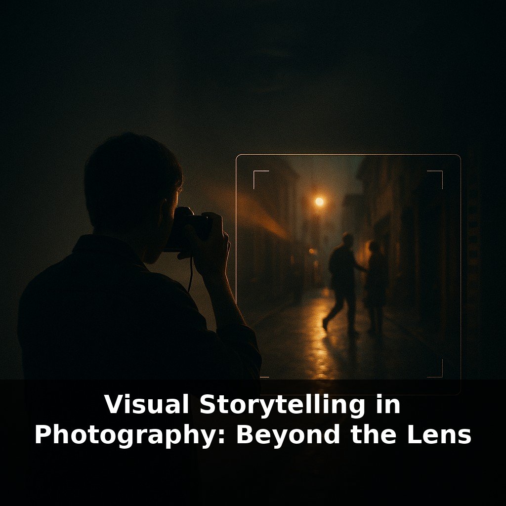
Photographers have always known this intuitively. Ansel Adams didn’t just “take” landscapes; he engineered them in the darkroom, spending most of his time reshaping light so a viewer’s eye would travel through the frame like a guided tour. Sebastiao Salgado uses grain, contrast and misty highlights to turn crowded scenes into something that feels both epic and intimate, like standing on a cliff edge watching a storm roll in. Modern tools quietly extend that tradition: 14‑stop sensors squeeze detail out of blazing skies and murky alleys, while apps let you nudge one shade of grey without touching the rest—more like sculpting than editing. Street shooters, wedding photographers, even smartphone users now lean on these controls to strip away distraction and clarify story, turning everyday moments—a bus window, a rainy sidewalk, a tired commuter—into small, self‑contained dramas.
Street photographers know this: when a scene feels flat in colour, switching to tones can suddenly reveal stories hiding in plain sight. Rain on a café window turns into a lattice of highlights; a wrinkled hand on a bus pole becomes a map of lived years. Sports shooters use it to turn a chaotic stadium into a single duel of expressions; wedding photographers use it when décor and outfits clash, but emotions run clear. Even with a phone, flipping to a monochrome preview changes how you move: you start hunting for silhouettes, reflections, lines and textures—like tracing the grain of a wooden table to discover where the knots and scars really are.
Think about what actually changes, frame by frame, when you commit to a world without colour. Your priorities reorder themselves. The first is luminance hierarchy: which areas are allowed to glow and which must recede. This is where those 14–15 stops of dynamic range become narrative tools, not tech specs. You’re no longer asking, “How do I keep this sky blue?” but “Should the sky be the brightest voice in this scene, or just a whisper behind the subject?”
The second is texture. In colour work, a red door on a grey wall is already interesting. Strip hue away and you suddenly need more: peeling paint, scuffs near the handle, a faint reflection in the metal. Detail becomes plot. That’s why Tri‑X earned its legendary status—not just for sharpness, but for how its grain turned surfaces into characters. Modern sensors and dedicated monochrome bodies push that further; when every pixel only cares about brightness, edges, pores, wrinkles and fabric weave gain a kind of ruthless clarity.
Then comes separation: how you avoid letting your subject dissolve into background mush. Without hue contrast, you lean on three main levers:
- Light direction: side‑light to carve faces, backlight to rim a silhouette. - Tonal contrast: making sure skin doesn’t match the wall behind it in brightness. - Depth cues: mist, blur and distance to peel layers apart.
Sebastião Salgado often lets distant elements fade into soft greys while keeping foreground figures etched and deep; you can mimic that with graduated adjustments or careful exposure, deciding which planes of the story should feel close enough to touch.
All of this affects timing. Colour shooters might wait for a red bus to enter the frame; you wait for someone to step from shade into a patch of sun, or for a cloud to dull a distracting highlight. The decisive moment becomes a decisive shift in tone.
Your tools now act like conversation partners. A B&W mixer or channel‑based conversion is less about “cool look” presets and more about asking, “If I darken everything that used to be blue, do the clouds become threatening or serene? If I lift the old ‘green’ values, does the park turn into a bright stage for the lone figure on the bench?” The same capture can tell entirely different stories depending on how you answer.
A foggy pier at dawn looks dull in a quick snapshot. But slow down and treat it like a story: wet planks catch faint highlights, railings repeat into the distance, a lone figure at the end breaks the rhythm. In a colour frame, you might care about the hue of the jacket; in tones, you’re deciding how strongly that silhouette interrupts the pattern of posts and planks—how loud their presence “speaks” in the scene.
Consider Ansel Adams’s approach to mountains versus Sebastião Salgado’s approach to miners. Adams often let snowfields glow while rock faces brooded in darker values, making peaks feel untouchable. Salgado, photographing workers emerging from pits, often kept their faces and hands just a step brighter than the surrounding gloom, so effort and exhaustion became the visual climax.
Analogy: walking a forest path at dusk, your eyes adjust; you start noticing edges of leaves, spacing of trunks, patches of sky. The world hasn’t changed—only what your vision now treats as important.
As feeds overflow with hyper-saturated images, choosing B&W becomes less nostalgia and more signal: “slow down, this matters.” Expect brands to reserve it for campaigns about memory, loss, or resilience, the way museums dim lights to make visitors lean in. AI tools will soon suggest tonal “edits” in real time, but the meaningful question shifts from *can* the software separate tones to *why* this separation serves the story you want a viewer to remember tomorrow.
Treat this “world in black and white” as a lab. Each frame is a small hypothesis: if I shift this tone, does the mood tilt toward tenderness or tension? Like rearranging furniture before guests arrive, you’re quietly steering how someone will move through the scene. The story isn’t just what you show, but how boldly each shade chooses to speak.
Try this experiment: For the next 24 hours, deliberately narrate your day in “black and white” terms out loud three times (e.g., “This meeting is a total disaster,” “I’m either a great parent or a terrible one”) and then immediately force yourself to add at least two “shades of gray” details that complicate the story. For example: “This meeting feels like a disaster, but two people nodded along and I learned exactly where the plan is weak.” Keep a running tally (on your phone with a simple counter app) of how many times you catch yourself in all-or-nothing thinking. At the end of the day, look at that number and ask yourself: “If my life were only this black-and-white version, what rich details would I have completely missed today?”