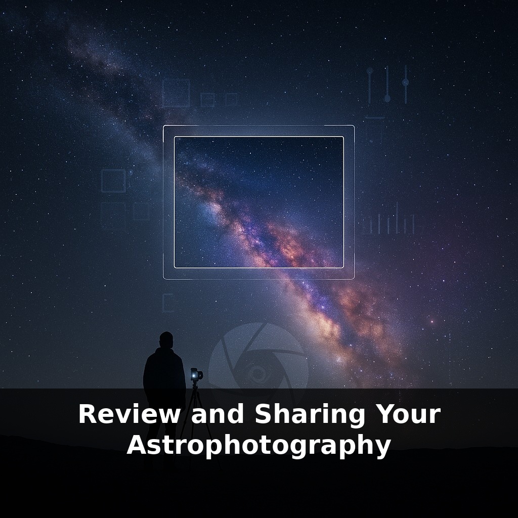
Most people on this planet will never see the Milky Way with their own eyes—yet millions stare at it online every single day. You’re out under a dark sky, camera clicking away, but the real magic? That happens later, when you decide which single frame the world gets to see.
Two million people load NASA’s Astronomy Picture of the Day, every single day—yet each image started as “just another stack” on someone’s hard drive. The leap from raw data to share‑worthy astrophotography isn’t about having the biggest telescope; it’s about what happens after you pack up for the night. Review, revision, and sharing turn a personal snapshot into something that can teach, inspire, or spark curiosity in strangers who may never stand under a truly starry sky.
In this episode, we’ll explore how to look at your own images with a critical but kind eye, how to use communities like AstroBin and Reddit for specific, actionable feedback, and how to decide when a work‑in‑progress is ready for the wider world. Think of it as learning to “edit with intention” so that each photo tells a clearer story of the universe—and of your growing skills.
Some of the most striking space images you’ve seen were once cluttered, crooked, or oddly colored on someone’s monitor. Between that first rough look and the final upload lies a quiet sequence of decisions: which frames to keep, which details to emphasize, what story the final image should tell. Online platforms become less like galleries and more like labs, where you can test different versions, gather reactions, and spot patterns in what people respond to. Over time, those reactions shape not just a single image, but your eye for what’s possible in your own data.
Two people can start from the same stack and end with completely different results—one muddy and flat, the other crisp and luminous. The difference isn’t secret software tricks; it’s how deliberately they move through the review and refinement cycle.
Start by separating “first impression” from “forensic inspection.” On first impression, shrink the image and squint a little. Does anything jump out? A crooked horizon, a lopsided composition, a color cast that makes the whole frame feel off? At this stage, you’re judging the overall feel, not the tiny stars at 400% zoom.
Then switch to forensic mode. Zoom way in and pan slowly across the frame. Look for guiding errors (oval stars in one corner), gradients from light pollution, dust motes, or banding. Make a mental note—or better, a short list—of issues you actually want to fix. This keeps you from randomly sliding sliders and hoping for magic.
Next, compare versions, not memories. Save clear checkpoints: “linear stretch,” “first color balance,” “noise‑reduced,” “final contrast.” Toggling between them trains your eye; you’ll start to see when you’ve pushed saturation too far or crushed faint detail with excessive contrast. Over time, those comparisons become your personal style guide.
This is where community can accelerate everything. Instead of posting “Thoughts?” with a single JPEG, share a small progression: early pass and current best, plus two or three specific questions—“Are the star colors believable?”, “Does the background look too smooth?”, “Is the framing working?” Focused questions invite focused answers and discourage drive‑by judgments.
Pay attention not only to what people say, but to what they respond to. On platforms with technical voting or “likes,” you might notice that images with careful star color get more traction than those with extreme saturation, or that slightly wider crops invite more engagement because viewers can “breathe” in the scene.
Treat each upload as data about your own decisions. Did a bolder crop get more saves but also more critique on noise? Did a more restrained version quietly outperform your neon experiment? Patterns like these refine your taste—and your next night under the stars will be guided by lessons collected while you were back at the keyboard.
Think of your image progression like developing software. Version 1.0 “works,” but versions 1.1, 1.2, and 2.0 gradually patch bugs, improve performance, and refine the interface. Early on, you’re fixing obvious “crashes”: blown‑out cores, crooked framing, harsh gradients. Later versions target subtle UX issues—how a viewer’s eye travels through the frame, whether colors feel natural enough that they disappear and the subject takes over.
Look at how top AstroBin or Instagram imagers release “before/after” or “v1 vs v3” posts. They’re not just flexing skill; they’re documenting a changelog. You’ll notice choices like softening stars to emphasize dust lanes, or easing off saturation so tiny galaxies pop out of the background. Try this: make two competing “final” edits with different priorities—one for drama, one for realism. Post both, clearly labeled, and ask which tells a clearer story of the target. Over time, that public A/B testing becomes your personal roadmap, revealing not only what others prefer, but what you’re most proud to put your name on.
Two million people may see a single space photo in a day, but the most important viewer is still you. As AI tools start flagging flaws and suggesting tweaks, your role shifts from “button pusher” to “art director,” choosing which version actually feels right. Think of upcoming platforms like collaborative code repos: branches for different styles, pull requests as critique, a clear history of every change. The more transparently you work, the easier it becomes for others to learn from—and build on—your experiments.
Over time, your gallery becomes less a trophy case and more a lab notebook: dates, gear, sky conditions, choices that worked or failed. Treat each upload like a scrimmage, not a championship—space will still be there for the rematch. As your eye matures, you’ll start revisiting old data, like renovating a sturdy house with better tools and a clearer blueprint.
Try this experiment: Pick one recent astro image (say, your Orion Nebula or Andromeda shot) and export three versions: one processed exactly how you like it, one pushed for detail (more sharpening, noise reduction, stretch), and one pushed for mood (stronger color, contrast, vignette). Post all three side‑by‑side in a dedicated astrophotography community (e.g., a specific subreddit or Discord channel) and *ask only one question*: “Which version would you keep and why?” Track the patterns in the feedback—are people responding more to technical clarity or emotional impact? Next clear night, re-shoot the same target using what you learned (e.g., longer subs if they wanted more detail, or a different white balance if they liked the moodier look) and compare the new image to your original three.