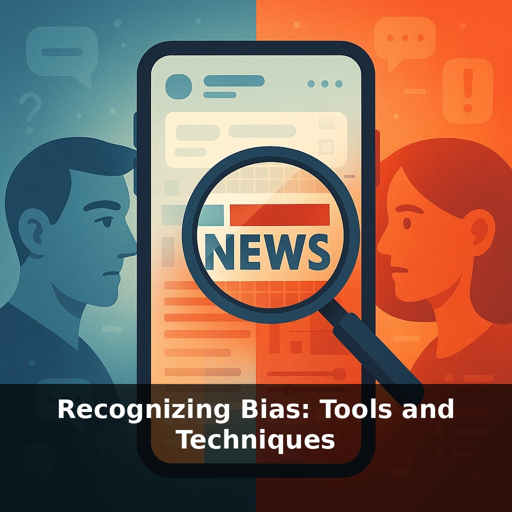
Alex drops a shocking headline in the group chat. The argument explodes, friends take sides, and an hour later someone posts a quiet correction: the story was slanted and missing key facts. Alex feels played. What if you could quickly scan any headline and spot the bias before you hit share?
That scanned headline is only your first filter. The harder part comes next: recognizing how the whole story might be nudging you. Two people can read the same article and walk away with opposite impressions—and both will swear the piece was “obviously” slanted against their side. That’s not just the content; it’s how our own expectations, feeds, and habits shape what we notice.
Consider three everyday traps: a viral thread that “summarizes” a 40-page report almost no one reads; a news app that quietly buries corrections while pushing outrage to the top; or an AI-generated news brief that sounds neutral but pulls from a narrow range of sources. In each case, the bias isn’t only in the words—it’s in what’s highlighted, what’s missing, and what’s repeated.
To deal with that, you need tools that go beyond gut feeling and help you systematically check what you’re being shown.
Think of this episode as moving from “I have a bad feeling about this story” to “I can show exactly where it leans.” Researchers and journalists now use structured methods to do that. In classrooms, students apply checklists like the CRAAP test to compare how three outlets cover the same protest. In newsrooms, teams run sentiment analysis on thousands of political segments and map which networks use more outrage words. At home, people install browser extensions that flag when a source skews left or right, or when a story appears on only one side of the spectrum.
Start with the simplest human tool: side‑by‑side comparison. Take one story—say, a new climate policy—and pull up coverage from three outlets that AllSides rates across the spectrum. Don’t skim for who “wins.” Look for three concrete things: which facts appear in all three pieces, which appear in only one, and which key questions nobody answers (cost, timeline, who enforces it). That last category—silent gaps—is where hidden bias often lives.
Next, zoom into language. A 2021 MIT study found that headlines with strong emotional words drive 17% more clicks; outlets know this, and many lean into it. When you read, highlight charged adjectives and verbs: “slams,” “rips,” “controversial,” “common‑sense,” “radical.” Then do a quick swap: in your head, replace them with neutral versions (“criticizes,” “proposes,” “disputed”). If the story suddenly feels less urgent or outrageous, you’ve just located some of its framing.
Now combine that with basic lateral reading, but make it targeted. If an article leans heavily on a single expert, pop their name into a new tab with “bio” and “funding.” You’re not hunting for a “gotcha”; you’re checking what perspective they represent. Do the same with think tanks, advocacy groups, or “coalitions” mentioned. Knowing whether a quoted source is industry‑funded, activist, or academic lets you see why certain points are emphasized—or ignored.
This is where computational tools become useful as a second opinion, not a replacement for judgment. Media Bias Chart v5.0 suggests that nearly two‑thirds of U.S. cable news segments fall outside “original fact reporting.” That means a lot of what you see is interpretation layered on facts. Tools like Ground News’ Blindspot, AllSides’ datasets, or NewsGuard’s 0–100 reliability scores can quickly show whether a story is mainly being amplified by one side, or whether a site routinely fails basic credibility checks. Treat these signals as prompts: “Why is only one camp covering this?” or “Why would advertisers avoid this outlet?”
Over time, this mix of pattern‑spotting, language auditing, and cross‑checking helps you move from “I don’t trust anything” to “I can see exactly how this is tilted—and decide what weight to give it.”
A local election offers a clean practice ground. One station’s segment shows overflowing town‑hall meetings and angry quotes from two small‑business owners. Another outlet’s article zooms in on funding details and interviews a budget analyst plus a school principal. A third mostly runs clips of the incumbent laughing with supporters. Using side‑by‑side comparison, you’d note not just who gets quoted, but which stakeholders never appear—renters, young voters, people opposed for non‑economic reasons. Those absences are as revealing as any adjective.
Try a national example: a tech‑regulation bill. A podcast episode leans on a trade association’s talking points; a newsletter cites a digital‑rights group; a longform piece interviews both, plus a former regulator. Lateral reading on those organizations’ mission pages and annual reports shows how their funding and priorities line up with the arguments you’re hearing. Over time, this feels less like “fact‑checking everything” and more like learning to read the credits at the end of a movie so you know who shaped what you just saw.
Building on that workflow, here’s the mindset shift: think “light bias hygiene,” not full investigation. Before sharing, pause for one deep breath and mentally run a tiny checklist: what’s the main emotion this is pushing, whose voice is loudest, and who’s missing. A 2021 MIT study found emotional headlines pull noticeably more clicks—so noticing that alone protects you from easy outrage hooks. Have you noticed your mood after doom‑scrolling? A weekly ten‑minute review of your go‑to sources can rebalance your info diet.
Building on that light‑bias hygiene idea, you’re moving from scrolling on autopilot to running a quick, smart scan on what hits your screen. Instead of being played like Alex, you’re reading on purpose. Pick the next article you see today and run it through the 5‑step bias check. Then, over the next week, notice how your feed feels different—and get ready, we’ll soon build a truly balanced news diet.
To go deeper, here are 3 next steps: Explore your own implicit associations by taking 2–3 tests on Project Implicit (implicit.harvard.edu) and screenshot your results so you can track changes over time. Pick up *Blindspot: Hidden Biases of Good People* by Mahzarin Banaji and Anthony Greenwald, and read just the introduction plus one chapter that connects most clearly to a bias you heard mentioned in the episode (like affinity or confirmation bias). Install a debiasing tool like “Bias Interruptor” (or another browser add‑on recommended in the show notes) and use it during one email or document review today, pausing whenever it flags language so you can rewrite that specific sentence more inclusively.