Most people decide if a site feels “trustworthy” in just a blink, and almost all of that gut reaction comes from design, not content. You’re scrolling, the product is solid, the copy is fine—yet it still feels…cheap. Why is that? Let’s pull that apart.
Sometimes the “cheap” feeling comes from surprisingly small things: a headline that doesn’t stand out enough, text packed too tight, or colours that look fine on your screen but vanish for someone with mild colour blindness. None of these sound dramatic, but together they quietly signal “unfinished” or “unprofessional.”
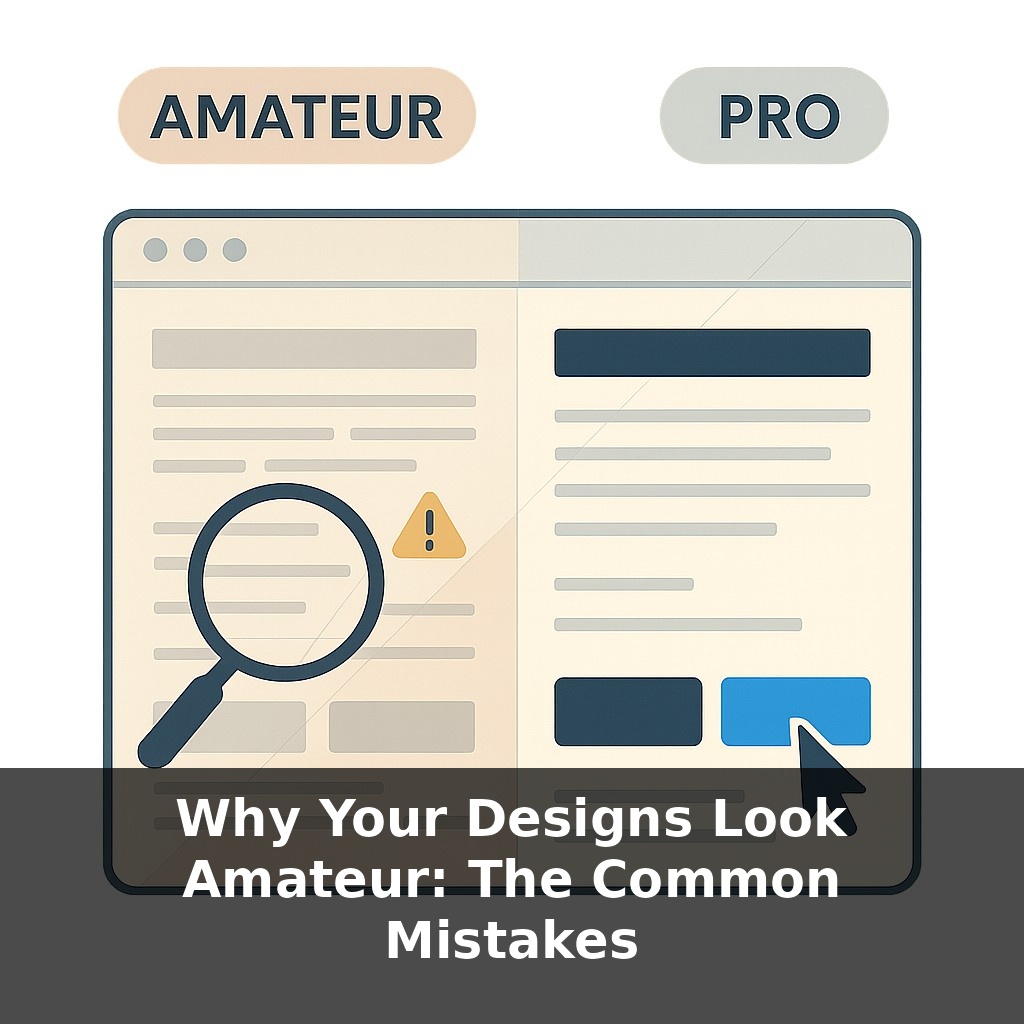
In this episode, we’ll zoom in on those repeatable mistakes—weak visual hierarchy, shaky typography, messy spacing and alignment, low contrast colour choices, clutter, and skipped accessibility basics. Think of it as a practical audit, not an art critique.
We’ll look at how teams like Airbnb tightened these fundamentals to move faster, why “just one more font” can tank perceived trust, and how a few checklist-level tweaks can push your work from “student project” to “studio work” without changing a single idea.
Think of this episode as putting your work under a microscope instead of stepping back across the room. We’re not chasing “pretty”; we’re chasing clear, deliberate choices. Professional designers aren’t magically more creative—they’re just more ruthless about catching tiny signals that scream “unfinished”: a heading that’s almost big enough, a button that’s almost aligned, a colour that’s almost readable. We’ll walk through each of these fault lines, show you how to spot them in your own projects, and then turn them into a short, repeatable pre–launch inspection ritual.
Let’s start with the uncomfortable part: most “amateur” designs go wrong in ways the creator can’t see, but a stranger spots instantly. That’s because you’re close to the content—you know what matters—while their eyes only see what the layout *suggests* is important. When that suggestion is fuzzy or contradictory, people label the whole thing as “unprofessional,” even if the idea is solid.
A useful way to debug this is to assume the screen is constantly asking your visitor one question: “Where should I look next?” Every element you add is either answering that question clearly…or adding noise. Extra borders, bonus icons, random lines, five different button styles—none of these are evil on their own, but together they start shouting over the message.
Decoration is a common trap. Drop-shadows, gradients, glow effects, fancy dividers—they’re tempting because they feel like effort. Yet research on perceived trust keeps finding the same pattern: people equate “clean and consistent” with “reliable,” not “busy and detailed.” Premium brands often look *simpler* than their cheaper competitors precisely because they’ve stripped away anything that doesn’t serve the content.
Another quiet culprit is font chaos. Multiple weights of one family already give you a rich toolkit; piling on extra typefaces rarely adds clarity. In that UX Collective poll where designs with more than three fonts were rated far less trustworthy, nothing else changed—same copy, same layout. Only the type choices shifted, and people’s confidence dropped almost by half. That’s how sensitive viewers are to coherence, even if they can’t name the fonts.
Then there’s colour. Misuse isn’t just about taste; it’s about who gets left out. Text that fails that 4.5:1 contrast guideline might look “minimal” on your monitor but becomes invisible for someone viewing on a phone outdoors, or for the 8% of men with colour-vision deficiency. When key actions rely only on colour—say, “errors in red, success in green”—you’ve quietly made the interface harder for a slice of your audience.
Structure plays a bigger role than most people expect. When Airbnb rolled out a strict 4-point spacing system, they weren’t chasing aesthetics alone; they cut interface build time by around 30%. Why? Fewer one-off decisions, fewer debates, faster alignment. Ironically, being disciplined with the boring details created more room for creativity where it actually counts: concepts, flows, storytelling.
Think of these small rules less as constraints and more as stabilisers. Once they’re in place, your layouts stop wobbling, and your ideas get a fair chance to land.
Open two tabs side by side: one from a SaaS you respect, one from a random template marketplace. Squint until the text blurs and notice what still “reads”: big blocks, button shapes, clusters of elements. That blur test exposes priorities without letting you get distracted by words or colours. If both pages feel equally noisy or flat, that’s a clue your own work might be leaning on content to do layout’s job.
Now run a different kind of test: strip out all icons from a screen you’re working on. Does anything actually *break*? Often you’ll find three download icons for one action, or decorative arrows that don’t point to anything meaningful. Keep the ones that disambiguate (“PDF” vs “CSV”), drop the rest.
Design is like adjusting a recipe in a test kitchen: you change one variable at a time—font size, margin, or button style—then taste again. The fewer things you tweak simultaneously, the faster you learn which small change creates a big jump in clarity.
Soon, layout tools will behave more like spellcheckers than passive canvases, quietly underlining awkward choices and suggesting fixes. But treating those prompts as automatic commands is like taking medicine without reading the label: it might help, or just mask deeper issues. The leverage comes when you ask *why* a suggestion appears, then decide whether to accept, adapt, or override it. That reflective loop is what turns auto-polish into a genuine, long-term skill advantage.
Treat this like learning a musical instrument: you’re training your eye to hear off-notes in layouts. At first, you’ll only spot the loud mistakes; over time, you’ll notice the faint buzz of misaligned details. That sensitivity is a skill, not a gift—and once it clicks, even quick drafts start landing closer to “polished” on the first pass.
To go deeper, here are 3 next steps: (1) Open up your last design and run it through the free “UX Check” Chrome extension and the Contrast Checker on WebAIM.org to fix any obvious hierarchy, spacing, and contrast issues the episode talked about. (2) Spend 25 minutes with the free first chapter of *Refactoring UI* (refactoringui.com) and then apply just one layout pattern from it—like consistent spacing scale or a defined type scale—to a single screen or slide you’re already working on. (3) Install Figma (if you don’t have it yet), then download a free, well-rated UI kit from the Figma Community and practice rebuilding one of your own “amateur-looking” designs using that kit’s grid, typography, and color tokens so you can see the difference a solid system makes.