Most people read noticeably faster when you simply add a bit more space between lines of text—without changing a single word. You’re scrolling a busy webpage, then hit one calm, open section. No pop‑up, no animation—yet you pause. Why did that quiet, empty area grab you more than the content?
Most beginners treat white space like an expensive apartment in a crowded city: if there isn’t something in every corner, it feels “wasted.” So they cram in extra buttons, more text, one more badge “just in case” — and slowly turn useful screens into visual noise. But professional designers treat emptiness as an active ingredient: they budget it, protect it, and even remove content to make more room for it.
Look at Google’s search page: one logo, one box, a few tiny links. That blank expanse isn’t laziness; it’s a deliberate signal of focus and confidence. Or think of Apple’s product pages, where each feature gets space to breathe, making every line and image feel more important and luxurious.
White space doesn’t just make things prettier; it quietly tells your audience what matters most — and what can wait.
Think about the last time you filled a slide, flyer, or dashboard and then thought, “It still looks empty—what else can I add?” That urge is the real problem. We’re wired to equate “more stuff” with “more value,” but in interfaces and visuals, that instinct quietly sabotages clarity. Research-backed design systems like Google’s Material Design don’t start by asking, “What can we show?” but “What deserves focus?” Then they allocate space around those priorities with almost surgical discipline. This is where white space becomes a decision tool: every margin, gap, and pause reflects what you’ve chosen *not* to compete for attention.
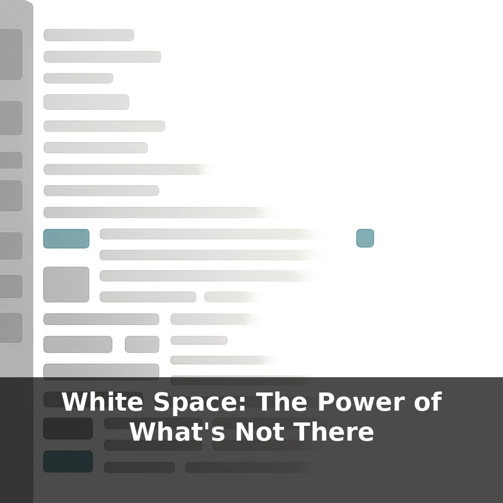
Think of white space as a set of invisible tools, not a vague “clean look.” There are three main tools you’ll use over and over: breathing room, grouping, and emphasis.
Breathing room is the cushion that keeps elements from bumping into each other. On a crowded dashboard, adding consistent padding around cards instantly makes each one feel like a separate, usable unit instead of part of a wall of data. That calm margin isn’t decoration; it’s what lets your brain stop, recognize, and act.
Grouping is where white space starts to *explain* your content for you. When related items sit closer together than unrelated ones, your audience instantly reads them as a set: these filters belong together, this label belongs to that input, these bullets all support that heading. You’ve seen this on Amazon product pages—price, rating, and key actions are tightly clustered, while secondary details drift further away. Even without reading, you can tell what “goes together.”
Emphasis is the dramatic use of empty areas to make one thing feel disproportionately important. A lone button surrounded by space feels more “primary” than a bright button jammed into a dense toolbar. Luxury brands exploit this constantly: a single bag or watch sits in the center of a generous, empty panel, so it feels rare and valuable before you ever notice the price.
To use these tools intentionally, start noticing *proportions*, not just presence or absence. Tiny, irregular gaps look like mistakes; larger, repeating intervals signal intention. That’s why many design systems commit to a spacing scale (4, 8, 12, 16, etc.) and stick to it ruthlessly. The exact numbers matter less than the rhythm they create.
Also watch what happens at different levels: micro‑space (between letters, lines, icons), meso‑space (between cards, sections, list items), and macro‑space (the big “air” around entire blocks). Most non‑designers tweak only the micro level and wonder why layouts still feel heavy. Often, the fix is bolder: remove a whole chunk and let the remaining sections stretch out.
In practice, designing with white space means asking one question repeatedly: “If this were more important, would I give it more room?” Then adjusting the layout until the space matches your answer.
Open a restaurant menu in a busy tourist area: long lists, cramped prices, photos jammed edge‑to‑edge. You skim, feel slightly stressed, and default to something familiar. Now compare that to a high‑end bistro menu where each section has only a few dishes and generous gaps between them. You’re nudged to linger, to consider, to believe each option is curated.
Interfaces behave the same way.
On Spotify, the home screen isn’t a static grid of albums; it uses pockets of emptiness to separate “Recently played” from “Made for you” from “New releases.” That spacing makes the feed feel personalized, not chaotic. On Airbnb, the listing page gives each key detail—rating, price, location—its own calm zone, so you can scan fast without feeling lost.
A subtle example: Stripe’s dashboard. Rather than squeezing in every metric, they let some tiles sit in quieter rows. Those “empty” stretches act like visual commas, telling your brain, “Pause—new idea coming.”
As AR, VR, and wearables layer interfaces onto daily life, “empty” regions will become safety features as much as aesthetic ones. Systems will need to carve out calm zones so alerts don’t collide with stairs, traffic, or other people. AI layout engines may watch what you miss, rush, or mis-tap, then silently widen gaps or stagger elements in response—like a smart city that lengthens crosswalk signals when it senses slower walkers—turning space itself into adaptive assistance.
Treat every interface you touch like a small city: some streets busy, some plazas open, each gap intentional. The next step isn’t learning new tricks; it’s deleting bravely—buttons, banners, entire sections—then stretching what’s left until actions and ideas feel unhurried. Space becomes your quiet co‑designer, editing with you instead of after you.
To go deeper, here are 3 next steps: (1) Block a 25-minute “white space sprint” on your calendar today using a tool like Motion or Sunsama, and during that block, turn on Freedom or FocusMe to temporarily pause Slack and email so you can experience uninterrupted mental margin. (2) Read Nancy Kline’s “Time to Think” or Juliet Funt’s “A Minute to Think” and highlight 3 specific “subtractive moves” (like cancelling a recurring low-value meeting or batching routine emails) that you’ll test over the next week. (3) Install the Mindful Break Chrome extension or use the Calm app to set two 2-minute pauses in your workday, and use those micro white-space moments to deliberately *not* add tasks, but to notice what feels crowded or unnecessary in your current schedule.