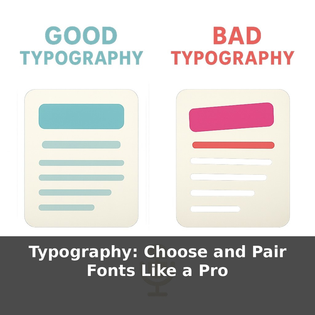
Your brain can spot bad typography faster than a typo, and it quietly punishes you for it. You’re scrolling a website: same words, two designs. One feels trustworthy and effortless to read; the other feels cheap and tiring. The paradox? The only difference is the fonts.
You’ve seen this split-screen moment in real life: two resumes, same experience, wildly different impact. One feels sharp, focused, and calm; the other feels cluttered and oddly “off,” even if you can’t say why. That invisible “why” is what we’re unpacking now. When non-designers pick text styles, they often think in terms of “professional vs. fun” or “pretty vs. plain.” But beneath those gut reactions are specific, controllable choices—like how heavy letters feel on the page, how tightly lines sit together, and how your eye climbs from heading to subheading to paragraph, almost like stepping stones in a shallow river. In this episode, we’ll treat those choices like adjustable knobs, not mysteries, so you can control the mood and clarity of your work on purpose, not by accident.
So where do “good” type choices actually start if you’re not a designer? Not in the font menu—that’s the trap. They start with *roles*: which text has to be skimmed in 2 seconds, which must be read closely, and which is just there for labels or hints. Headlines, body copy, captions, buttons—each plays a different part, and that part should drive your choice. Once you know the roles, you can look at a typeface the way a casting director looks at actors: Does this one stay legible in long paragraphs? Does that one grab attention at large sizes? Clarity first, personality second, decoration last.
Think of this step as getting out of “I like this font” mode and into “this font has a job” mode. Start with the jobs that are hardest to fudge: long reading and quick scanning.
For long reading, your main questions are: Can someone stay with this for three paragraphs without feeling tired, and does each line end before their eyes get lost? That’s where the 75‑character guideline quietly earns its keep. If your lines stretch too wide, comprehension drops, even if the design looks “clean.” Shrink the text box or bump up the size until your lines feel more like short sentences than marathon runs.
Next, look at the shapes inside the letters. Two practical clues: x‑height and contrast. A larger x‑height (taller lowercase letters) often feels friendlier and a bit more casual; a smaller one feels more formal and airy. High contrast (very thick and thin parts) can look elegant at big sizes, but fragile and flickery in small body text. Low contrast is sturdier and usually better for lots of reading.
Now switch to quick scanning roles: headlines, section titles, buttons. This is where you can afford stronger personality and bolder weight, *as long as* it doesn’t fight the body text. Successful pairings usually share at least one trait—maybe similar x‑height or similar letter width—so they look related, even if one is serif and the other is sans. The popular “serif body, sans heading” combo works partly because the shapes feel distinct at a glance, yet compatible when stacked on the same page.
Hierarchy is where your choices become a system instead of a pile. You’re not limited to size jumps; you can use weight, color, and spacing to create clear rungs: H1, H2, subhead, body, caption. A slightly lighter gray for captions, an all‑caps but letterspaced label above a title, a medium weight subhead between bold headlines and regular body—all of these say “this is important, but *this* is more important” without shouting.
Digital tools add another layer. Variable fonts let you nudge weight or width with a slider instead of swapping fonts, which keeps performance tight and visual rhythm consistent. Responsive design means your choices have to survive on a cramped phone and a big monitor; test both. Too-tight line-height that felt crisp on desktop can turn into a wall of text on mobile, so that 120–145% guideline is less a rule and more a reliable starting range.
Your goal isn’t to memorize rules; it’s to notice cause and effect: when you change weight, spacing, or pairing, what happens to how fast and comfortably someone can move through the page?
Think about where you’ve *felt* type doing its job without noticing. Open Wikipedia: boring, right? But it’s a masterclass in restraint—one main text style, modest headings, tiny cues like italics and small caps to sort information without visual drama. Now jump to Stripe’s marketing site: still clean, but headings carry more weight and character, while body text stays almost invisible. Both are successful, just tuned for different goals: one for dense reference, one for fast persuasion.
Or look at The New York Times vs. Apple. The Times stacks several text roles—headline, deck, byline, body, caption—each slightly different in size, weight, or spacing, so you can skim or dive in. Apple, by contrast, often leans on a single family with subtle shifts, letting imagery speak while text gently guides.
Your experiment: pick one site you like and one you find tiring. Screenshot them, then trace over every distinct text style with a colored pen. Count how many roles each uses and how they differ. That map will reveal their hidden typographic logic.
Soon, responsive text won’t just resize; it will subtly reshape itself to match context—bolder on a shaky train, calmer on a bright desktop, more open for aging eyes at night. Variable setups can even tune themselves to content: dense legal copy could “breathe” more than a snappy promo line, without a redesign. AI helpers will likely propose pairings based on brand traits and accessibility data, but your edge will be taste—deciding *which* of those options actually feels right for real people.
Good news: you don’t need perfect “designer vision” to get this right—you just need to keep testing how your words feel in real use. Read them aloud on your phone, send a draft to a friend who skims everything, and notice where they slow down or bail. Those friction points are clues that your letterforms need gentler pathways, not louder decoration.
Here’s your challenge this week: Pick one real project (a landing page, resume, or one-page PDF) and redesign it using just two typefaces: one serif for headings and one sans-serif for body text, chosen for clear contrast in weight and x-height. Set up a simple type scale (for example: 32px, 24px, 18px, 14px) and apply it consistently to headings, subheads, body, and captions instead of eyeballing sizes. Then export two versions—one with your old typography and one with your new system—and compare them side by side, specifically checking readability, hierarchy (what you notice first, second, third), and overall cohesion.