Your brain decides if a design feels “trustworthy” in less than a blink. Now listen: same colors, same fonts, same photos—two screens on your laptop. One feels sharp and reliable, the other a bit sketchy. In today’s episode, we’ll unpack why that happens—and how to control it.
A single nudge to the left or right can change how “serious” your layout feels—almost like a subtle shift in tone of voice. Today we’re zooming in on two quiet power tools behind that effect: alignment and balance.
This isn’t about making things “pretty.” It’s about giving the eye a path to follow and the brain fewer decisions to make. Studies show we judge a page in milliseconds; alignment and balance are how you stack those milliseconds in your favor. That might mean snapping everything to an invisible grid, or intentionally breaking that grid once you know the rules.
We’ll look at why consistent edges, shared centers, and even whitespace can act like rails that guide attention. Then we’ll get practical: simple alignment tweaks you can apply to slides, dashboards, marketing pages, or your next internal doc to make them instantly feel more considered and more professional—without adding a single new visual element.
Those snap-to-grid lines in your tools aren’t just there to annoy you—they’re shortcuts to cleaner thinking. When elements line up, your brain groups them, assumes they’re related, and moves faster. That’s part of why aligned layouts are read more quickly and feel less tiring. Balance works the same way: a heavy block of content on one side almost begs for something to counter it, whether that’s another element or generous breathing room. Professional-looking design often comes down to repeating a few quiet decisions: pick an axis, commit to it, and let it organize the chaos for you.
Open a random internal slide deck, web page, or dashboard you’ve made. Now squint at it until the text blurs and all you really see are blocks and lines. What you’re looking at in that fuzzy view is the true structure of your layout—where the eye will travel before the brain has time to read anything.
This is where alignment and balance stop being theory and start acting like tools.
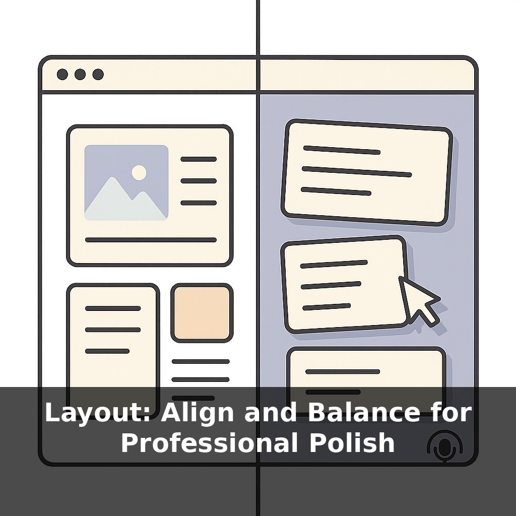
First, think in “rails,” not individual objects. Instead of dragging each box “until it looks right,” decide on a few main vertical and horizontal lines that everything will snap to: maybe a strong left edge, a column for supporting details, and a consistent baseline for section titles. Once those rails exist, every extra element either joins a rail or has a very good reason not to. That single decision kills a huge amount of visual noise.
Next, separate “centered on the page” from “centered in a group.” A common trap: one centered headline, three left‑aligned bullets, a button that’s kind of between the two. Pick a logic: either the whole block shares a left edge, or everything in that group centers on the same vertical axis. Mixed logic is what makes layouts feel wobbly.
Balance benefits from the same kind of deliberate thinking. Pretend each cluster of content has weight based on size, color, and density. Big dark chart? Heavy. Small, pale note? Light. When all the heavy pieces fall to one side, you can counter them with another element—or by carving out a clear area of breathing room on the opposite side. That negative space isn’t “wasted”; it’s doing the job a missing object would have done.
One practical tactic: zoom out to 25–50% and flip quickly between two candidate layouts. Don’t ask which is prettier; ask which one your eye can trace in a simple path—top to bottom, or in a smooth Z or F shape—without jumping around. If your gaze ping‑pongs, you likely have competing axes or lopsided weight.
For multi-section pages, repeat alignment patterns like a chorus. If section one’s title, text, and button follow a certain grid, reuse that structure for the next sections. Repetition calms the layout, and it makes any intentional break from the pattern feel purposeful instead of accidental.
Slide your chair back from the screen and think in “lanes,” not pixels. Take a product page: logo and nav in one horizontal lane, hero copy and image sharing a vertical edge, then a row of three benefit cards that all snap to the same top and left. Suddenly, even if someone scrolls fast, their eye hits a predictable rhythm: headline → proof → action.
Concrete example: look at Stripe’s marketing pages. The code samples, headlines, and CTAs often line up on invisible columns, so your gaze can skim without friction. Or peek at Apple’s product sections: huge photo on one side, tight text stack on the other, then the next section flips that relationship—but the margins and text columns stay consistent, so it feels like one system.
One practical test: duplicate a busy slide, then ruthlessly drag every text box so their left edges match. Align charts under each other, right-align all numbers. Without touching colors or fonts, you’ll often feel the whole thing “lock” into place—clearer, calmer, more confident.
As tools quietly automate more layout decisions, the designer’s role shifts from “placing boxes” to defining priorities and rules. You’ll choose which content deserves prime positions, how dense each area should feel, and what rhythm suits your audience’s reading habits. Think of it like setting a treatment plan in medicine: diagnostics (analytics, tests), prescription (layout rules), then ongoing adjustment as user behavior changes and new devices appear. The craft moves upstream—even for “non‑designers.”
Treat this like tuning an instrument: a tiny twist brings the whole chord into harmony. As you work, ask: what deserves the strongest line of sight, and what can quietly support in the background? Play with small shifts—one nudge, one regrouped column—and notice when the page suddenly “clicks.” That click is your cue you’re learning to direct attention on purpose.
To go deeper, here are 3 next steps: 1) Open Figma (or Canva if you prefer) and recreate a simple 3-card layout using a 12-column grid and the “Align left / center / right” tools, deliberately testing how different alignment choices change the visual weight. 2) Grab a short homepage or slide you’ve already designed and run it through the free online tool Page Flows' UI gallery or Dribbble search—compare your spacing, alignment, and balance against 3 examples you save to a “Layout Inspiration” folder. 3) Read the “Alignment” and “Proximity” chapters in *The Non-Designer’s Design Book* by Robin Williams, then apply just one principle (like using a single strong alignment line) to redesign a cluttered section of your resume, portfolio, or sales page today.