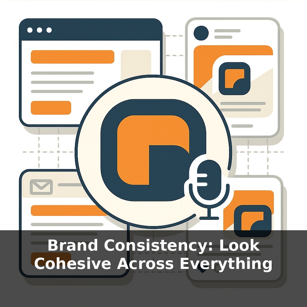
Most people see a logo several times before they remember it—but when every touchpoint looks and sounds the same, that memory can lock in much faster. A client opens your email, your site, your social feed. Do they feel one brand speaking…or three different strangers competing?
Most small teams think “consistency” means just reusing the same logo file—and then wonder why everything still feels a bit off. The real shift happens when every new asset doesn’t start from scratch, but from the same, well‑thought‑out decisions. That’s where guidelines and systems come in: they don’t kill creativity, they narrow the chaos so your best ideas are easier to recognize as yours.
This is also where trust is won or lost. People notice when your website feels premium but your invoices look like they were made in a rush. Their brain quietly asks, “Which version is real?” The goal isn’t to make every post, slide, and document identical; it’s to make them clearly related, like different recipes built from the same pantry. In this episode, we’ll turn that “pantry” into something you can actually use, even if you’re a team of one.
So how do you actually build that “one recognizable brand” when your reality is messy—multiple tools, rushed deadlines, different people making things? Most teams don’t fall apart in the big stuff (homepages, campaigns); they drift in the small, everyday pieces: a slidedeck tweaked before a meeting, a quick social graphic, a last‑minute event flyer. That drift is expensive. Studies show consistent brands earn more and waste less time “reinventing” assets. The opportunity isn’t perfection—it’s removing 80% of variation with a few smart, repeatable decisions you lock in once and reuse everywhere.
Here’s the simple version of what works: pick your “always” elements, then protect them everywhere.
Start with visuals. Lock in: - One primary logo (plus a small/mono version for tight spaces). - 1–2 main colors, 1–2 accent colors, and clear rules for backgrounds. - 1 headline font, 1 body font, with basic sizes and spacing.
Now add behavior: your voice and patterns. - Voice: choose 3–5 traits (e.g., clear, friendly, confident) and write a “before/after” line for each. - Patterns: recurring ways you show up—photo style, layout habits, types of headlines, common CTAs.
This becomes your “minimum viable brand system.” Not a 70‑page PDF no one opens, but a short, living document people can actually use. The test: could someone new create a slide or post that genuinely feels like you by following it?
Next, reduce the number of places people can go rogue. Wherever work is getting made, ask: “Can this be templatized?” - Presentation templates with your colors, fonts, cover layouts, and a few ready‑made content slides. - Social templates: a handful of reusable formats for quotes, tips, product highlights. - Basic document templates: proposals, invoices, one‑pagers.
Think of it like standardizing a house style in cooking: same core ingredients, same plating rules, but endless actual dishes. You’re not limiting what can be “cooked”—you’re standardizing how it leaves the kitchen.
Then comes governance, which sounds heavy but can stay lightweight: - One “brand owner” (even if that’s you) who has final say. - A simple checklist before anything goes out: logo correct? colors on palette? fonts on spec? voice traits visible? - A single folder or hub with the latest logos, templates, and examples of “this is what good looks like.”
Finally, use drift as data, not just a headache. When people keep breaking a rule, it’s a sign: the rule might be unclear, hard to apply, or not actually serving real‑world needs. Update your system to match how the brand is truly used, instead of forcing everything into an ideal that only exists in your head.
A quick way to spot whether your “one brand” is actually showing up as one: line up three random assets—a slide, a social post, and an invoice—and hide the logo on each. If your team can still tell they belong together, you’re in good shape. If not, look at the details that give them away (or don’t): Are button styles consistent? Do headlines follow similar rhythms? Are margins, corner radiuses, and icon styles aligned or all over the place?
Borrow a trick from product teams: treat each recurring format like a “component” you can reuse. For example, decide that every testimonial, no matter where it appears, uses the same layout: quote size, author name style, photo treatment, even how many lines you allow before truncating. Do the same for pricing blocks, feature lists, and FAQs. Over time, these micro‑patterns become visual shortcuts; your audience recognizes you almost subconsciously because the structure of things feels familiar before they even read the words.
Your audience will soon expect your brand to “feel” the same everywhere, not just look the same. As voice, AR, and AI media spread, you’ll need rules for sound, motion, and even micro‑interactions—like a signature loading animation or notification chime. Treat these like a chef treats seasoning: tiny, consistent touches that quietly signal “this is us.” The opportunity: small teams can now punch above their weight by encoding these patterns once, then letting tools scale them automatically.
As you refine this, notice how tiny choices—like always ending emails the same way or using one signature photo angle—start to act like breadcrumbs. Over time, they guide people back to you without them quite knowing why. Treat it like tuning a recipe: adjust, taste, share, adjust again. The “right” level of cohesion is the one your audience can feel, not just see.
Here’s your challenge this week: choose ONE core brand element (like your color palette, fonts, or your “about” bio) and apply it consistently across five places: your Instagram profile, latest grid post, Stories template, website homepage, and email footer. Set a 30-minute timer, pull up all five, and make them match visually and verbally (same colors/hex codes, same 1–2 fonts, same 1–2 brand phrases). When you’re done, take screenshots of all five and compare them side‑by‑side to confirm they look like they belong to the same brand.