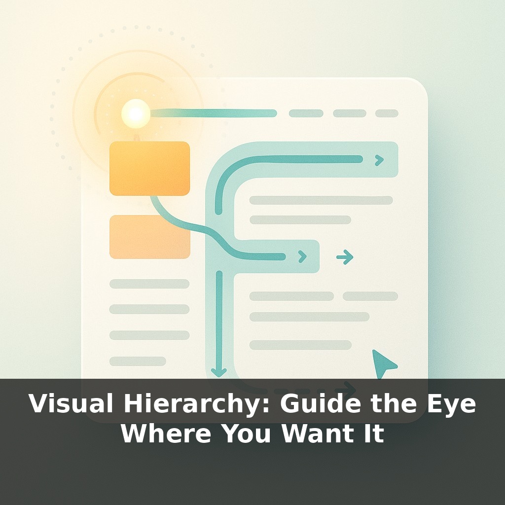
Your eyes probably just traced an invisible “F” across your last web page—top line, second line, then down the left edge—without you deciding to. Now, here’s the twist: with a few quiet design choices, you can make that automatic pattern work entirely in your favor.
You’ve seen how that “F” reading pattern quietly steers attention; now let’s talk about how to steer it on purpose. Visual hierarchy is how you decide what gets noticed first, what earns a pause, and what’s just supporting detail. On a landing page, that might mean a bold promise, a clear price, and a single, obvious button—each staged so the eye moves smoothly from one to the next. In a slide deck, it could be one big number, a short headline, and then the fine print parked safely out of the spotlight. Think of it less like decorating a page and more like choreographing a short, silent story: first frame, second frame, conclusion. When you do it well, people feel like your content is “simple” or “obvious” even when it’s actually dense. In this episode, you’ll learn how to create that effect on purpose—using just a handful of practical moves.
Think about the last time you scrolled a sales page and, without really intending to, you ended up staring at a single price or one big claim. That wasn’t luck; it was a stack of tiny cues nudging your attention in sequence. Now we’ll zoom in on those cues: which elements naturally shout, which ones whisper, and how they can quietly cooperate instead of fighting each other. We’ll look at real examples—like pricing tables that practically choose a plan for you, or signup forms that feel “oddly easy”—and tease apart what’s happening. The goal isn’t to make things louder; it’s to make the path through your content feel frictionless.
Start by assuming your viewer is in a hurry and half‑distracted. Your job is to make “what matters most” so visually obvious that even a skimmer can’t miss it—and then to make “what comes next” feel like the natural follow‑up.
A practical way to do this is to think in layers: primary, secondary, and tertiary. Primary is the one thing you’d want someone to take away if they only glanced for two seconds. Secondary supports or explains that primary point. Tertiary is context, disclaimers, fine print—useful, but never allowed to compete.
Now map those layers onto the tools you control:
- **Size:** Reserve your largest type and images for the primary layer. If everything is big, nothing feels important. Aim for clear jumps—headline 2–3× larger than body, not 10%. - **Weight & style:** Bold, italic, and uppercase are powerful; use them to distinguish layers, not to decorate random phrases. - **Contrast:** High contrast (dark on light, light on dark) pulls attention. Dial it up for primary elements, soften it for background details. - **Color:** A single accent color used sparingly can act like a magnet. On a page with mostly neutral tones, one colored button or key phrase becomes a natural next stop for the eye. - **Spacing:** Extra space around something isolates it and makes it feel important. Tight clusters signal “these belong together.” - **Alignment & position:** People tend to start at the top and left (back to that “F” pattern). Put your primary message where that journey begins, then stage secondary elements along the natural reading path.
Look at Apple’s product pages: that hero area isn’t just big; it’s relatively isolated, high‑contrast, and centrally placed. Supporting details are still visible, but they’re quieter on every dimension—smaller, lighter, lower on the page.
The trick is consistency. Pick rules—like “only CTAs get the accent color” or “only one element per screen is ultra‑bold”—and stick to them. Break a rule only when you intentionally want to create a new focal point.
Your one analogy for today: visual hierarchy is like a carefully plated dish in a restaurant. The main ingredient is front and center, garnished and well‑lit; sides and sauces are portioned and placed to make the star look even better, never to compete for the first bite.
Picture your weekly status slide: one column of text, all the same size, every bullet pleading for attention. Now compare that to a news app’s home screen. Notice how one story gets the big photo, another just a line of text, and a few are tucked into a smaller strip? That’s hierarchy in action—and you can borrow it.
Try three fast rewrites of something you use often:
1) A plain-text email: turn the key outcome into a short, bold line, then stack the “why” and “next steps” beneath in smaller type. 2) A cluttered dashboard: promote a single must-watch metric into the top-left with extra space around it; demote vanity numbers to a quieter corner. 3) A dense FAQ: group related answers, give each section a clear mini-heading, and let one or two questions per screen stand out more than the rest.
Over time, you’ll start seeing your own work less as “filling space” and more as arranging priorities.
Soon, layouts may quietly reshuffle themselves based on what you hesitate over, scroll past, or re‑read—like a restaurant that rewrites the menu between courses based on what you actually finished. You might see risk warnings grow larger if you rush, or complex steps break into smaller chunks when your cursor lingers. The ethical tension: who decides what “helpful” means? Expect new norms, audits, and even regulations around when adaptive hierarchy serves you versus nudges you a bit too hard.
Treat your next layout like reorganizing a pantry: essential items at eye level, treats a bit harder to reach, long-term supplies down low. As you play with emphasis, notice how tiny shifts change which “shelf” people grab from first. The more you test, the more you’ll design paths that feel natural instead of forced.
To go deeper, here are 3 next steps: 1) Open a free Figma account and rebuild one screen of your favorite app using only three text sizes, one accent color, and a single primary button style to practice clear visual hierarchy. 2) Read the “Visual Hierarchy” chapter in *Refactoring UI* by Steve Schoger & Adam Wathan, then apply their spacing and contrast tips to redesign a cluttered page from your own site or portfolio. 3) Install the Stark or Contrast plugin (Figma/Sketch) and run it on one of your existing designs to adjust font weights, sizes, and color contrast so your primary call-to-action becomes the most visually dominant element on the page.