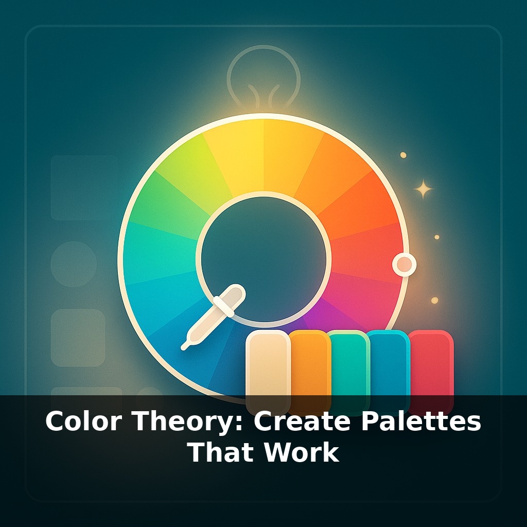
About nine out of ten snap judgments about a product come down to one thing: color. You open an app, scroll a website, or pass a storefront, and in a heartbeat your brain decides “trust this” or “skip it” — all before you’ve read a single word.
Here’s the twist: “good taste” in color isn’t magic, and it’s not something you’re born with. It’s a small set of rules plus a bit of practice. In this episode, you’ll learn how to turn a blank canvas into a reliable palette you can reuse across slides, products, and brands—without guessing or scrolling endlessly through random swatches.
We’ll keep it practical. You’ll see how to: - Pick a “workhorse” base color that fits your goal - Add supporting colors with clear jobs (background, accent, alert) - Use proportions so your design never looks like a rainbow explosion - Check accessibility so more people can actually read what you’ve made
By the end, you’ll know how to build a 5–6 color system you can apply anywhere—and why it works, not just that it looks “nice.”
Most designers don’t start from a blank wheel of endless options—they start from constraints. Brand teams lock in just a few values: a primary hue, a small range of brightness, and 2–3 accent roles. From that, they generate dozens of on-brand layouts. You can do the same by turning vague preferences into specific numbers. For example, choosing a blue at hex #2563EB, setting your light background at 96% brightness, and reserving one high-saturation color for alerts instantly narrows your choices from millions of combinations to maybe 15–20 usable swatches you can actually manage.
Start by deciding what your palette *needs to do*, not what “looks pretty.” A dashboard, a pitch deck, and a poster all have different color jobs.
Three core jobs to plan for: 1) Neutral layer (backgrounds, cards, muted text) 2) Functional layer (primary actions, links, data lines) 3) Signal layer (success, warning, error, highlights)
Now let’s turn that into numbers.
1. Build a neutral backbone Pick one temperature and stick to it: - Cool gray example: - Background: #F3F4F6 - Card: #E5E7EB - Borders: #D1D5DB - Body text: #111827 These all sit around low saturation (under 10%) and vary mostly in lightness from about 96% (background) to 10% (text). That gap is what keeps things readable.
2. Lock in a primary scale Choose a single hue angle, then create a ramp of values at different lightness levels. Say you like a medium blue: - Base: #2563EB You can pull variations like: - Light tint for subtle fills: #DBEAFE - Mid for outlines/secondary buttons: #60A5FA - Strong for main buttons: #1D4ED8 - Dark for hover states: #1E40AF Notice you didn’t change hue, only saturation/lightness. That keeps everything “on brand” without feeling flat.
3. Add purposeful accents Use data, not vibes: - Brand accent (for emphasis, not primary actions) - Example teal: #14B8A6 - Positive state: #16A34A - Warning: #F59E0B - Error: #DC2626
Keep these under control with proportion. In a typical UI or slide: - Neutral layer: ~70–80% of what you see - Primary color scale: ~15–20% - Accents + states: ~5–10% total
4. Make it work for more people Run quick checks instead of guessing: - Normal text (#111827) on light background (#F9FAFB): contrast ≈ 15:1 (well above 4.5:1) - Primary button text (#FFFFFF) on #2563EB: contrast ≈ 5.9:1 - Avoid green (#16A34A) vs red (#DC2626) as the *only* difference in charts; change lightness too - Example: use darker green (#166534) and lighter red (#FCA5A5) so they also separate by value.
5. Stress-test your palette Apply it to three quick scenarios: - A login screen with one clear primary action - A 3-line bar chart with success/warning/error states - A simple 3-slide pitch: title, content, “thank you”
If any screen feels chaotic, you likely promoted accents too much or used too many saturations at once. Scale them back to your neutral and primary ramps until the layout feels calmer but still clear.
Think about how this plays out in real products. Slack leans on purple, but scroll their UI and you’ll see it’s mostly off-whites and grays; the purple shows up in about 10–15% of the interface (buttons, highlights, logo), while brighter greens/reds are reserved for status and alerts. By contrast, early-stage startup decks often use five saturated hues at similar intensity—blue title, red chart, green icon, purple footer, orange CTA—which visually compete and blur hierarchy.
Try mapping roles in numbers: if your slide has 20 visible “areas” (background, header, chart bars, buttons, icons…), assign ~14–16 of them to neutrals, 3–4 to your primary scale, and 1–2 to accents. For a data example, chart 5 series using one hue in steps of 20% lightness: 20, 40, 60, 75, 90. Then overlay a single, saturated accent line at the same hue but higher saturation only for the key metric. You’ve created focus by changing one variable at a time instead of reaching for random new colors.
As displays, lighting and devices diversify, your “one palette fits all” approach will age fast. Start planning for systems that adapt: a dashboard might use one variant at 300 nits on a laptop and another at 1,000 nits on a TV. Test your core set under at least 3 conditions: bright daylight, dim room, and mobile outdoors. As wider gamuts (P3, Rec.2020) spread, define a “safe” sRGB core plus 2–3 richer hues you only use where hardware support is guaranteed.
Next, turn today’s palette into a reusable asset. Save your 5–6 core swatches plus 4–6 tints/shades each in your design tool, then label roles clearly: “Primary/700,” “Error/500,” “Neutral/100,” etc. Aim for a compact library of about 30–40 tokens. Over your next 3 projects, force yourself to use only this set and refine it, not reinvent it.
Before next week, ask yourself: 1) “Looking at a project I’m working on right now, what is the *exact* mood I want to communicate—and does my current palette (hue, saturation, and value) actually match that mood, or is it fighting against it?” 2) “If I convert my palette to grayscale or squint at it, do I still have clear contrast between my focal elements and the background—or would a small shift in value (lighter/larger highlights, deeper shadows) make my hierarchy read instantly?” 3) “Which color in my current palette is doing the ‘heavy lifting’ as the dominant hue, and what two supporting colors (an accent and a neutral) could I tweak today—using the color wheel or a reference image I love—to make the whole design feel more intentional and cohesive?”