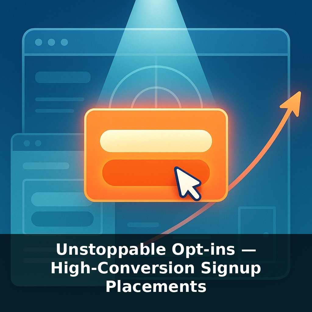
Most people hide their best email opt-ins in the digital equivalent of a broom closet—then blame “low traffic” when signups crawl. Yet one small tweak in where a form appears has quietly multiplied signups for some sites, without changing a single word of copy.
Most sites treat “where to ask” as an afterthought—tacked onto a template, shoved in a sidebar, or dropped at the very bottom of a page like a P.S. on a long letter. But the numbers tell a different story: small shifts in placement routinely produce jumps you’d normally expect only from a full redesign or a brand-new offer.
Today we’re going to zoom in on *moments*, not modules. The specific situations when a visitor is already leaning in, already wrestling with a problem, or already feeling relief—those micro-moments are where opt-ins can quietly become “unstoppable.”
Think of it less like decorating a room and more like timing a well-placed question in a conversation: ask too early and it feels pushy, too late and the moment’s gone. Our job is to identify those high-intent beats in your experience and match them with the right prompt, in the right format, at the exact right time.
Instead of hunting for a single “magic” spot, start thinking in layers: different visitors hit peak motivation at different times. A first-time reader skimming a blog post, a returning buyer on a confirmation page, and a comparison shopper stuck on pricing are not in the same headspace—and they shouldn’t see the same prompt. Your job is to map these states like a weather radar: where are people heating up, cooling off, or stalling out? Then, at each of those points, you pair a specific problem they’re feeling with a tailored, low-friction next step that feels like the obvious way forward.
Start by hunting for “natural yeses” already hiding in your flow. You’re not creating demand from scratch; you’re intercepting it.
One cluster lives around **content**. Not just any article—pieces that solve a concrete pain. Look in your analytics for posts with high time-on-page and scroll depth: that’s where people are investing effort. There, a generic “join our newsletter” in the sidebar is background noise. Instead, offer a content upgrade halfway down: a checklist, swipe file, or template that continues the exact task they’re working on. Keep the form right in the reading flow, ask for just an email, and phrase the CTA in first person: “Send me the templates.” You’re converting momentum, not interrupting it.
Next, examine **friction points**. Places where visitors hesitate, compare, or feel risk:
- Pricing pages where they bounce - Feature comparisons that get lots of toggling - FAQ sections with heavy traffic
Here, the best “ask” isn’t more reading—it’s reassurance. Swap in offers like “Get a 5-minute walkthrough,” “See a live demo,” or “Get this comparison as a PDF you can share with your team.” Short forms win: name + email at most. Treat the form as a relief valve for uncertainty.
Then, mine your **relief moments**—especially after someone commits:
- Order confirmation pages - “Success” screens after free trial signups - Download complete pages
They’ve just said yes and are unusually receptive to a useful next step. Instead of a dead-end “Thanks,” invite them into a focused sequence: “Email me setup shortcuts,” “Send me launch reminders,” “Unlock customer-only bonuses.” These post-commit prompts often see far better engagement than cold, site-wide forms because trust is fresh.
One more rich vein: **exit and return behavior**. Use exit-intent or timed overlays where people routinely hover toward the tab bar or idle. But keep them tightly matched to the page context:
- On a long guide: “Want this as a 3-page summary you can keep?” - On a cart: “Want a 10-minute reminder checklist before you buy?”
In other words, the closer your offer sits to the task in front of them, the less it feels like “signing up” and the more it feels like continuing what they already started.
Think of each high-intent section of your site like a different station in a professional kitchen: the grill, the prep table, the plating area. The ingredients (your offer) might be the same, but how you present and “serve” them needs to match what’s happening at that station.
On a long, tactical blog post, the “station” is focus. Your reader’s mentally chopping vegetables; they’re mid-task. An in-flow box that says “Send me the 5-part shortcut version of this process” pairs with that concentration. The commitment feels like mise en place—getting everything ready so the real cooking goes faster.
On a pricing page, the “station” is risk. Visitors are mentally turning the heat up and down, wondering, “Will this burn me?” Here, a tiny form offering “Show me a real example from a company like mine” functions less like a pitch and more like tasting a spoonful before serving guests.
Over time, your goal isn’t to add more stations, but to tune each one so the next small “yes” feels as natural as reaching for the salt.
Forget “where should the box go?” and start asking “how will this evolve?” As behavior signals deepen, placement stops being static real estate and starts behaving more like weather—shifting with each visitor’s path, device, and past actions. Expect layouts that reflow so the most relevant prompt rises automatically, while low-fit prompts fade. You’ll also see more joint offers: partners co-owning a single, ultra-relevant opt-in that travels with users across properties, not just pages.
Treat this like tuning a playlist, not hanging a single poster. Different tracks belong in different rooms: a quick-tip opt-in in your how-to hub, a deep-dive series near your research content, a VIP-only perk beside your customer portal. Your challenge this week: add *one* new, context-matched prompt and compare its performance to your “generic” catch‑all.