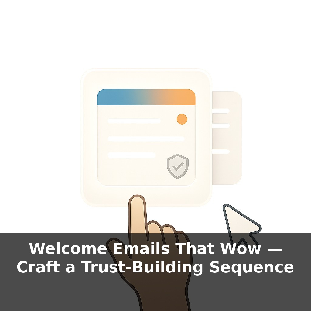
About two-thirds of people open welcome emails—yet most creators treat them like a boring receipt. A new subscriber is staring at your subject line, deciding in seconds: “Did I just make a smart move… or join another noisy list?” That tiny moment quietly shapes your revenue.
Here’s the part most lists quietly get wrong: the *sequence* around that first send. Not a 7-part saga. Not a complex funnel map. Just two sharp emails, sent right when someone’s attention is at its peak. In most accounts I audit, new subscribers wait 15–60 minutes for email #1—or never get a second touch at all. That delay is brutal: even a >5-minute gap can slash lead-magnet downloads by almost 50%, and with them, your chance to earn trust.
When you compress that gap and tighten the flow, everything changes. A simple two-email sequence can outperform a bloated 8-email “nurture” that took weeks to build. Think in concrete numbers: if 1,000 people join this month and ~680 open your first message, that’s 680 chances to prove you’re worth reading again—and 680 seeds of future sales.
Next, we’ll design those two emails so they’re fast to build, personal, and almost impossible to ignore.
Most creators try to “fix” this moment with more content instead of better structure. You don’t need 10 emails—you need two that behave like a system. That system lives inside your ESP: automation rules, timing, and simple logic. For example, you can fire Email #1 at 0 minutes, Email #2 at +18 hours, skip Email #2 if they’ve already clicked a core link, and change links based on answers to a 1‑click question. With even 200 new subscribers a month, that’s 2,400 people a year experiencing a consistently sharp first impression—without you touching a thing.
Email #1 has one job: deliver the thing they came for *and* make the next click effortless. That means stripping away everything that competes with the main action.
Structure it in four tight blocks:
1) **The “Here it is” line (0–20 words).** Top of the email, no preamble. Something like: “Here’s your [guide/template/checklist] + a quick 10‑second favor.”
2) **The delivery block.** Use a big, obvious button plus a plain‑link backup. Example: - Button: “Download the 7‑Step Launch Checklist” - Backup link: “Or click here if the button doesn’t work.” Put this *above the fold* so they never scroll to get what you promised. Track clicks on both so you can build an “engaged from day 1” segment; in a list of 5,000, that’s often 1,800–2,500 people you can confidently email more often.
3) **A one‑sentence positioning line.** Under the button, answer: “What do you stand for?” in *one* clear sentence: “I help solo consultants turn tiny lists (under 1,000 people) into $5k+ launches without paid ads.” This line is a filter. If 2,000 people see it and 5–10% think, “That’s me,” you’ve framed every future send.
4) **A single micro‑step.** Not “book a call,” not “buy now.” A low‑friction action that teaches your ESP *who they are* or *what they want*. Two reliable options: - A 2–3‑option “choose your path” click survey - A reply‑worthy question
Example click survey for a 3,000‑person monthly influx: - “I’m just getting started” - “I’ve sold a bit, want consistency” - “I’m scaling past $10k/month”
If 40% click, you now have ~1,200 people auto‑tagged by stage. Email #2 can swap examples or offers based on those tags, without you rewriting from scratch every week.
Keep the design dead simple: logo, text, one button, no social icons. In tests across B2B and creator lists (5k–50k size), that layout consistently beats “newsletter style” welcome designs by 10–25% on clicks.
Now you’re ready for Email #2: a short story + 1 focused invitation that turns those first clicks into real conversations or first revenue.
Here’s where you turn theory into proof. Take a list of 3,000 new subscribers over a month and split them, 1,500 each, into two welcome flows. Flow A is your new two‑email sequence. Flow B is your current “business as usual.” In Flow A, add a simple behavior rule: if someone clicks the micro‑step in Email #1, they get a version of Email #2 that references that choice directly in the first two lines. If they don’t click, they get a “default” version with a softer invitation.
Now watch what happens over 30 days. You might see something like this: - Flow A click rate on Email #2: 28% - Flow B click rate on Email #2: 11% - Flow A replies or form submissions: 120 - Flow B replies or form submissions: 35
Tag every person who takes the micro‑step as “W1‑Engaged.” Three months later, compare revenue or key actions. If “W1‑Engaged” subscribers buy at 2.3× the rate of everyone else, you’ve just identified the tiny moment worth obsessing over—and funding with better copy, stronger offers, and priority support.
In the next 2–3 years, start treating the first 48 hours as a live lab, not a fixed funnel. Test dynamic content blocks that swap in different case studies, price anchors, or FAQs per segment—aim for 3–5 variants, not 50. Layer in preference-capture inside Email #2 (topic toggles, format choices) and let those switches re-route subscribers into lighter or heavier content streams. Then, every quarter, pull a cohort report: compare 90‑day value for those who clicked vs. adjusted settings vs. did nothing.
Your challenge this week: build and ship a bare‑bones two‑email flow, then *prove* it beats your old setup. Start with 200–500 new signups. In your ESP, tag them “Test‑Welcome‑Cohort.” After 30 days, compare: click‑through, replies, and at least one hard metric (sales, demo requests, booked calls). Keep the winner, then test one new tweak next month.