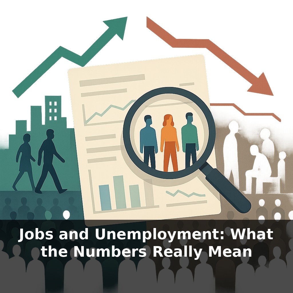
One month, the headlines cheer “low unemployment.” The next, markets panic over “soft job growth.” Here’s the twist: both can be true. In this episode, we’ll step inside those job reports and uncover what they reveal—and what they quietly hide—from your daily life.
A headline saying “unemployment is 4%” sounds precise, almost surgical. But that single number hides a messy story about who’s working, who’s looking, and who quietly stepped off the playing field altogether. In this episode, we’ll move past the surface and look at the deeper signals economists watch when they’re trying to tell whether the job market is genuinely strong—or just wearing good lighting.
We’ll unpack why central banks obsess over tiny changes in these figures, how a one-point rise in joblessness can ripple into a multi-percent drop in output, and why two years with the same rate can feel completely different on the ground. We’ll also connect this data to your world: the kinds of jobs being created, where they’re located, whether they’re remote, and what they might mean for your bargaining power over pay and hours.
Beyond the headline numbers, labor data also tell a story about *who* is getting work and *what kind* of work it is. Analysts slice the same surveys by age, education, race, industry, and region to see, for example, whether recent gains are mostly going to college grads in big cities or to workers without degrees in smaller towns. They also watch hours worked and multiple-job holding, which can reveal when people are stitching together side gigs like ingredients in a complicated recipe just to reach a stable income, even while the overall statistics still look reassuringly calm.
Look beneath that clean “U-3” unemployment line and you find an entire dashboard of dials economists watch: some flashing green, some quietly blinking yellow.
One of the most revealing is the **labor-force participation rate**—the share of adults working *or* actively looking. When participation is falling while the headline rate looks stable, it can mean people are slipping out of the game entirely: parents priced out by childcare, older workers nudged into early retirement, or discouraged jobseekers who stopped applying after too many rejections. That’s why analysts pay special attention to **prime-age participation**. When 25–54-year-olds reach a 20‑year high, as they did in 2023, it signals that the core working-age population is being pulled in rather than pushed out.
Then there’s **job openings**. A high openings rate paired with low measured unemployment tells one story—employers scrambling to hire, sometimes lowering requirements or raising pay. High unemployment with low openings tells another: people sending out résumés into a quiet void. The ratio of openings to unemployed workers has become a modern favorite because it hints at how hard employers are competing for talent.
Wage data add another layer. Fast-rising pay can mean workers finally have leverage—or it can be a sign that firms are bidding aggressively in a tight environment, with potential inflation to follow. Weak pay growth, even with “good” unemployment numbers, may suggest that new positions are concentrated in lower-wage roles or in sectors with little room for negotiation.
Hours worked matter too. If payrolls are rising but average hours are slipping, some firms may be spreading limited work across more people instead of expanding output. That can feel very different on the ground from a world where both headcounts and hours are climbing.
Remote work trends complicate everything. When remote postings jump from 4% to 13% in a few years, geography-based patterns in all these indicators start to blur: a software engineer in Ohio is suddenly competing with candidates in Austin and Bengaluru, while a downtown café in a major city quietly loses the commuter crowd it once relied on.
Finally, broader measures like **U‑4 to U‑6** scoop in discouraged workers and involuntary part-timers. When those stay elevated while the headline rate improves, it’s a clue that the recovery is thin at the edges—even if the main number looks camera-ready.
Think of these indicators as a restaurant’s kitchen, not just its “open/closed” sign. A single number at the door tells you it’s open; stepping inside reveals whether the ovens are on, the staff is scrambling, or half the tables are empty.
Say two towns report the same low rate. In one, a new battery plant has quietly hired hundreds of technicians, boosting demand for electricians, welders, coders, daycare workers, and truck drivers. Wage offers creep up, training programs appear at the local college, and landlords start renovating older buildings to house incoming workers. In the other town, a logistics hub automated most roles; many residents now piece together seasonal contracts, short projects, or early retirement. Both places share a headline, but the stories underneath couldn’t be more different.
Zoom out and these patterns steer policy: a surge in high-skill openings might spark visa debates; a rise in long-term nonparticipants can fuel arguments over retraining, child-care subsidies, or disability rules.
A tighter link between real‑time hiring data, demographic shifts, and climate policy will shape careers more than any single rate ever could. As automation spreads, some roles may vanish as quietly as old browser tabs; others will refresh around green tech, care work, and AI support. Countries that treat retraining like routine software updates—frequent, low‑friction, expected—are more likely to keep workers attached, tax bases stable, and social debates less volatile.
Your challenge this week: Each time you see a headline unemployment number, hunt down two extra indicators—like prime‑age participation and job‑opening rates—for the same period. Ask: do they paint a tighter, looser, or sideways picture than the headline suggests? By the weekend, jot a one‑sentence “story” for each day’s combo. You’ll start training the same pattern-recognition muscle policymakers rely on.
Seen this way, those monthly figures become less a verdict and more a draft script. Demographics aging, climate shifts, and AI adoption will keep rewriting it—swapping some roles, inventing others. Like tasting a sauce as it simmers, revisiting new indicators over time lets you notice quiet changes early, and adjust your own plans before the heat rises.
Here’s your challenge this week: Pick one local labor market (your city or region) and, using the latest BLS data or your country’s stats office, compare its *headline unemployment rate* to its *labor force participation rate* and *underemployment/part-time for economic reasons* numbers. Then, in 5–10 job postings from that same area, tally how many ask for degrees vs. skills/experience and note what skills come up most often. Finally, write a 3-sentence “reality check” summary you could explain to a friend: what the official unemployment number *misses* about real job conditions where you live, and which skills seem most likely to protect you in this market.