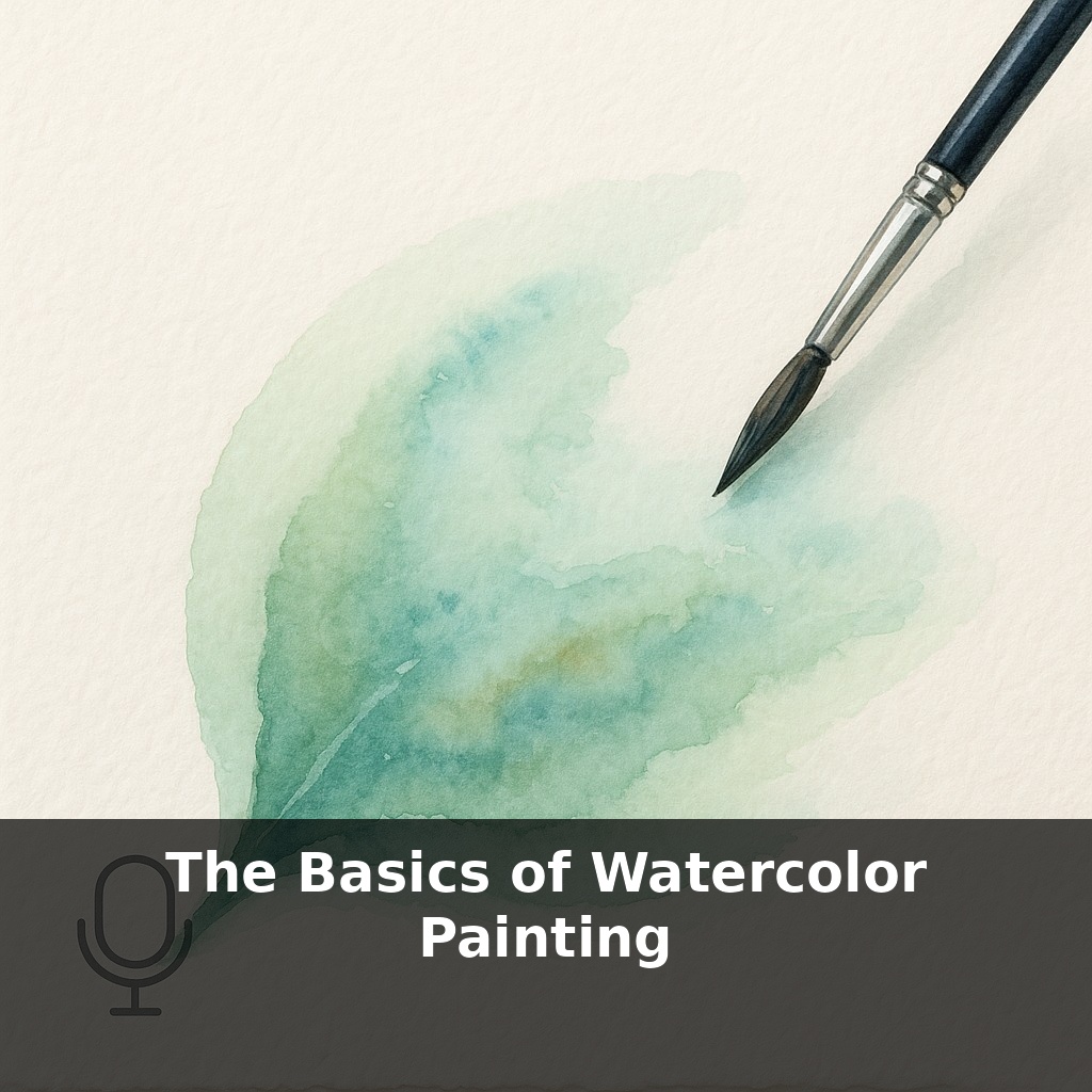
Your next watercolor painting is already on the page—before you touch a brush. As the paper warps, the water races, and the pigment blooms, you’re not just painting a picture… you’re negotiating with three forces that don’t fully care what you planned.
Most beginners think they need more colors, better brushes, or the “right” brand of paint. In practice, the real upgrades are invisible: paper weight, drying time, and how long you dare leave a wet shape alone. These aren’t as exciting as a shiny new palette, but they quietly decide whether your sky dries as a smooth glow or a cauliflowered disaster.
This is where watercolor stops feeling like coloring-in and starts feeling like a craft. The pros you admire aren’t just “good with color”; they’ve learned exactly how far they can push their materials before everything collapses. They know how much the paper can drink, how fast a wash will set in their studio, and when to let an imperfect edge simply be.
In this episode, you’ll start building that kind of practical sensitivity—by testing your setup like a scientist instead of guessing like a gambler.
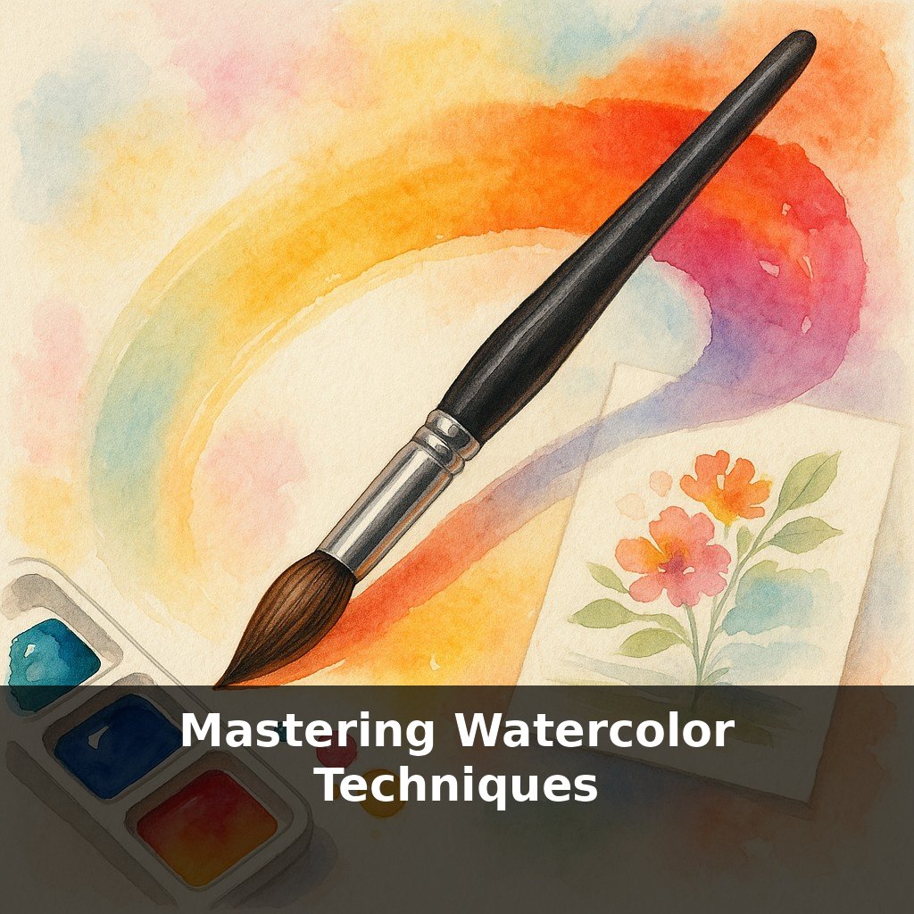
Think of this as setting up your “laboratory” before you run real experiments. Right now, your tools might feel random: a pad you grabbed on sale, a brush from a school kit, a few paints in a tin. In this episode, you’ll turn that pile of supplies into a tested setup you actually understand. We’ll look at how different papers behave side by side, what your brushes can and can’t do, and how your particular paints shift from pan or tube to page. Instead of copying tutorials blindly, you’ll start building your own reference map—made with your hands, in your conditions.
Most people test watercolor paper by starting a “real” painting and hoping for the best. Instead, you’re going to poke at your materials on purpose and watch how they misbehave.
Begin with three small rectangles on your page—about postcard size. Label them: “dry + controlled,” “medium,” and “very wet.” You’re not painting scenes yet; you’re mapping how far you can push moisture before it takes over.
On the dry rectangle, mix a modest puddle of color and load your brush, but then blot it once on a paper towel. Make a confident stripe. Look for a crisp start and finish, a clean edge, and little to no blooming. This is your baseline: how your brush and paint behave when you’re cautious.
On the medium rectangle, add noticeably more water to the mix. Load the brush fully this time. Lay a broad band of color, then, while it’s still glossy, drop in a second color at one edge. Instead of watching just the colors, study *speed*: how quickly they travel, how far they fuse before the shine dulls, and where a soft edge turns abruptly sharp.
On the very wet rectangle, push excess water onto the page—almost a puddle. Tilt your board slightly. Let gravity move the color, then pull it back with the brush, then tilt again. You’re looking for thresholds: when does a beautiful gradient suddenly break into backruns? At what angle does the water start to outrun the pigment?
Now repeat the same trio of rectangles with a different brush—say, a smaller round or a flat. Notice how much liquid each shape can carry, how easily it scrubs, how it releases color. You’re comparing “water budgets”: which tools dump moisture fast, and which ration it out slowly.
As you go, jot quick notes in the margins—“Round #8: floods quickly,” “Flat 1”: smoother large areas, sharper edges.” Over time, these pages become your personal operating manual, tuned to your room, your tools, your habits. You’re not chasing a mythical “right way”; you’re discovering the specific ranges in which *your* setup behaves predictably enough that creativity can sit on top of control, not fight against it.
Treat this page like a training field, not a masterpiece. For your next test, paint a narrow “racetrack” band, about 3 cm wide, curving gently across the sheet. Start with a mid-strength mix on one end and, without reloading, stretch it as far as you can. Where does the color run out? That fade-out point is your brush’s true reach, not what the label says.
Now try a simple “ladder” of swatches using a single color: each step, add just one clean brushful of water to your mix. Line them up from strongest to palest. Later, when you want a delicate sky or a bold shadow, you can point to a step instead of guessing.
Think of it like calibrating a new camera lens: before shooting anything important, you test focus, zoom, and low light so you know where it fails gracefully and where it falls apart. Here, you’re quietly discovering where your strokes start to scratch, where blends start to streak, and where a single extra dip of water flips control into chaos.
Your challenge this week: create one “field test” page before every real painting—a racetrack, a ladder, or both—so each session sharpens your instincts, not just fills another sheet.
Soon, beginners may train on screens before touching paper, using AI to replay each stroke like a sports analyst breaking down a serve. You could test wild timing or tilt experiments virtually, then carry only the best moves back to your real brushes. As eco‑pigments and smarter tools arrive, this habit of running quiet trials first will let you adopt new colors, surfaces, and digital aids without losing that subtle, fingertip sense of when the page is ready—and when it’s one drop away from chaos.
Soon you’ll notice something subtle: your “tests” start to look like tiny abstract paintings. Those stripes, ladders, and racetracks become a visual diary of risks taken and limits stretched—more like a musician’s scales than homework. Keep them. Flip through them. You’ll see your timing, courage, and control evolving long before your finished pieces catch up.
Try this experiment: Set up three small watercolor swatches side by side on the same sheet, and paint all three using the same two colors (for example, ultramarine blue and burnt sienna). On the first swatch, paint wet-on-dry (dry paper, damp brush); on the second, pre-wet the paper and then drop in the same colors; on the third, lay down clear water, then tilt the board as you touch in color so gravity does the blending. As each swatch dries, note how the edges, blooms, and color vibrancy change between techniques. Then repeat the experiment with a different color pair (like lemon yellow and alizarin crimson) and compare which combo and technique gives you the glow and texture you like most.