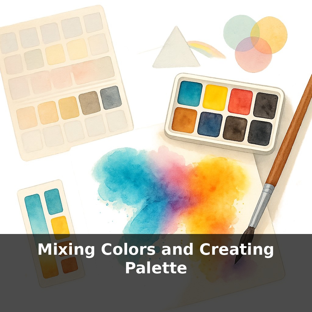
Watercolor artists can create over two hundred distinct hues using fewer than ten paints, yet most beginners still carry bulky sets. You’re at the table, palette full, and every mix turns dull. How can less paint—and smarter mixing—suddenly unlock glowing, custom colors?
Color is more than “red plus blue equals purple.” Behind your palette sits a whole framework: light wavelengths, pigment chemistry, and the way water spreads tiny particles across paper. Change any one of those, and the result on your page shifts—sometimes subtly, sometimes dramatically. That’s why two brands with the “same” color name can behave like completely different paints once they hit your brush. As you move beyond simply grabbing whatever looks close in the pan, you’ll start choosing specific pigments for their transparency, staining strength, and how they mingle with others. Instead of accepting whatever your set “offers,” you’re designing a compact toolkit that matches how you actually paint. Think of it less as owning every color and more as curating a small, dependable team that can handle almost any job you throw at it.
Now we’ll zoom out from individual pans to the bigger picture: how those paints relate to each other on your palette. Think about the difference between owning random books and arranging a small, coherent library—same objects, but one invites browsing while the other makes you hunt. A split-primary setup, with warm and cool options of each primary, starts to give you that sense of order. You’ll notice certain pairs give bright, punchy mixes, while others lean earthy or muted. Paying attention to these tendencies turns guesswork into repeatable choices and lets you predict how a new color will behave before it even touches paper.
Color mixing starts getting interesting when you stop asking “what tube is this?” and start asking “what role does this color play?” On a split-primary palette, each paint is a specialist: some excel at intense, high-chroma mixes, others are quiet workhorses that gently knock the saturation down without turning everything to sludge.
One practical way to see this is to organize your paints in two rings on paper: an “inner ring” of bright mixers and an “outer ring” of neutralizers. Put your most saturated primaries and secondaries inside; place your earthier options—like raw sienna, burnt umber, or an olive green—around them. When you want a vivid sky or flower, pull only from the inner ring. When you need believable skin, rocks, or shadows, sneak in just a touch from the outer ring to soften the mix.
This also helps you avoid chroma collapse. Instead of tossing four or five tubes into a problem area, treat neutrals as something you mix with intent: two pigments for a clear, lively color; three if you want it more subdued; rarely more. Notice that many convincing “grays” or “browns” are simply near-complements mixed in controlled ratios: a green plus a red, a blue plus an orange, tuned just enough to quiet the color without killing it.
Next comes mapping relationships. Take each primary and see what happens when it meets its opposite on your palette. Your cool red with your cool green might yield a graceful, bluish gray perfect for mist; the same red with a warmer green could give a dense, bark-like brown. Label these discoveries right on the page. You’re not just swatching; you’re building a custom reference of emotional temperatures—stormy, tender, electric—that you can call back to later.
Over time, you’ll notice certain three-color “families” that cover surprising ground: for example, one yellow, one red, one blue that can move from foliage to bricks to distant hills with only shifts in water and proportion. Lock those in as mini-palettes for specific subjects—landscape trio, portrait trio, urban-night trio—so you can travel lighter and work faster without sacrificing range.
Think of your palette like a small software development team: each “dev” has a specialty, but the real power appears in how pairs and trios solve specific problems. Start by picking three “project teams” from what you already own.
Team 1: High-impact accents. Choose one intense yellow, one punchy red, one assertive blue. Use them only for focal points—sunlit roofs, flowers, a bright jacket—so your strongest colors are saved for where the viewer should look first.
Team 2: Background builders. Select softer versions or earth colors that naturally sit back. Let this team handle skies, distant trees, pavement, anything that shouldn’t shout. You’ll notice how much calmer your scenes feel when backgrounds share a family resemblance.
Team 3: Shadow designers. Combine a slightly cool primary with its near-opposite neighbor plus a quiet earth. This trio can shift from cool evening shadows to warm indoor ones with tiny proportion tweaks, giving form without defaulting to black.
Your challenge this week: assign your paints to these three “teams,” then paint three tiny studies where each team is used only for its role.
In a few years, your swatch pages may talk back. Apps already hint at two-color recipes; next-gen tools could watch your hand, learn your habits, then nudge you: “Try this quieter triad for that storm cloud.” Think of a GPS for color decisions—quiet until you need a reroute. As museums refine historic palettes via spectral scans, you might load Sargent’s or O’Keeffe’s virtual set, then let an AI suggest adjacent “what-if” mixes you’d never reach by instinct alone.
As you refine your palette, notice how certain mixes feel like recurring characters rather than one-off guests. Keep a running “color diary”: jot where a mix appeared, what mood it carried, and how it shifted next to neighbors. Over time, this log becomes a personal map, guiding you toward braver choices and quieter, unexpected harmonies.
Try this experiment: Squeeze out just three paints—ultramarine blue, quinacridone magenta, and Hansa yellow—and challenge yourself to mix a 9‑color mini palette from only those. On a piece of watercolor paper, draw a 3×3 grid and deliberately mix each square as a different “mood”: one warm, one cool, one muted, one high‑chroma, etc., by shifting how much of each primary you add. As you mix, aim to “sneak up” on each color—add tiny amounts, especially of the darker paints, and notice the exact moment a color tips from fresh and vibrant into dull or muddy. When you’re done, pick your favorite three mixes and put them side‑by‑side in a quick sketch (a simple row of colored rectangles is fine) to see how a limited palette can still feel rich and cohesive.