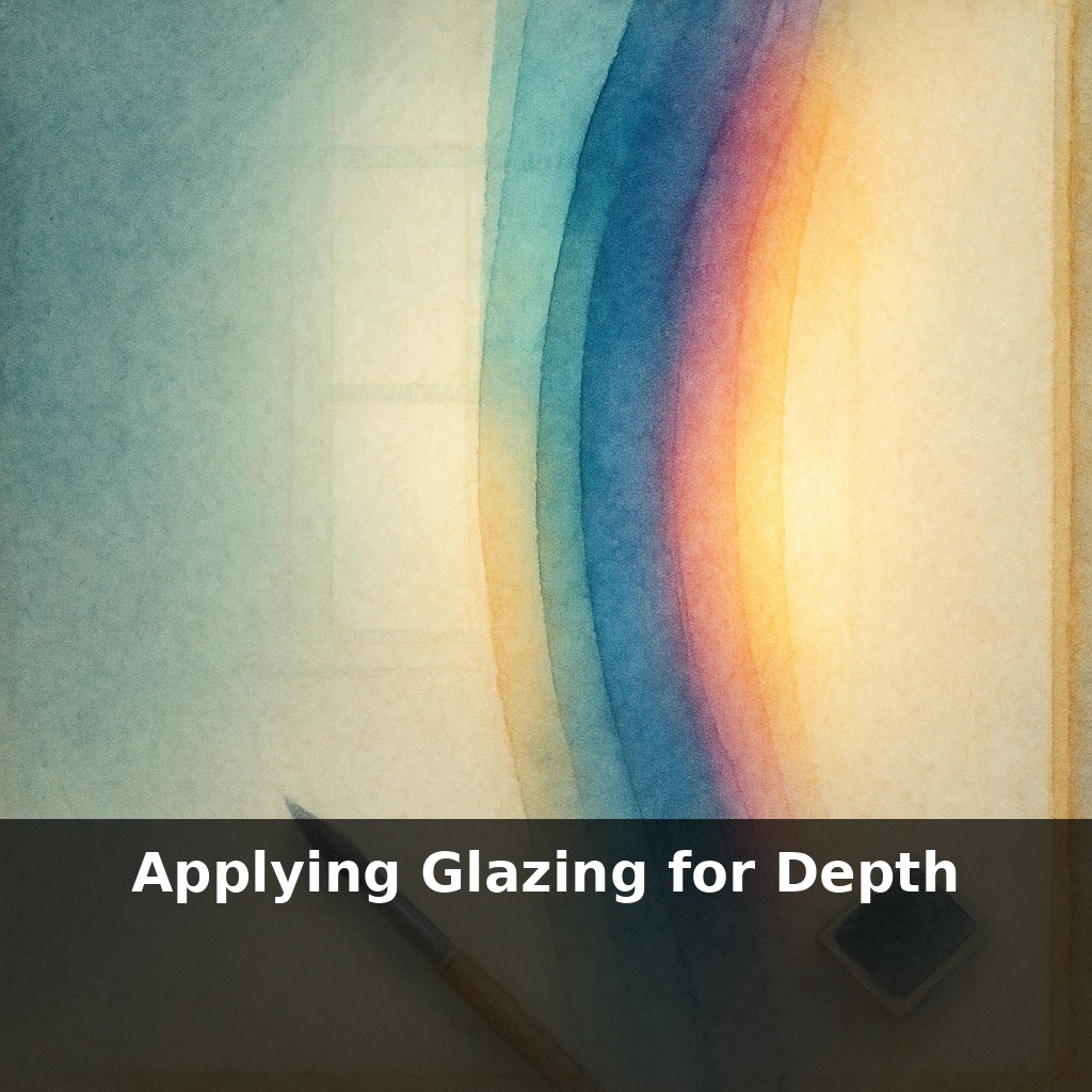
Some of the deepest, richest watercolor you’ve seen might be just three or four whisper-thin layers of paint. One scene: same colors, same brush, same paper—flat in one version, glowing in the next. The only difference? How those transparent layers are stacked.
Johannes Vermeer reportedly used up to 40 ultra-thin layers in a single passage of paint—not to show off, but to control *how* light moved through his colors. That same obsession translates beautifully to watercolor: the difference between a dull sky and a luminous one is often decided long before the “final” layer goes down.
Think of it like planning a slow-cooked recipe: you’re not just adding ingredients, you’re timing and sequencing them so flavors develop without turning to mush. With glazes, you’re doing the same with hue, temperature, and value over time.
In this episode, we’ll dig into how to choose pigments that actually reward multiple passes, how to keep your paper’s surface from giving up halfway, and how to plan a stack of layers so your painting gains depth instead of just getting darker.
Think of this phase as designing traffic for light. You’re not just deciding *what* colors to use, but *how easily* light can move through each one, bounce off the paper, and return to your eye without getting “stuck” in muddy layers. That depends on three quiet players most people ignore: the specific pigments in your pans, the way your water dilutes them, and the condition of your paper’s surface after each pass. Get those working together, and you can bend depth, temperature, and focus—guiding attention the way a director controls where the camera lingers in a scene.
The first quiet decision is *how strong* your glaze is. That “milk-like” mix is a midpoint, not a law. Think in three gears: - “Tea”: barely-tinted water to gently shift temperature - “Milk”: your main working glaze for depth and value - “Cream”: more saturated accents that still let the paper glow
Test each gear on scrap with the same brush you’ll use in the painting. If you can see hard edges or brush tracks when it dries, you’re either too thick or moving too slowly.
Next comes direction. A flat, even glaze across everything usually flattens space. Instead, let the bead of paint *exit* in the direction you want the form to turn. For a rounded cheek, pull the last stroke along the curve. For a receding hillside, drag the bead down the slope so color is barely there at the top and richest at the base. That tiny shift in where the paint gathers suggests volume without more drawing.
Now temperature: warm-over-cool receding, cool-over-warm advancing can be used to steer focus. Lay a faint cool glaze over a sunlit wall to nudge it forward against a warmer, hazier distance; reverse that relationship and the wall will sink back. Don’t chase this over the whole page—limit serious temperature shifts to two or three key “depth gates” in the composition, like foreground figures against midground buildings, or trees against sky.
Selective glazing is where things get surgical. Instead of covering an entire object, confine the wash to planes that turn away from the light, or to cast shadows only. A doorway: one glaze deepens the interior; a second, narrower one just under the lintel creates an extra step into darkness. This “micro glazing” builds structure without adding line.
Your brushwork should get *smaller* as layers build. Early passes: broad, confident, even a little sloppy. Later passes: narrower brushes, fewer strokes, no scrubbing. Think of it like refining a 3D model: big mesh first, then tiny bevels and chamfers to catch or lose light.
Finally, watch for two danger signals: a soapy, over-touched surface (paper is protesting) and colors that shift toward gray instead of richer versions of themselves. At that point, stop glazing broad areas and reserve any further layers for tiny, essential adjustments only.
Think of three mini “case studies.” First, a city street at dusk: lay down a basic drawing and light local color, then use separate, ultra-thin passes to nudge mood—one glaze only over windows to suggest interior glow, another just on upper façades to cool them toward evening, a final, slightly stronger pass in the street’s center to pull the eye inward. Same sketch, three different emotional reads depending on which planes you choose to deepen.
Second, portraits: instead of chasing perfect skin tone in a single mix, build it. A very light warm base, then a cooler blush only along jawline and eye sockets, then a near-invisible neutral over the shadow side of the face. The “life” comes from the accumulated shifts, not from any one magic color.
Third, try a limited, three-pigment glaze strategy for an entire piece. Commit: one hue for all warms, one for all cool shadows, one for atmospheric softening in the distance. It’s like setting global “lighting presets” for your scene, and it forces consistency in depth and mood.
Glazing may soon move from “felt” intuition to data-informed craft. As nano-pigments push transparency, we could treat each layer like adjusting a photo filter: tiny, precise shifts that barely disturb the surface. AR tools might preview how a future pass alters mood—like ghost layers in design software—while conservation imaging turns old masters into color roadmaps, showing exactly where they warmed shadows or cooled highlights so we can adapt those strategies to our own work.
Let glazing become your quiet rehearsal space: each pass a note, each pause a breath. As you experiment, notice how small shifts in direction or temperature can rewrite the mood, like rearranging furniture in a familiar room. Depth stops being a trick and starts feeling like choreography—light, color, and paper learning new steps together.
Try this experiment: Take a small study (6x6" or smaller) of a simple object—like a red apple or a blue mug—painted flat in its local color, and let it dry completely. Then mix a very thin glaze of a warmer version of that color (for the apple, a transparent orange-red; for the mug, a transparent turquoise-blue) using plenty of medium so it’s sheer, and brush it only over the half of the object facing the light. On the shadow side, glaze once with a very thin complementary color (for the apple, a greenish glaze; for the mug, a soft orange-brown), again keeping it transparent. Step back and compare the glazed vs. unglazed halves: notice how the glazed side suddenly looks deeper, rounder, and more luminous, and tweak the thickness of the glaze until you get the richest effect without losing the underlying form.