“Watercolor is the only painting medium where plain water can ruin you or save you.” Now you’re leaning over a sheet of paper: one brushstroke blooms beautifully, the next turns to cauliflower chaos. Same paint, same brush—so why does the paper suddenly take control of the picture?
So what changed between those two strokes? The quiet answer usually isn’t talent—it’s tools. Professional watercolorists talk about paints, brushes, and paper the way sound engineers obsess over microphones, cables, and speakers: each part slightly bends reality before it reaches the audience.
Pigment isn’t just “color in a pan”; additives like honey or glycerin can make it glide, grab, or stubbornly sit on the surface. Brush choice shifts from “soft round thing with hairs” to a calibrated device for storing and releasing water on command. And paper stops being a blank background and becomes the hidden engine deciding how far a wash travels before it settles.
As you start noticing these micro-decisions, the mystery of “good days” and “bad days” at the easel turns into something far more useful: a system you can test, tweak, and eventually trust.
So before chasing “looser style” or “stronger colors,” it helps to zoom in on what’s actually in front of you: a chemistry set. Your paints aren’t just hues, they’re recipes—some loaded with honey that stay moist and re-wet instantly, others drier and grabby, better for crisp detail. Brushes vary from workhorse mops that act like reservoirs to springy points that snap back and carve sharp lines. Then there’s surface behavior: some sheets invite water to sink in slowly, others let it skate on top just long enough to tilt, tilt, tilt—and steer the whole wash where you want it.
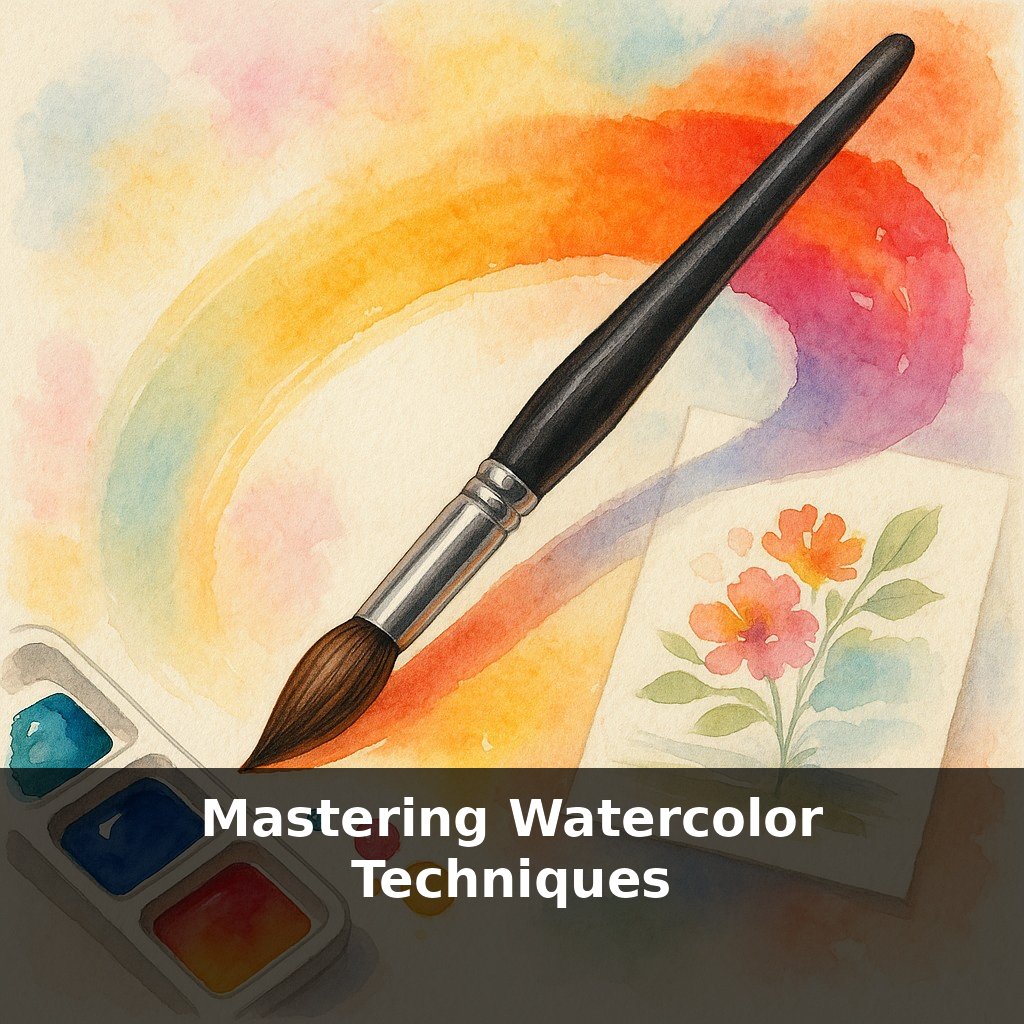
Professional watercolor setups tend to look minimal—often just a small palette, a couple of brushes, and one block of paper—but hidden inside that simplicity is a chain of decisions you can actually map.
Start with what’s *inside* your colors. Two pans labeled “ultramarine” from different brands can behave like completely different species. One might contain a single pigment with a strong tendency to granulate, settling into the tiny valleys of the paper and creating a broken, textured look. Another might be a smooth mix of several pigments that dries flatter but shifts in hue as it dilutes. Neither is “better”; they simply answer different questions: Do you want texture to appear automatically, or do you want a clean, even field you can control by hand?
Additives nudge this behavior further. Honey-rich paints often stay tacky longer, clinging to the palette and rewettng easily. That’s a blessing for slow, layered work but can feel slippery if you’re chasing razor-sharp edges and fast-drying passages. Drier formulations indulge people who like to build structure in stages, because they quit moving sooner and accept glazing without reactivating as much underneath.
Then consider the tool that carries all of this to the page. Modern synthetics can be engineered for specific jobs: some filaments are designed to hold a surprising amount of water for their size, others prioritize snap so a fine point returns instantly after each mark. You might find a mid-sized round that can flood a sky, then—without changing tools—switch to drawing tiny window frames simply by changing pressure and angle. That kind of versatility means you solve composition problems with movement, not equipment swaps.
Finally, the surface quietly decides timing. Hot-pressed sheets often keep water near the top for a moment before it sinks in, which can give you a narrow window to tilt, lift, or connect shapes with clean, graphic transitions. Cold-press and rough absorb at different speeds across their texture, so a single wash can dry with varied edges—soft in one area, crisp in another—if you learn to read when each zone crosses from glossy to merely damp.
As you test combinations, patterns emerge: certain pigments consistently create halos on one sheet but behave perfectly on another; a favorite brush might excel at fast studies yet feel too thirsty for intricate glazing. Instead of chasing a mythical “perfect” setup, you’re matching characteristics like a coach drafting a team: each material has a role, and your job is to discover which trio works together to play the way you want to paint.
Test this with three quick mini “lab experiments,” no masterpieces required.
First, pick one high-granulating color and drop it into three different water puddles: one barely damp, one evenly glossy, one almost dripping. Watch how the same color settles into completely different textures. Note which stage gives you the kind of sky or stone you like.
Next, load a single round brush with a juicy mix and paint a slow, continuous line that snakes across the page. Without reloading, vary only your pressure: press, lift, twist. You’ll discover a hidden alphabet of marks that brush can make before it runs dry.
Finally, try a two-swatch comparison: on the left, lay a flat mid-tone wash. On the right, repeat it, but at the halfway point, tilt the board sharply and keep it there until dry. That tiny change in angle becomes visible architecture in the dried wash—subtle but repeatable once you’ve seen it.
Your challenge this week: run these three experiments on every new brand or set of materials you buy, before you paint anything “finished.”
In a few years, your “simple” kit might feel closer to a modular lab. Biopolymer binders could shift how long colors stay workable, much like how software updates quietly change what your old laptop can handle. Smart papers that flag rising acidity would matter less mid-painting and more when you—or a collector—want that piece to survive decades. And if 3‑D printed brush tips go mainstream, customizing edge shapes could become as normal as tweaking a digital brush preset.
Treat each new setup less like a mystery and more like onboarding a tiny “team” for a project: run drills, note who performs well, then keep that roster handy. Over time, you’ll build a personal playbook—swatch cards, margin notes, dried tests—that turns guesswork into habits, so that even bold experiments rest on something quietly repeatable.
Before next week, ask yourself: 1) “If I limited myself to just three brushes and two primary colors from my current palette, which ones would I choose, and what exactly makes them feel ‘right’ in my hand and on the paper?” 2) “When I test my paints in a small swatch chart today—labeling each color, checking how transparent or staining they are, and how they lift with a damp brush—what surprises me about how they actually behave versus how I assumed they would?” 3) “After painting the same simple subject (like a pear or a leaf) on two different papers I own (for example, cold press vs. hot press, or student vs. cotton), what do I notice about how the washes flow, edges dry, and colors granulate—and which surface honestly makes me more excited to keep painting?”