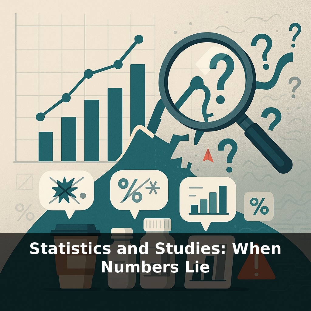
About half of the psychology experiments tested in a major project couldn’t be repeated successfully. Now, listen in: a headline claims “coffee doubles your productivity,” a drug ad boasts “clinically proven results,” a startup flaunts “breakthrough data.” Which one, if any, should you trust?
That messy track record isn’t just a “science problem”; it’s a **numbers problem**—and those same tricks show up in political polls, health headlines, startup pitch decks, and even school performance reports. A study might rely on a tiny, unrepresentative group, quietly toss out “inconvenient” data, or slice the results in so many ways that *something* statistically “significant” pops out by chance. Visuals can mislead, too: a chart can make a tiny shift look like a crisis, or flatten a real risk until it seems harmless. And when correlation is sold as causation, yesterday’s coincidence becomes today’s “proven” trend. In this episode, we’ll slow down the hype cycle: how to spot shady statistics, what honest research looks like, and simple checks you can do before you let a number change your mind.
When a new study hits the news, you usually see only the polished headline, not the messy kitchen where the data were “cooked.” Was the sample big enough and diverse enough to matter to you? Were dozens of questions tested until something—anything—crossed the magic 0.05 line? Were “outliers” removed because they were errors, or because they spoiled the story? And even if the math checks out, who funded the work, and what do they stand to gain from a dramatic result? We’ll unpack how incentives, methods, and presentation quietly shape what those tidy percentages and bold claims really mean.
Sometimes the problem starts before a single number is crunched. Who gets counted—and who doesn’t—can predetermine the “truth.” A tech company might tout an “85% satisfaction rate” while quietly surveying only its most active users. A political pollster may call landlines during business hours, “discovering” that older, at‑home voters dominate public opinion. The result sounds precise, but it’s really a story about who was reachable, not what everyone thinks.
Then there’s what happens *after* data collection. When researchers or marketers test many questions, timeframes, or subgroups and only show the eye‑catching bits, you’re seeing the highlight reel, not the full season. This can turn statistical noise into apparent patterns: one city where a policy “worked,” one age group where a product “shined,” one month where a stock “soared.” Without knowing how many things were tested and discarded, you can’t tell whether that result is sturdy or a fluke.
Even when the math is technically correct, the way results are framed can warp your intuition. A treatment that “cuts risk in half” sounds huge—until you learn the risk went from 2 in 10,000 to 1 in 10,000. Absolute numbers (how many people are actually affected) often tell a very different story than relative changes (percent up or down). The same goes for averages: a “mean income” can be dragged skyward by a few ultra‑rich outliers, hiding how most people are actually doing.
Visual design quietly joins the act. One study might show a vaccine side effect with a bar chart starting at 0%, making the difference nearly invisible; another might start the axis at 95%, making the same gap look like a cliff. Pandey and colleagues found that many viewers rely more on bar height than on axis labels, so these design choices aren’t neutral; they steer your gut reaction.
Funding and incentives overlay everything. Industry‑backed studies are not automatically wrong, but if ten trials are run and only the most flattering one gets published—or negative results disappear into a drawer—the public record becomes systematically optimistic. This “publication bias” means you’re often seeing a curated gallery of success, not the crowded back room of mixed and failed attempts.
Think about where you *meet* statistics in the wild: a food label claiming “supports heart health,” a school district bragging about “top‑quartile performance,” a crime map colored bright red in one neighborhood. None of these are outright lies, but each can be framed to push your feelings in a specific direction.
A cereal company might run five small nutrition studies and only advertise the one that showed a tiny benefit, quietly ignoring the four that found nothing special. A city could report “crime is up 50%,” leaving out that it went from 2 incidents to 3. A university might highlight that its graduates’ “average starting salary is $90,000,” conveniently boosted by a handful of tech hires in Silicon Valley while most alumni earn much less.
Sampling bias is like tasting just the top layer of a big pot of stew right after you’ve sprinkled in extra salt—if you stop there, you’ll swear the whole dish is perfect, while the deeper layers tell a different story.
As sensors, apps, and wearables log your every step and heartbeat, more of life turns into graphs that claim to know you better than you know yourself. Insurance pricing, school funding, even which posts you see will increasingly hinge on models trained with assumptions you never approved. Data skepticism won’t mean rejecting numbers; it will mean asking who set the recipe, who tasted the result, and who profits when the dish is declared “good enough” for everyone.
Treat each shiny statistic like a used car: tap the brakes, lift the hood, and ask how it was driven before you buy it. When a chart or claim feels persuasive, pause and look for what’s missing—timeframe, context, uncertainties. You don’t need to be a mathematician; you just need to stay curious enough to ask, “Compared to what, and for whom?”
Start with this tiny habit: When you see a number or claim in an article, headline, or podcast (“X doubles your risk,” “Study proves…,” “Users grew 300%”), just pause and whisper to yourself: “Compared to what?” Then, if it’s easy, glance back and look for two things only: the sample size (how many people) and the time frame (over how long). If you can’t find those in 10 seconds, simply say: “OK, this stat is a bit flimsy,” and treat it as a maybe, not a fact.