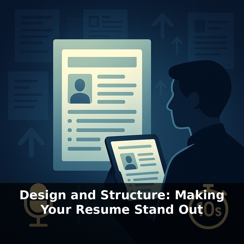
Recruiters often decide your fate in under ten seconds—about the time it takes to read a single text message. A hiring manager opens your resume, skims the top half, and hesitates: follow up, or move on? In that tiny pause lives your opportunity—or your rejection.
That split-second judgment doesn’t come from reading every bullet; it comes from how your resume *feels* at first glance. Our brains are wired to latch onto structure: we look for patterns, anchors, and visual cues before we bother with details. A cluttered layout makes even strong achievements blur together, while a sharp visual hierarchy can make an ordinary career look intentional and compelling. Think of the sections on your resume as rooms in a well-designed house: clear doorways (headings), logical floor plan (section order), and enough open space (margins, line spacing) so a visitor never wonders where to go next. When your design quietly directs attention—first to your headline, then to your most relevant wins—you lower the effort required to say “yes” and make it harder to justify a quick “no.”
Most people respond to that first-glance pressure by cramming in more text, more roles, more bullets—assuming density signals strength. In reality, it often does the opposite: it hides what matters. The real advantage comes from treating your resume like a product interface you’re designing. Every element has a job: some components attract attention, others organize it, and a few deliver the “aha” that makes someone want to click “schedule interview.” When those parts are deployed deliberately—section labels, font choices, spacing, alignment—you turn a flat document into a guided experience that highlights your best evidence.
Think of design and structure in two layers: macro and micro. The macro layer answers, “Where does my eye go first, second, third?” The micro layer answers, “Once I’m here, can I decode this in two seconds or less?” Both layers must work for humans and ATS at the same time.
Start with macro. Your top third is prime real estate: name, role/target title, and a concise summary or headline cluster. This is where you anchor the story you want the reader to believe about you. Instead of a vague “Professional Summary,” use a line that fuses function and value, like “Senior Product Manager | Fintech Growth & Experimentation.” Directly underneath, 2–3 tight lines that reflect the role’s keywords without lapsing into buzzword soup. This is less about poetry, more about alignment.
Below that, section order should mirror how the recruiter thinks for *this* role, not some generic template. If you’re earlier in your career or pivoting via education, put “Education” or “Projects” above “Experience.” If you’re experienced, lead with “Experience” and tuck education later. Certifications, portfolios, and publications move up or down depending on their relevance; there is no sacred order, only strategic order.
Now the micro layer: how information is chunked inside each section. Use consistent patterns so the reader doesn’t have to re-learn the “legend” each time. For roles, a reliable pattern is:
Job Title (emphasized) Company · Location · Dates (de‑emphasized) 1–2 line scope sentence 3–6 result-focused bullets
Each part serves a distinct purpose: title for level, company for context, scope to frame scale, bullets for proof. When those ingredients appear in the same order and style across roles, the brain glides instead of stumbles.
From a formatting standpoint, treat your layout like well-structured code: simple, predictable, and resistant to weird environments. That means standard fonts, no text inside shapes, and cautious use of two columns—fine for humans, but only if the underlying text order still reads cleanly top-to-bottom for ATS. Use layout to group related information, not to perform visual acrobatics. The more your structure can survive being stripped of styling—copied into a plain text editor and still making sense—the more durable it is across systems you’ll never see.
Think of your resume more like a user’s first session in a new app: they didn’t come to explore; they came to accomplish one task fast—decide if you’re relevant. So design around “mission-critical actions.” For a recruiter, those actions are: confirm role fit, assess seniority, and spot 2–3 concrete wins. Anything that doesn’t accelerate those checks is visual noise.
One way to stress‑test your layout: run a 6‑second scan test. Open your resume, look at it for exactly six seconds, then hide it and answer three questions: 1) What role and level did it communicate? 2) Which 1–2 achievements do you remember? 3) Where did your eyes land first—and did that *deserve* the attention? If you can’t answer clearly, your structure is burying the signal.
Next, print your resume in black and white on cheap paper. Smudgy ink and lower contrast expose weak hierarchy fast: blurry headings, dense blocks, misaligned dates. If your key points still pop in that low‑fidelity version, they’ll survive rushed reviews, tiny laptop screens, and imperfect ATS conversions.
AI will reward candidates who think like information architects. As richer formats emerge, the “dumb PDF” becomes just one node in a wider ecosystem: profile data, skills graphs, even project repositories. Treat your resume as the canonical schema that everything else maps to. For instance, aligning your section labels and skill clusters with how major platforms tag roles makes it easier for future tools to auto-assemble tailored profiles for specific openings. Your layout choices today quietly train tomorrow’s matching engines.
Treat this version of your resume as a working prototype, not a final monument. Each role, industry, or country is a new “environment” that reveals different bugs in your design. Treat feedback like user analytics: if people misread your level, bury a win, or skip a section, refactor the layout. The goal isn’t beauty—it’s fast, accurate understanding of your value.
Start with this tiny habit: When you open your laptop, drag just **one** bullet point on your resume into a new line and rewrite it to start with a strong action verb (like “Led,” “Designed,” or “Improved”). Limit yourself to describing **one** concrete result with a number (even if rough), such as “improved response time by ~10%” or “supported a 5-person team.” The next day, when you sit down again, tweak just **one** section header (like changing “Work Duties” to “Product Management Experience”) to better match one job posting you’re looking at.