Researchers found stories beat raw stats by more than ten to one in memory tests—yet most business decks are still walls of charts. In a quarterly meeting, two teams present the same data. One wins funding, one doesn’t. The numbers were equal. So what tipped the scale?
Sixty dense slides into a strategy review, attention quietly leaves the room. Laptops open. Phones appear. Not because the topic isn’t important, but because the brain can’t find a path through the numbers. Then someone speaks up: “Let me show you what this looked like for one customer last month.” Heads lift. Same information, new entry point.
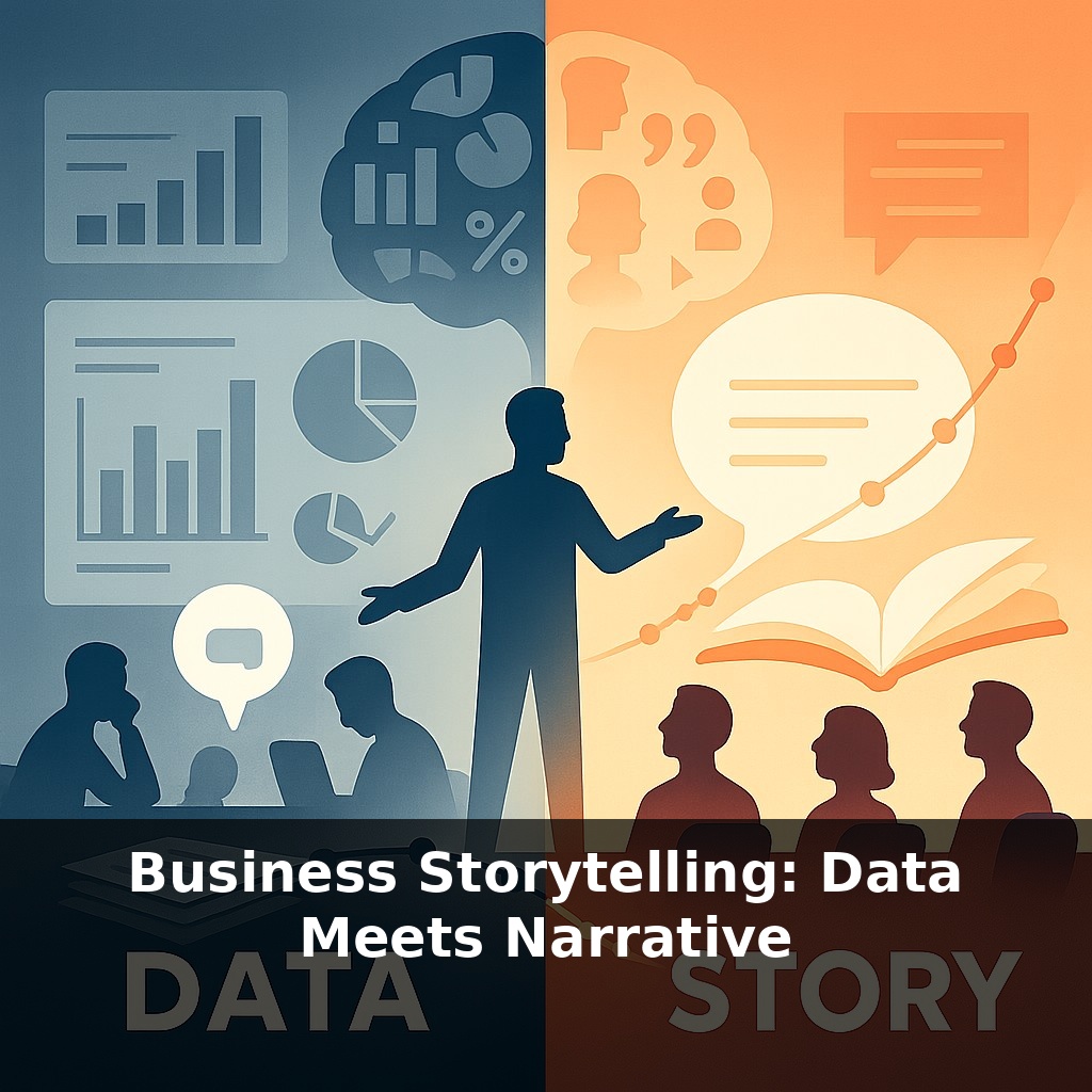
What changes in that moment isn’t the data—it’s the structure around it. Instead of a flat sequence of metrics, there’s now a before, during, and after; a situation, a struggle, an outcome. The numbers don’t vanish; they snap into place. Executives stop asking, “What are we looking at?” and start asking, “What happens if we scale this?”
In this episode, we’ll focus on that shift: how to wrap rigorous analysis in a clear arc that makes action feel not just logical, but inevitable.
Executives don’t gather for numbers; they gather for decisions under pressure. In those moments, data competes with risk, politics, and habit. A neat chart might earn a nod, but a well-aimed narrative can dislodge deeply held assumptions. This is where “data meets narrative” becomes less about style and more about power. The same spreadsheet can justify a budget cut—or unlock investment in a risky bet—depending on the human stakes you surface, the tension you highlight, and the trajectory you sketch between today’s pain and tomorrow’s possibility. The skill is knowing which thread to pull, and when.
Executives may nod at a dashboard, but they lean forward when they can see motion: something changing, at stake, unresolved. That’s where the classic narrative arc earns its keep—not as a “creative writing trick,” but as a way to organize quantitative evidence around cause, tension, and consequence.
A useful way to design that arc is to think in three passes over your data: elevation, escalation, and implication.
Elevation: Start by lifting one concrete situation out of the aggregate. Instead of “churn is up 3.2 %,” anchor in a specific segment, region, or account that embodies the pattern. UPS didn’t start with a fuel-savings heatmap; they focused on the daily friction of drivers taking sub‑optimal routes, then showed how often it happened and what it cost. Elevation turns an abstract metric into a focused lens.
Escalation: Next, amplify the stakes with contrast and trajectory. Show “then vs. now,” “with vs. without,” or “us vs. benchmark.” Here, your charts earn their place—not as decoration, but as evidence that the local story scales. HBR’s finding about narrative‑tied KPIs points to the same principle: every beat in your arc should connect visibly to a number the room already cares about. Escalation isn’t about melodrama; it’s about quantifying the cliff edge.
Implication: Finally, translate the pattern into a concrete fork in the road. Two or three modeled paths are enough: stay the course, minimal change, bold shift. For each, use your analysis to project impact on cost, risk, and upside. This is where ORION’s case became compelling: not just “routes will be better,” but “we save 10 million gallons of fuel annually, or we don’t.” Implication reframes your narrative from “here’s what we found” to “here’s the decision this data demands.”
Notice what’s missing: ornamental anecdotes, overstuffed slide galleries, and unmoored “insights.” The arc does not soften the numbers; it hardens their relevance. Your role is less novelist, more surgeon: select precisely, cut cleanly, and expose the vital organs of the problem so the room can operate.
A practical way to test this is to start small. Suppose you’re proposing a new onboarding flow. Version A of your deck leads with a funnel chart. Version B opens with a brief email from a frustrated new customer last week, then reveals how many others look similar, and finally shows what happens to revenue under three alternative flows. Same dataset, different path through it. In user tests, teams often find that stakeholders can accurately retell Version B days later, while Version A blurs into “some numbers about drop‑off.”
You can also prototype arcs verbally before you ever touch slides. Walk a colleague through your findings as if you’re debriefing a field visit: “Here’s who we looked at, here’s what surprised us, here’s the choice it puts in front of us.” Notice where their questions spike—that’s usually where your escalation is working, or where your implication needs sharper options.
Your challenge this week: Take one upcoming presentation and build two openers—one chart‑first, one elevation‑first. Try both on a friendly stakeholder and ask, three days later, which one they still remember and why.
As AI tools start drafting “auto‑stories” from your dashboards, your edge won’t be prettier charts; it will be the judgment to question easy plots and surface what actually matters. Think like a good doctor reading scans: where is the real risk, what is noise, what must be told plainly? In a world of deepfakes and synthetic demos, the leaders who win trust will narrate their data with receipts attached—sources clear, assumptions labeled, trade‑offs visible, even when the ending is still uncertain.
Treat each future deck like a live rehearsal, not a static report: test different openings, reorder slides, even swap a chart for a brief quote from the field. Notice when the room starts annotating your slides or riffing on your ideas—that’s your signal the story is breathing. Over time, your “numbers update” becomes a lab where strategy quietly evolves.
To go deeper, here are 3 next steps: (1) Open a recent metrics report (e.g., last month’s sales or website analytics) and run it through a data-storytelling canvas like the free “Storytelling with Data” resources (storytellingwithdata.com) to turn one key chart into a before/after narrative slide. (2) Watch Nancy Duarte’s free YouTube talk “DataStory: Explain Data and Inspire Action Through Story” and pause after each example to reframe one of your own KPIs using her “What? So what? Now what?” structure. (3) Install a simple dashboard tool like Google Looker Studio or Power BI and create a 1-page “decision dashboard” that pairs every metric with a short, human-centered caption (e.g., “What this means for our customers…”) using tips from Brent Dykes’ book “Effective Data Storytelling.”