“Data is like garbage,” statistician John Tukey warned. “You’d better know what you’re going to do with it before you collect it.”
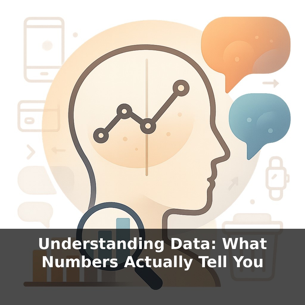
Now your fitness app, your bank, and your boss all track your numbers. The real puzzle is: when those numbers go up or down…what do they *actually* mean?
“Trust the numbers” sounds objective—until two experts stare at the same chart and argue opposite conclusions with equal confidence.
That’s because numbers don’t speak; people do. The meaning comes from *which* question you ask, *which* data you include, and *which* patterns you choose to see—or ignore. A tiny shift in how you slice a dataset can flip a success story into a warning sign.
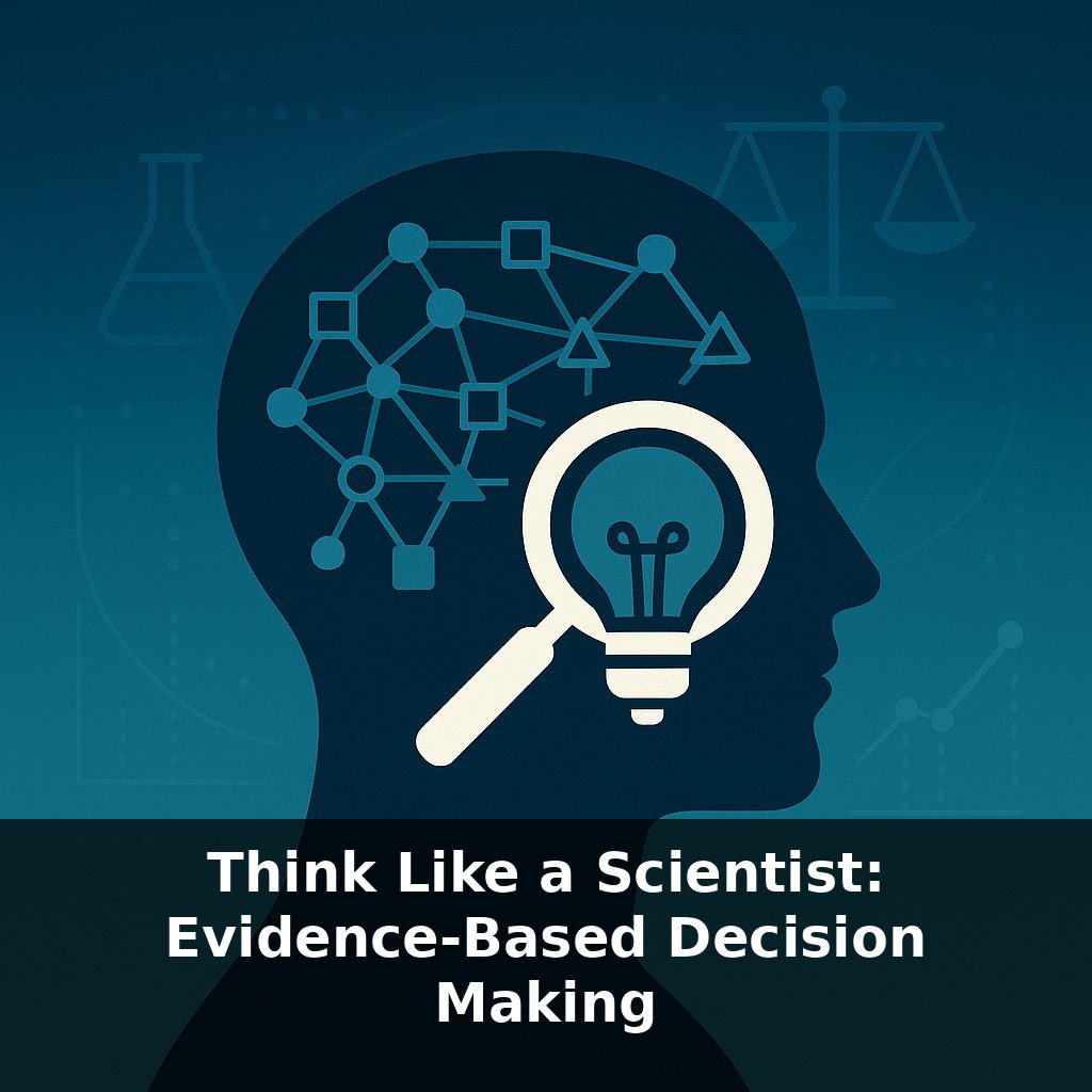
This is where scientific thinking matters. Behind every “statistically significant” claim is a chain of decisions: who was measured, when, how, and compared to what. Each link can quietly bend the story.
In this episode, you’ll learn how to read that story instead of just the headline—how to tell the difference between real signals and convenient narratives, and how to notice when a confident claim is built on surprisingly fragile evidence.
A single result rarely tells you much on its own. What matters is how it behaves over time, across situations, and against alternatives. A company’s “record sales” might hide that most new customers came from a one-time discount. A sleep score spike might just reflect a quieter weekend, not a miracle routine. To think like a scientist, you start asking: “Compared to what?” and “What else could explain this?” That’s where context enters—who was *not* measured, which time window was chosen, and what got left out of the summary you’re shown.
When you stare at a result—“this ad boosted sales 12%,” “this drug reduced risk by 30%”—the first question isn’t “Is that big?” but “Big compared to *what*, and for *whom*?”
Interpreting results starts with the question you *thought* you were asking. - Is the goal to predict what will happen next month? - To explain *why* something happened? - To decide between two concrete options?
Each goal pushes you toward different tools. A company forecasting churn might accept a messy but highly predictive machine‑learning model. A medical trial can’t stop at prediction; it has to argue *cause* and rule out alternatives.
That’s where the p‑value fact sneaks in: it tells you how surprising your data would be *if nothing interesting were going on*, not how likely your favorite story is true. Treat it as one clue, not a verdict. A tiny effect in a massive sample can look “significant” on paper yet matter almost zero in the real world—like a new drug that lowers blood pressure by 0.5 points in a million patients. Technically real, practically useless.
So you zoom out. You ask: - How large is the effect in concrete units—minutes saved, dollars earned, lives impacted? - How variable is it—do most people benefit, or just a sliver? - How robust is it—does it survive if you change the time window, trim outliers, or analyze subgroups?
Examples from practice are sobering. Machine‑learning systems once hailed as game‑changers in medical imaging later stumbled in new hospitals because they had silently learned shortcuts—like associating a particular clinic’s logo with more severe cases. The model looked brilliant on test data drawn from the same place it was trained, then failed when conditions shifted. Performance without scrutiny is a trap.
The replication crisis is another warning: you can get “exciting” results simply by running many small studies, trying many analyses, and only publishing the hits. Without strong design and adequate sample sizes, noise dresses up as discovery.
So numbers become more trustworthy when you: - Pre‑commit to how you’ll analyze them - Stress‑test your findings with alternative explanations - Prefer patterns that reappear across independent datasets
In other words, meaning emerges when you treat each result as a provisional clue, not a final answer.
A hospital tests a new sepsis alert system. On paper, deaths drop 15% after launch. Victory? Not so fast. Maybe, at the same time, they hired more night‑shift nurses, or flu season was milder. Until they compare with similar hospitals *without* the system, and look across multiple months and wards, they can’t separate the alert’s impact from everything else changing in the background.
A marketing team sees click‑through rates jump after switching email subject lines. If they only tested on their most loyal customers, that “win” might flop with new audiences. When they rerun the test on colder leads, the effect shrinks to almost nothing; the earlier result was real for one slice, misleading as a general rule.
Interpreting results is like adjusting a medical dose: too small and nothing happens, too big and side effects dominate. Careful teams keep tweaking questions, samples, and comparisons until the pattern holds under more than one “dose” of scrutiny.
Raw counts from sensors, apps, and platforms will soon describe your day in microscopic detail: heart rhythms, driving style, even how fast you reply to messages. That stream can guide better care, safer streets, and fairer loans—or enable predatory pricing and subtle discrimination. Your challenge this week: whenever you see a bold “data‑backed” claim, ask, “Who benefits if this story is believed—and what would I need to see to trust it?”
Treat each result less like a verdict and more like a weather report: useful, but always provisional and local. Over time, you’ll start to notice which “storms” are just passing noise and which patterns keep returning across tools, teams, and situations. That habit—quietly testing claims against reality—is how you turn raw findings into wiser choices.
Here’s your challenge this week: Pick one real dataset you already encounter daily (for example, your step count, weekly sales report, or website traffic) and, today, reframe it into at least three different questions (e.g., “What’s the trend?”, “What’s driving the spikes?”, “What’s missing from this picture?”). Then, calculate one simple descriptive metric (like a 7-day moving average or conversion rate) and one comparative metric (this week vs. last week) from that same data. Before the week ends, share your two main insights with a colleague or friend and ask them how they would interpret the same numbers differently.